by Ariela
This is the second of two blog posts on the making of the Anathem Illuminated First Page art print. Read the first part here.
Where last week’s post concentrated on historical inspirations and references in imagery, this one goes into the material concerns of making a manuscript page that looks like it came from the Concent of Saunt Edhar.
Writing on a Leaf from a Page Tree
First, I want to give a major shoutout to Neal Stephenson for coming up with a plausible and sustainable paper culture model for Arbran maths. Parchment would not have been practical, both in the volume of paper usage shown in the math, and also because they would have needed a large number of skins and the math presumably doesn't a sufficient number of herd animals. Paper production likewise probably couldn't have kept apace without mechanization or a large number of avout papermakers. Details like this keep enthusiasts (not Enthusiasts) like me happy.
It seems that, even with all the sequencing, page trees don’t produce perfect writing surfaces. Only one in ten leaves is suitable for collection, drying, cutting, and use, with many having veins that are too prominent to allow for easy writing. This probably means that the leaves that make the cut have visible, but not excessively raised veins. I considered the possibility that page tree leaves would be sequenced to grow with perfectly parallel veins that could be used as ruling lines for writing, but decided that this was improbable: it would limit the uses of the paper by forcing all writing to be approximately the same size and eliminating certain kinds of folding of the leaf because it would cause the rules to orient in the wrong direction. Moreover, if the veins weren’t perfectly parallel, that would also be cause for disqualifying a leaf from use, which Erasmas would surely have mentioned. So the leaves probably have a pattern of veins similar to those of Earth trees from a similar climate to that of the Concent of Saunt Edhar.
After completing a full draft of the piece, I washed watercolor paper in a yellow brown and, once it had dried, painted a full system of leaf veins in slightly darker brown. I wanted them to be visible, enough that it would be clear this is a leaf, not parchment or paper, but not pronounced enough to be distracting from the text.

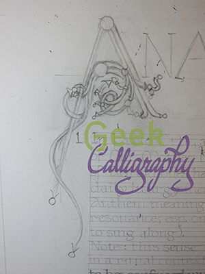
Finished underpainting with guide lines for the text positioning penciled in.
Only half the leaf is visible and it is landscape-oriented rather than portrait. This has to do with how handmade books are bound. Four or five pages are stacked, oriented horizontally, and then folded about the x-axis and stitched together at the fold. This is called a ‘quire’ or a ‘gathering.’

How a ‘gathering’ or ‘quire’ of four or five sheets of paper or parchment are stacked and then folded along the the center to create a small booklet of 16 or 20 pages.
Copyists write on these quires, which are then collected and, after first checking and re-checking that they are in the correct order, sewn together to form a codex. Assuming page tree leaves, like Earth leaves, tend to grow longer than they grow wide, this means that, when a rectangle with the largest possible surface area is cut from it and oriented horizontally, the central vein will also run horizontally.

A landscape-oriented cut on a portrait-oriented leaf that is so much taller than it is wide is inefficient.

A landcape-oriented rectangular cut out of a landscape-oriented leaf makes much better use of the available surface.

Once a rectangular piece is cut out of the leaf, it is folded down the middle so that it can be used in a quire.
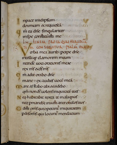
Incidentally, this is a verso, or left-hand page. The wider margin, which is the outer margin, is on the left, as are the pinpricks that would be used to align the text with all the other pages in the book.
Inks and Pigments
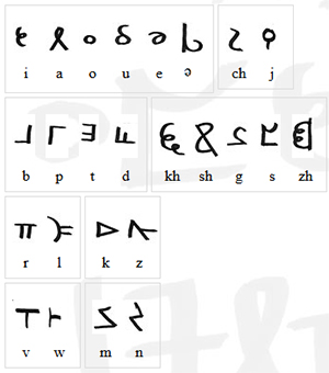
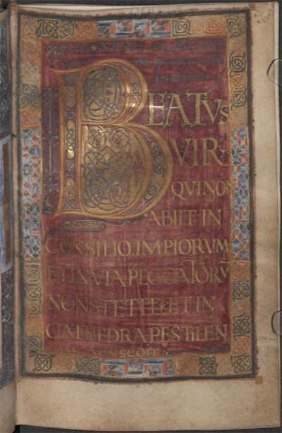
Once we have the writing support, aka what we’re writing on, we need to figure out what to write with. Erasmas mentions writing with a quill and ink, but what was his ink made of? As a middle-grade manuscript with decoration but no illumination or figurative illustration, this manuscript’s marginalia would be drawn in several different colors of ink.
The Concent of Saunt Edhar seems to engage in quite a bit of trade, but presumably traded goods are less abundant and more valuable than ones that can be produced from local resources. Mining isn’t mentioned as an activity at the math, so all mineral-based pigments would probably be too scarce to be used on this manuscript. Accordingly, I largely confined myself to colors that could be made from plant matter that could be grown at Saunt Edhar, or at least in an Earth climate similar to that described at the math.
The main body of the text is in a brown/black color similar to that of iron gall ink. This actually came down to an aesthetic choice, because it was equally likely that the Edharians could have made carbonic ink from lamp black. Carbonic ink is much blacker than iron gall ink. While there’s no mention of fire-based light sources, presumably some burning could be done just to produce ink. But I like the brown-black of iron-gall ink better.
The red color is similar to what might be produced from the madder plant, and the blue is similar to a product of woad, both of which grow well in the western European climate.
The exception to the plant-based pigments rule is the white, which is based on chalk white. Since chalk halls feature prominently, we can assume that there is a plentiful supply of calcium carbonate at hand that could also be used for white paint on manuscripts. Bonus: way less toxic than lead!
Disclaimer: just as I did not write this on an actual leaf, I did not actually use paint derived from madder, woad, or calcium carbonate. Using the watercolors I had on hand, I did my best to color match those displayed in the Traveling Scriptorium’s online Medieval Manuscripts Ink & Pigment Sampler.
And that’s it.
For those who are interested, I have a Pinterest board of manuscripts and other images I looked at while working on this project.
And finally a big ‘thank you’ to Neal Stephenson and his agent, Liz Darhansoff, for giving me permission to do this project.