If you’ve ever dreamed the impossible into being or are just a huge Seanan McGuire fan, this one’s for you.
How It Came to Be
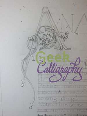
Terri is an enormous fan of Seanan McGuire’s work. While urban fantasy isn’t generally Ariela’s cup of tea, we’ve been trying to find one of Seanan’s many works where Ariela enjoyed the book as much as Terri did so we could do art for it. We pitched a Wayward Children piece way back in 2019, but the series is tied up in a number of film and television options that prevented us from securing image rights. When Terri finished Middlegame, she told Ariela that she was having ideas that including “words and fancy math.” Ariela replied that this was doable, though she did need to finish the novel first. Terri then decided to skim the novel for quotes, resulting in this:
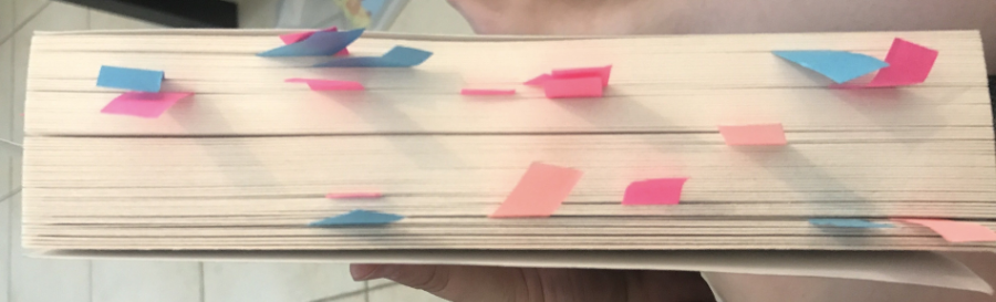
Image shows the page side of a trade paperback novel liberally sprinkled with blue and pink sticky note flags.
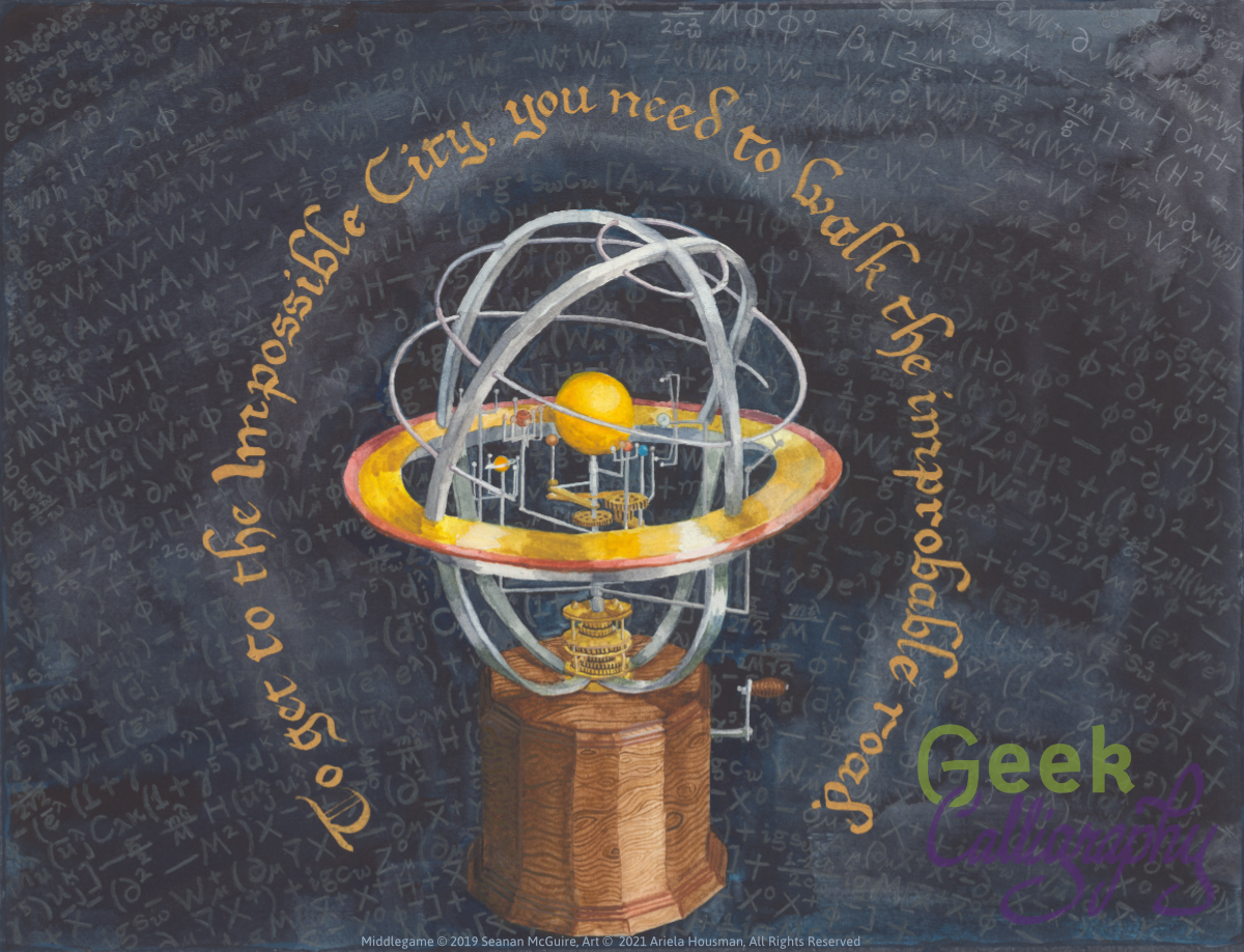
In the end we decided to go with the heart quote of the novel, arcing around one of the recurring images of the single through lines it contains. Creating this piece involved a number of varied items, including eBay reference images and a hula hoop. Think of them as ingredients in the alchemical process.
We soft launched this print at DisCon III to great success and are proud for it to be the first product we officially release in 2022.
The print features an orrery, showing the planets in a possible significant alchemical alignment.* The background is the Standard Model equation in the Langrangian form, in sweeping arcs.
The quote is both from Middlegame and Over the Woodward Wall, and tells you that:
“To reach the Impossible City, you need to walk the improbable road.”
This is a limited edition run of just 100 art prints in the 11”x14” size and only 20 in the 16”x20” size. Each print is matted on a black, archival-safe mat and comes ready to hang or to put in a standard 11”x14” or 16”x20” frame. Ships flat.
“The improbable road spools onward, and outward, and the journey continues from here.”
*By which we mean “this is the planetary arrangement that the reference image had and Seanan didn’t tell us we needed a different one.”