
by Ariela
I have been blathering on Twitter a bunch lately about how much I prefer writing Hebrew (specifically the square Aramaic alphabet, not the Paleo-Hebrew alphabet) to writing in the Latin alphabet. Mostly that has been context-free venting into the void, which is what Twitter is great at, but I thought perhaps I should explain why this is.
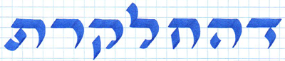
First and foremost, Hebrew makes spacing out text much easier by the presence of a number of letters that stretch very easily. Meet every Hebrew-writing calligrapher's best friends, Dalet, Heh, Ḥet, Lamed, Kuf, Reish, and Tav.
Say hello to the nice letters. Letters, say hello to the nice people.
What these letters all have in common is a single line across the top of the letter. That makes it very easy to use them to take up a lot of extra space, like so.

These are the same letters as above, but taking up much more room.
The letters are polite, though. The would never take up this much room on a crowded train.
So if you have a relatively short line of text, but want to take up the full width of the line, just having several of these letters makes that fairly easy.

Same words on both lines, but one is much longer. (Words are delet petucha, 'open door.')
Latin alphabet, by contrast, really only has the characters t and f with these easily extentable horizontal lines, with r and z having not quite horizontal bars. (Z's rarity makes it by far the least useful in this regard.)

The Latin alphabet's poor excuse for stretchy letters.
Even this, however, is different than the Hebrew stretchy letters. Excepting Reish, each of the Hebrew stretchy letters is stretching in the middle of the letter, and has a significant part of the letter at the beginning and the end. F, t, z, and r are stretching beyond themselves, which means that if you stick this in the middle of a word, it winds up making a break in the word.
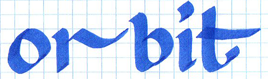
Does this say "orbit" or "or bit"? #NoContextForYou
There are a few other Roman characters that have flourishes that are made to extend a letter, like e, y, and g.

Pretty flourishes are fun.
Same issue here with the making a visual break. You can really only use this at the end of a word.

These are both the same word, and they take up the same amount of space. But one is legible and the other is not. It's all about where the flourishes are.
But the biggest difference is that there is an accepted convention in Hebrew about these stretching letters, whereas we don't have that so much anymore in the English language. Instead, we have to stretch each letter a little bit, and when that isn't enough, resort to stretching the kerning (spacing between letters and words). I hate kerning. Not only is it more work, I like the aesthetic of the result less.

This is kerning. Kerning is not my friend. The top line has normal kerning, the bottom line has stretched kerning in order to take up more space.
And none of this even gets into the fact that Hebrew has no upper and lower cases (majuscule and miniscule), so it makes for a more solid block of text with fewer white spaces.
Basically, I like Hebrew because it makes my job easy. Well, easier.