by Ariela
I have been working on a custom ketubah commission since January. The bride, Sarah, asked me to keep it under wraps until their wedding so that they could have a big reveal, but as the wedding happened on July 10, I can now share it.
I've decided to share the entire process, to give you a window into what it is like to work on a custom ketubah.
Other ketubah artists may work differently, but I always start with the art and then do the text once the art is completed. So when creating a ketubah from scratch, my first step is always to determine what sort of artwork the clients want.
I have worked with clients who have come to me with anything from a concrete description of what they want down to details all the way to those who have no idea what they want. Most fall somewhere in the middle. Sarah and Michael came with three different ideas, which is pretty common. After a consultation by Skype, we decided to go with their first idea, which was "some combination of particle tracks and music notation." Michael is a physicist and Sarah is a cantor, so the idea was obviously very "them."
During our call, we determined that they wanted the music notation on the left and the particle tracks on the right, with a transition from one to the other in the middle. They wanted some combination of blues and purples as the colors. They also told me that, while their text was not set yet, they knew that it would have both English and Hebrew, and that they would want it in side-by-side columns rather than stacked. It was helpful to know that so early, as it meant I could incorporate it into the design.
Sometimes I get lucky and a design lends itself to being "mocked up" digitally. When that happens, I can show clients more options for less effort, thanks to the magic of PhotoShop; it's a lot easier to invert the colors on something digitally than it is to draw an entire new sketch in inverse (this also means it is cheaper for them). That's what I did here. I was able to show them three different potential text layouts as well as three different color schemes (color on white, white on color, and combo). The images of particle paths that I found were almost always white on a colored background. Music, on the other hand, is almost always color on a white background. This way we were able to look at all combinations of all options, yielding nine mock-ups.
To simulate the transition, I didn't actually do any original work, I just superimposed the particle tracks on the image of some Renaissance-style music that Sarah had provided, with a visibility gradient. To give Michael and Sarah a better idea of what the genuine article would look like, I included one pencil sketch.
After looking at the options, Sarah and Michael decided they wanted the top right option, colored lines on a white background, with the two columns of text separated by a stripe of the art. They also decided to abandon the Renaissance-style music notation in favor of modern. I asked them to send me some music that was meaningful for them to include; when making art with language, it's important to include functional language, and I would no more include random music notes for a musician than I would nonsense code for a programmer. They chose chapter 2 of the Song of Songs, with a smaller selection of preferred verses in case I couldn't include the entirety. I also asked Michael if he had any partiality to a specific set of particle tracks; he didn't. With these references in hand, I was almost ready to start the lineart.
The last thing I needed before starting the lineart was a signed contract (including an agreed-upon payment schedule) and a first deposit. There are a few reasons why I tend to do it here. First, earlier in the process I don't have enough idea of the amount of work I'll need to put in to give even a projected total. While Michael and Sarah zeroed in on their final idea fairly quickly, it's not uncommon for each mock-up or sketch to cover a completely different concept. To compare it to the tech process, which is the one with which I am most familiar from my day job, this is still the RFP (Request for Proposal) stage, except I am sometimes entertaining bids from the same customer for jobs as disparate as building a website to building a bicycle. They're not even in the same ballpark in terms of estimated costs. Once we figure out what I am making for them, I send them a contract and we move into a very abbreviated Discovery phase, where I refine my understanding of what they wan t before starting lineart (or more detailed layouts, in the case of purely digital art). The second reason I don't demand a contract before I start sketches is that sketching/mock-ups is an important getting-to-know-you phase for me as an artist that helps me determine if I am a good fit for the client and vice versa. While I can tell some clients right off that I cannot meet their needs (someone once asked me if I could paint in the style of Chagall to which the answer was an immdediate No), what is less apparent is if our communication styles will mesh. There are some people with whom I just cannot establish the type of communication that I need. This is no bad reflection on them, any more than my inability to paint like Chagall is a bad reflection on me as an artist. But I know what I need to be able to do my best by my clients, and if I can't get it, it is better to figure that out before we are locked into a contract, forcing rounds and rounds of unproductive back-and-forth as we speak past one another.
Fortunately for me, Michael and Sarah and I communicated very well, and the contract was signed with zero fuss. I went to work on their lineart and produced this.
I told them that, for purely aesthetic reasons, I would depart from a faithful reproduction of the particle tracks reference I was using and add more swirlies in the upper right, to balance the image. I also asked Sarah to proofread the music, as I don't actually read music.
Michael said that adding more swirlies was fine, Sarah sent back a few corrections, and they asked that the music start to "fly apart" further left. After making sure that they understood that less of the music would be readable, I supplied this:
Sarah made a request regarding the art between the two text boxes that I couldn't quite parse, so we had another quick phone call to resolve it and I produced this version.
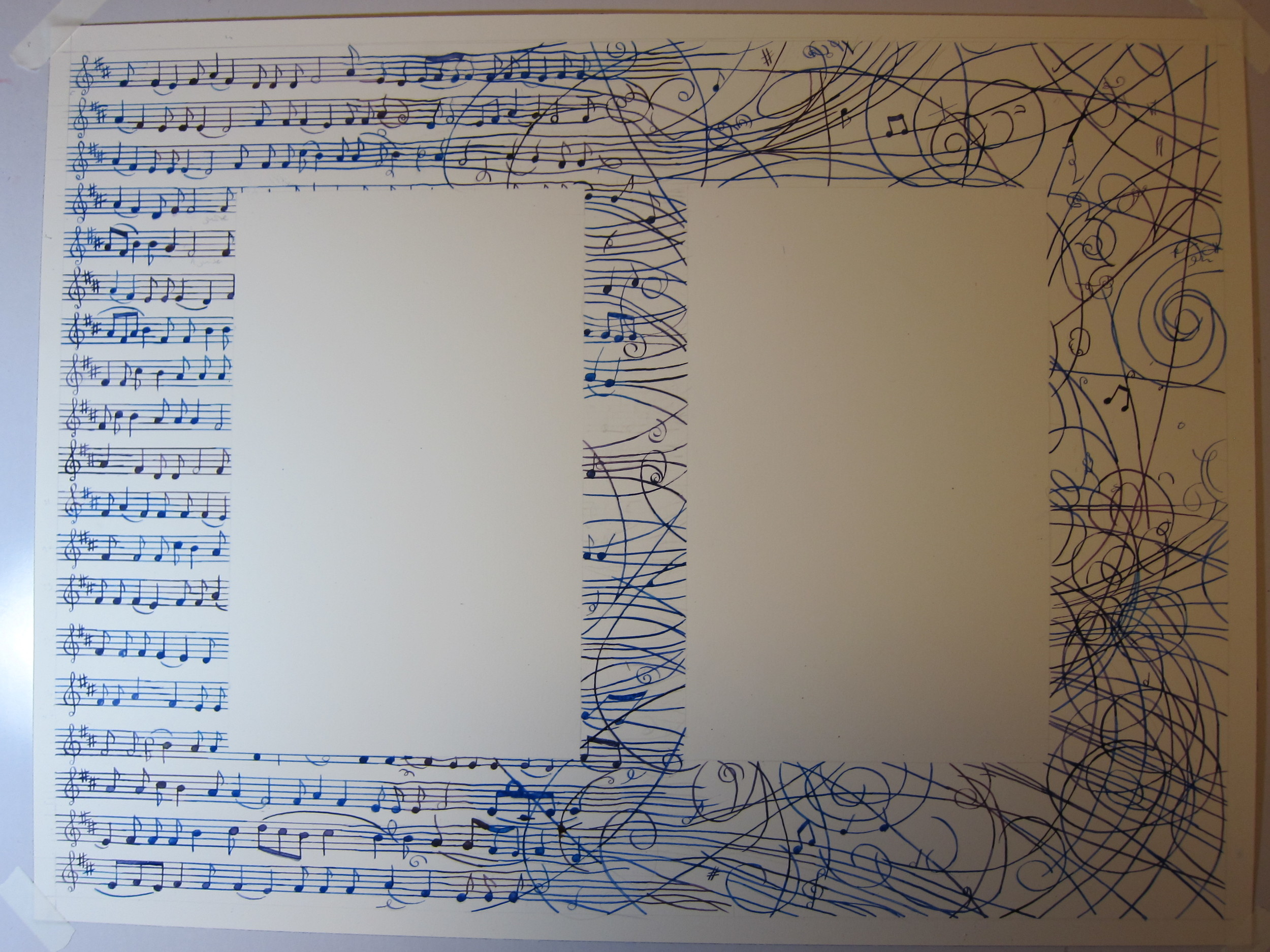
They approved. I clarified that they wanted everything to be a mix of blue and purple, rather than each line or note being one discreet color. After I got their second deposit, I began painting the lineart. 8 days later I sent them a small preview to double-check that the colors were in fact what they had in mind. I was almost certain they were, but sometimes you don't realize that you and the clients have different images in your head until they are out of heads and on paper.
Fortunately it was. And then I sent them the full painting. The pencil marks were still there, because I don't erase anything until the text is done, but here is what I sent them.
At this point, I needed the text. Fortunately for me, I had just a week to wait (and that week was Passover). I knew from our initial consultation that Sarah and Michael were creating their own text. From experience, I know that custom texts rarely arrive in a completely finished form, so I had asked Michael and Sarah to get theirs to me no later than the end of April. With a wedding date of July 10, that would give me a nice cushion for some additional back-and-forth asking clarifying questions.
In this, they were exceptional. They had built their text around a core of Rabbi Aryeh Cohen's Egalitarian Ketubah Text and consulted with an Aramaic expert to help them construct their changes in the Hebrew/Aramaic portion. Instead of replying to the text with 20 bullet points asking for clarification, I asked just a few questions about their layout preferences and one about spelling. Then I was ready to pencil in the text.
However, it was still a good thing I had left myself that cushion time. The other way in which Sarah and Michael's text was exceptional was its length. Clocking in at 893 words, their text was far and away the longest I have ever written in a single document; for comparison, our Traditional Ashkenazi tends to come out to around 300 words, give or take based on name length. We hadn't known about the text length when I did the lineart, or I might have left some more room. The letters were just 4.5mm high, which made for especially difficult writing in English, where lower case letters don't take up a full letter height. If you saw me tweeting about "long text of longness," this was it.
A penciled text is a strange animal. It's not really a lineart for the letters so much as it is a bunch of notes to myself about "this letter here." They can be hard to read. For this reason, I have proofreaders with whom I work regularly. (When Terri and I lived in the same city, Terri did this job; now I have two people in Chicago who do the work, as it's not practical to ship things to Terri.) It is not uncommon for an officiant to ask to proofread a text as well. This is the image I sent to Sarah and Michael to forward to their officiant.
Unsurprisingly, he decided that he did not need to proofread it after all :)
After that it was just a matter of inking ALL THE TEXT, then letting it dry and erasing it. Which I did.
Tada, the finished product:
Time clock totals:
Communication - 5 hours, 6 minutes
Mockups - 1 hour, 12 minutes
Lineart - 3 hours, 57 minutes
Painting - 6 hours, 51 minutes
Penciling - 9 hours, 12 minutes
Proofreading - 2 hours, 11 minutes
Inking - 12 hours, 6 minutes
Erasing - 19 minutes
Packing - 8 minutes


![IMG_1462[1].jpg](https://images.squarespace-cdn.com/content/v1/56565a97e4b0acafe106535a/1468368135451-KV2CHORXKUHS7O05LKU9/IMG_1462%5B1%5D.jpg)


