How Movies (and TV) Fail at Writing with Quill Pens

by Ariela

I don't know of any profession that feels it is well and accurately represented by pop cultural portrayals. Lawyers complain about courtroom dramas, police complain about crime procedurals, etc. So it probably won't surprise you that media portrayals of people writing with quills are, well, less than realistic.

Exhibit A:

Hermione Granger, portrayed by Emma Watson, using a quill all wrong.

Hermione Granger, portrayed by Emma Watson, using a quill all wrong.

I love me some Harry Potter, but the quills in the movies make me growl inarticulately. I mean, leaving aside the fact that all quills in the HP universe must be enchanted, because there is no other way that a child who grew up using pencils and biros (ballpoints, for those of us reading the US editions), could possibly just pick up a quill and write with it. No chance. 

Feather anatomy, courtesy of Ask a Biologist, Arizona State University

Feather anatomy, courtesy of Ask a Biologist, Arizona State University

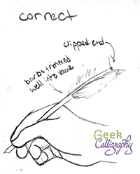
*ahem* As I was saying, the movie's portrayal of writing with quills is actually pretty standard for onscreen depictions. And it's wrong. Those super wispy bits down by Hermione's hand are called the downy barbs, and I don't know of any scribe who doesn't trim those away. Apart from making the quill harder to grasp, they will pick up ink every time you dip your nib. Yuck. Most of us trim further up the shaft as well, right into the vane (see handy guide to parts of a feather). Some trim all the barbs away and leave the pen as just the central shaft.

Also, most of us clip the opposite end of the quill. Writing with a pen that has an overlong barrel will unbalance the pen, whether it's a felt-tip or a quill. And, depending on how you sit while you write, you might wind up poking yourself with the opposite end in the eye or up your nose. Yeah, not fun.

An illustration of the issues mentioned above. Using a quill that hasn't been properly trimmed is terrible.

An illustration of the issues mentioned above. Using a quill that hasn't been properly trimmed is terrible.

Holding Quill Correctly - Geek Calligraphy

Yet pop culture persists in this myth, and I persist in being cranky about it on Twitter.

So piqued by it was I that, while wandering the National Gallery in London last month, I started snapping pictures of paintings of people writing with quills. Since these paintings date to times and places when people actually used quills, they're all correct depictions. I had thought that it would make a good tumblr - Paintings of People Depicted Using Quills Correctly - but I was prevented from starting it by my utter bewilderment at the tumblr interface. (Anytime anything gets posted to tumblr for Geek Calligraphy, Terri is the one doing it. G-d bless managers.) But Mary Robinette Kowal suggested that I could make a Pinterest board instead.

So, behold:

There's not a whole heck of a lot there yet, but it will grow.

Also, as a bonus, please enjoy pictures of these souvenir "quills" which I found in the Tower of London gift shop. Appropriate placement, really, as these are not writing devices but torture devices. [cowers]

The image does not properly convey the terrible quality of the metal pen nib slapped on the end of this "plume."

The image does not properly convey the terrible quality of the metal pen nib slapped on the end of this "plume."

Yes, that's a ballpoint shoved in the end of this quill. Because the untrimmed shaft wasn't enough.
Yes, that's a ballpoint shoved in the end of this quill. Because the untrimmed shaft wasn't enough.

Upgrading Nib Organization

by Ariela

When I feel like I cannot control what is going on in my life, one of my coping mechanisms is to clean and organize. Clutter makes me tense, and it acts as a good proxy for things I cannot actually control. Last year, during a particularly bad couple of weeks at work, I labeled every ten-inch span of the shelves in my pantry.

A few weeks ago, inspired by I am not sure what, I decided that I needed to upgrade my nib organization system. I mean, I know why I needed to improve the situation, I'm just not sure what prompted me to decide that now was the time that it needed to be fixed.

 This was my old organization system:

One box with slots, seven little envelopes, three little plastic bags, and one box labeled "random nibs" with utter chaos inside.

One box with slots, seven little envelopes, three little plastic bags, and one box labeled "random nibs" with utter chaos inside.

The plastic case with the different slots for 10 nibs, a piece of magnet, and reservoirs, was originally a set of Manuscript nibs that I bought years ago in a state of naivete. (I have since learned that I hate Manuscript everything, from their nibs to their cartridge pens.) I moved the Manuscript nibs somewhere else and put my primary set of nibs, right-handed Mitchell Roundhand nibs from John Neal Booksellers, in there. It's not space efficient, but it meant that I could find the correct size nib easily.

Not so for the rest of my nibs. My left-hand Mitchell nib set, used for certain Hebrew hands that require a different pen angle, I continued to keep in the little envelope John Neal sent it in. Every time I wanted a nib, I had to dump out the entire set and sort through them to find the right size. Ditto my backup sets of nibs for both right and left Mitchell nibs. All my other nibs were jumbled together in a small box held closed with a rubber band.

I thought about trying to get more cases like the one my Manuscript nibs came in, but it's not particularly space efficient.

The two nib organizers that don't meet my needs.

The two nib organizers that don't meet my needs.

So I googled for "pen nib organizer." I came up with surprisingly little. Artbin has a container similar to the Manuscript one, but it has several compartments in which to put multiple nibs, which would still require a bunch of sifting through a bunch of nibs to find the right one. There was also an Etsy listing for a block of wood that would store the nibs pointing upright, perfect for stabbing yourself when trying to get the next nib over. But the second image result led me to this blog post from Studio Chavelli.

So over the following weekend, I made my own. I continue to be terrible about taking process photos, but here is my finished Nib Organizer Wallet:

Head-on view of the new nib organizer wallet, with my hand

Head-on view of the new nib organizer wallet, with my hand

Side view of the open nib organizer wallet

Side view of the open nib organizer wallet

The first two rows or "pages" of nibs are both Mitchell Roundhands, righty nibs in front with the yellow paper, lefty second with the purple paper. The two remaining rows behind are both covered in white paper and contain my Brause poster nibs, a selection of Hunts, aka Speedball, and two random singletons with space for more at the back. Each is labeled, but the color and order tells me at a glance what is where.

The inside of the organizer is all corrugated cardboard, but I wanted the outside to be more durable. I used a different kind of cardboard that is much denser but also thinner and taped both a front and a back on just like extra pages. I added two additional pieces to create a top flap that lapped the front over. I covered it with some tan pleather I had lying around, gluing it in place with PVA glue. Then I cut a small notch in the front of the outside cover so that I could settle the socket half of a large snap in place. I then sewed the snap down with doubled button thread. I used a piece of durable blue fabric leftover from a bookbinding project to cover the inside of the front cover; cut it to size, pinked the edges, and then glued it into place with PVA. The blue cloth covered up the edges of the pleather and the ugly side of the stitches on the snap socket.

I cut a piece of the same blue cloth to cover the inside of the back cover next. I sewed the stud half of the snap to that fabric before pinking the edges and gluing it into place to keep from having to sew through the cardboard and leave the stitches showing on the other side of the pleather. I glued the pinked fabric with the snap sewn in to the inside of the back cover with PVA. And that was it.

I brought the new nib wallet with me to Capricon where I was doing some art demos. I could tell when a fellow dip-pen user walked by because they would stop and goggle at the open nib wallet next to me. I got nearly as many exclamations over the nib wallet as I did over the calligraphy in process. Clearly I am not the only one who has felt the absence of such an item in their life.

Manuscript Ketubah: The Research Behind the Design

by Ariela

I have a serious aversion to including design elements that mean nothing just to look cool. Whenever I put binary in a piece, it actually says something. I have done a custom piece with live Javascript forming the roots of a tree and two different ketubot with musical notation for the cantillation of the clients' favorite verses from the Song of Songs. 

When I started working on the Mansucript ketubah art, I knew that there would be research involved. Illuminations have extensive symbolism and iconography associated with them, and I would no more pick and choose images for this design at random than I would include garbage code in a piece about programming - aside from pinching my own sensibilities, it would likely be most irritating to the target audience. Unfortunately, I don't have a lot of experience with the study of illuminated manuscripts. Sure, I look at them more frequently than the average person on the street, I'm a calligrapher. But beyond recognizing certain alphabets (what we now call "fonts") and artistic styles as being typical of certain eras and places, I don't actually know much. I certainly don't know enough about the symbolism to avoid accidentally putting something utterly inappropriate in the design. To the research-mobile!

Read More

A Short Guide to Scribal Errors

by Ariela

The curse of engaging in a craft that many other people have done for centuries before you is that it is hard to come up with something original. But the flip side is that it's hard to screw up in a totally original way, too.

Calligraphy has been around for millennia, and basically any cock-up that can be done has been. Moreover, we have terms for them! And many of them are in Greek, because lots of them were made by monks copying bibles.

There are lots of ways to screw up writing a text. For now, I will only deal with the ones that arise from unintentional mistakes made while copying a text by looking at a reference document (called the exemplar). A different set of mistakes can be made if you are writing out a text that is being read to you, or writing from memory. I will also only deal with errors that occur in languages based on alphabets that are written horizontally; there is some overlap with syllabic or ideographic writing and vertical writing, but each does have their own pitfalls.

All examples below use the text of Frankenstein by Mary Wollstonecraft Shelley.

Haplography

This is when a scribe omits a chunk of text due to the eye skipping from one section to another. Dropping one letter by mistake is not haplography, it has to be more. There are several sub-types of haplography.

Homeo teleuton (also homeoteleuton): An eye-skip due to words or phrases having the same ending.

The word "child" is at the end of a phrase several times in this paragraph, leading to an eye jump from one instance to another. The text in purple is where the problem originates, and the text in green is omitted in the copy.

The word "child" is at the end of a phrase several times in this paragraph, leading to an eye jump from one instance to another. The text in purple is where the problem originates, and the text in green is omitted in the copy.

Homeo arcton (also homeoarchy): An eye skip due to words or phrases having the same beginning.

Here we have two sentences in short order that begin "There was a..." Jumping from the first to the second, we omit a bunch of text.

Here we have two sentences in short order that begin "There was a..." Jumping from the first to the second, we omit a bunch of text.

When the homeoarchy or homeoteleuton occurs at the beginning or end of a line, right up against the margin, it is a type of parablepsis.

Parablepsis is, according to Wiktionary, is "A circumstance in which a scribe miscopies text due to inadvertently looking to the side while copying, or accidentally skips over some of it." This is a bizarre definition, to my mind, as the punctuation seems to divide it into two completely disparate sets of errors: a) any type of error made due to looking to the side, or b) any omission of a bunch of text for any reason. I think a better definition would be "Haplography that occurs at the beginning or end of a line."

Here we have homeoteleuton that is also parablepsis: the word "public" appears at the end of two lines, and the eye skips from the first to the second.

Here we have homeoteleuton that is also parablepsis: the word "public" appears at the end of two lines, and the eye skips from the first to the second.

Dittography

This is where you repeat a sequence. It can be anywhere in length from just a few letters to several lines, depending on how quickly you catch yourself.

Here we have a phrase duplicated. This sort of dittography usually indicates that the scribe's mind wandered in the middle of the line.

Here we have a phrase duplicated. This sort of dittography usually indicates that the scribe's mind wandered in the middle of the line.

Dittography mostly happens when there is a repetitive element in the text, but every once in a while a scribe would just have a total brain fart and reproduce something for no apparent reason.

There's no obvious reason why the line in green was written twice.

There's no obvious reason why the line in green was written twice.

It can also happen anywhere within a text.

This is an example of dittography within one word. "Possessed" is written correctly in the original on the left, but has an extra "ess" in the copy on the right.

This is an example of dittography within one word. "Possessed" is written correctly in the original on the left, but has an extra "ess" in the copy on the right.

Transposition

This is where you switch the order of things.

It can cover the swapping of letters in a word.

Here we have a simple letter-order swap. If you just had the copy text on the right, you would probably be able to figure it out.

Here we have a simple letter-order swap. If you just had the copy text on the right, you would probably be able to figure it out.

It also includes the flipping of word order.

Two words are swapped around here. It makes some difference to the meaning of the text, but not a huge amount.

Two words are swapped around here. It makes some difference to the meaning of the text, but not a huge amount.

These are both fairly benign examples of transposition. The former is easily spotted and the latter doesn't change the text fundamentally. However, transposition can change the meaning of a text drastically if applied in the wrong place.

Changing the position of one word in this sentence changes its meaning completely.

Changing the position of one word in this sentence changes its meaning completely.

As bad as this is, it can be much worse. English is a verbose language, and Shelley's writing style is flowery. In terse languages where word order matters (so not Esperanto, for example), moving a word around means greater disruption to the meaning imparted. In Hebrew, where words are generally shorter due to verb and noun constructs based on a three-letter root, swapping two letters can literally mean the difference between the words 'crisis' and 'meat' (שבר/בשר), 'evening' and 'hunger' (ערב/רעב), 'hate' and 'subject/thesis' (שונא/נושא). It is not always clear from context that a mistake occurred. 

How to Prevent Scribal Errors

No matter how careful you are, it's almost impossible to copy out a text of great length without making any mistakes at all. In the 13 years I have been working as a professional calligrapher, I have only once written a text which my proofreader found to be completely without error. Fortunately for me, I do my calligraphy in pencil first, get it proofed, and then ink it after the corrections are made. (That's part of Terri's job.) Other scribes throughout history have not been so lucky. It is possible to fix a mistake made in ink, but the longer the mistake drags on, the harder it is. Also, errors of omission frequently don't leave enough room for fixing.

So the next time you see a tweet from us like this: 

You'll know what happened.

What’s the difference between a calligrapher and a scribe?

It’s true that in general English usage, there’s not much to choose between the words ‘calligrapher’ and ‘scribe.’ As with so many synonyms in English, the two derive from different languages of origin – Greek and Latin respectively, here – and they mean pretty much the same thing. When Jews say ‘scribe,’ though, we tend to mean one very specific thing: someone who knows the Jewish law pertaining to the writing of certain sacred texts and has the technical skill to write them. Each of these requirements can take years of study to meet.

Read More

Dispelling two common myths about calligraphy

by Ariela

When I tell people I am a professional calligrapher, I get a lot of different responses, everything from "Wow!" to "That's a thing?" But two comments I hear the most are "I could never do that, my handwriting is terrible!" and "You must have a lot of patience." 

Today I would like to put these misconceptions out of their misery. Or at least try.

Misconception number one: you must have good handwriting to be a calligrapher

I can't speak for all calligraphers, but when I do calligraphy, I use a completely different process than when I am writing anything else. My equipment is different, the way I hold the pen is different, and the motions I make are entirely different. I have a sneaking suspicion that if my brain were scanned while I was writing a shopping list vs. calligraphing a text, different parts of my brain would light up.

My calligraphy is relentlessly regular. My actual handwriting is actually all over the map. When I am writing slowly it is reasonably neat, but when I write quickly it gets sloppy very quickly. Here is an example of something I jotted down for myself recently:

Yes, I scribbled the date and location of Troi and Riker's wedding on the back of an envelope.

Yes, I scribbled the date and location of Troi and Riker's wedding on the back of an envelope.

Looks totally different than my calligraphic hands. (Honestly it looks like a combo of my parents handwriting.)

If you want to learn to do calligraphy, it doesn't matter what your handwriting looks like. You must be able to hold a pen for extended periods; hold your hand steady; draw a short, straight line; and draw a curve. If you can do that, you can learn calligraphy. Some people, for many good reasons, cannot do these things. And while this might also lead them to have less legible handwriting, poor handwriting is not the reason they wouldn't be able to do calligraphy. Correlation not being causality and all that jazz.

Misconception number two: you must be really patient to do calligraphy

I have a hard time not scoffing whenever I hear this one. I'm a very impatient person. Perhaps not more than the average person, but I can only see what goes on inside my own head. Really, I am not patient. What I am is tenacious, perfectionist, meticulous, and stubborn as all get-out. If all  you see is me sitting, making stroke after deliberate stroke with my pen, yeah, it might look like patience. But it's being fueled by something very different.

In one respect I suppose it is kind of true that you must be patient, in that calligraphy is not a craft that you can pick up quickly. I had been doing calligraphy as a hobby for seven years before I apprenticed to a professional. I went through 3 months of apprenticeship before I was even allowed to do the smallest bits of jobs for clients. I did small professional jobs for two years before I started doing bigger ones. Even now it takes a while to complete any one piece.

So yeah, I spend a lot of time perfecting my craft. But so does any artist. Or author. Or athlete. And probably lots of other professions starting with other letters. But I bet that Yo-Yo Ma, N.K. Jemisin, and Serena Williams don't get told "Wow, you must have so much patience" in response to their explanations of their careers, even before they became famous.

So just because you are an impatient person, don't think that you cannot do calligraphy. Sometimes it will be hard and boring, yes, but if you want it enough, it will be worth getting through that time to get to the reward at the end.