Geek Calligraphy Abroad

by Terri

My sister got married just outside of Jerusalem yesterday. I have been in Israel with my family for the last almost month. Working over an eight hour time difference has been... fun. In the way of sticking sharp objects in one's eyes and dental surgery sans anesthesia. On the other hand, I have lots of great pictures. Here is a selection:

Half of Reading Station/תחנת קריה. This is an old bus stop, repurposed into a free library. [Image shows a man, woman and stroller in front of a bus shelter filled with bookshelves]

Half of Reading Station/תחנת קריה. This is an old bus stop, repurposed into a free library. 
[Image shows a man, woman and stroller in front of a bus shelter filled with bookshelves]

Wine grapes (either cabernet or malbec) at the Tzuba Winery. [Image shows two clusters of blue-purple grapes amid healthy green leaves]

Wine grapes (either cabernet or malbec) at the Tzuba Winery. [Image shows two clusters of blue-purple grapes amid healthy green leaves]

Mosaic map of The Cardo (Roman street in the Old City of Jerusalem.

Mosaic map of The Cardo (Roman street in the Old City of Jerusalem.

A solo cat and a cat who owns a person consider each other, rather like the cats in The Aeronaut's Windlass. [Image shows a thin cat with a white belly and calico back staring down a much more well fed grey and black tabby with a red collar]

A solo cat and a cat who owns a person consider each other, rather like the cats in The Aeronaut's Windlass. [Image shows a thin cat with a white belly and calico back staring down a much more well fed grey and black tabby with a red collar]

Monster at the western retaining wall of the Temple Mount (also known as The Kotel). [Image shows a small child in a red t-shirt and rainbow skirt touching the stones of a wall that's over 2000 years old.]

Monster at the western retaining wall of the Temple Mount (also known as The Kotel). [Image shows a small child in a red t-shirt and rainbow skirt touching the stones of a wall that's over 2000 years old.]

Making friends with a boa constrictor at the Biblical Museum of Natural History. [Image shows me with a large brown snake wrapped around my arms whose head is extending up my neck. The expression on my face is half amused, half terror]

Making friends with a boa constrictor at the Biblical Museum of Natural History. [Image shows me with a large brown snake wrapped around my arms whose head is extending up my neck. The expression on my face is half amused, half terror]

Wide interior shot of the stalactite caves in the Sorek Valley. Visible in the center is the stalagmite feature often referred to as "the ice cream cone with three scoops."

Wide interior shot of the stalactite caves in the Sorek Valley. Visible in the center is the stalagmite feature often referred to as "the ice cream cone with three scoops."

Classic shot of the Kotel and Temple Mount. [Image shows the stone wall of the Temple mount and the gold dome of the Dome of the Rock mosque]

Classic shot of the Kotel and Temple Mount. [Image shows the stone wall of the Temple mount and the gold dome of the Dome of the Rock mosque]

I Love Coloring

by Terri

Animated .gif of me coloring a tulip purple.

Animated .gif of me coloring a tulip purple.

Knitting is my primary hobby. So much so that I shipped a large box of yarn to Israel to make sure that I would have enough to knit while on vacation there.

But in addition, I love to color in so-called "adult coloring books." No, they don't have naughty pictures in them (though my favorite book so far has many many naughty words), but they are often more difficult to use than ones designed for children. Typically the images are subdivided into many small shapes, that require more fine motor control than the average five year old possesses. In theory they are designed to be calming and somewhat meditative. Before discovering the F*cking Awesome Coloring Book, my favorite books were generally based on on mehndi designs or other geometric shapes

Ariela, on the other hand, finds the whole idea of coloring line art she didn't draw herself twitch inducing. She likens it to wearing someone else's underwear. So the idea of Geek Calligraphy coloring pages never actually occurred to her - she doesn't find it enjoyable, so why should she make them for other people? 

First test version of the Spoon Dragon coloring page. Monster has since absconded with the original.

First test version of the Spoon Dragon coloring page. Monster has since absconded with the original.

In my house, there are Monster's markers and Mommy's markers (generally very fine felt tip pens, but I also like brush tips for larger area coverage). I also have a box of colored pencils, and have branched out into gel pens. I have discovered the joy of coloring cabbages and achieving exact radial symmetry in my work. Coloring taps into the part of my brain that is more than happy to choose a radically different yarn than the pattern designer intended, but won't make structural alterations to the pattern itself. In my world, Spoon Dragon is a lovely shade of lilac with blue hair. Fantastic blues and greens show up in every bird, not just peacocks. And I always have something to do while waiting for major web edits to do their thing. In fact, while working on this post, I have been coloring a large raptor type bird wearing sunglasses and holding a piece of pizza in its talons. The bird is in magnificent flourescent shades and the pizza cheese is sparkly. I didn't have to create the bird myself, which is awesome. I just get to choose what it looks like.

So if you like to color, you're in good company. And we'll continue to turn some of Ariela's line art into downloadable pages for you to enjoy.

Visitor Friendliness and Hostility: On Airports and Disneyland

by Ariela

My geekery takes a lot of forms. I like things that are considered culturally geeky: comics, SFF, etc. I also have a day job in tech. But today I want to geek out about something I haven't spoken about much on this blog: usability.

In between aspiring to be a professional artist when I was a child and then circling back around to actually become one as an adult (with an ongoing dog-leg into non-profit technology), I spent my high school and college years wanting to go into exhibit design for history museums. This meant that I spent some time learning about visitor flow in physical spaces as well as in websites.* Since I spent a week in London recently, I thought a lot about usability in the real world, between doing touristy stuff at historic sites and museums and flying in and out.

Heathrow security prep station. This photo is from futuretravelexperience.com. I did not get my own as I didn't want to hold up a line by taking photos.

Heathrow security prep station. This photo is from futuretravelexperience.com. I did not get my own as I didn't want to hold up a line by taking photos.

Let me say, for all the terrible things that people say about Heathrow, I found it quite visitor-friendly. Before going through security, they have preparation stations set up. They're little counters where you can sort your stuff out. They not only have trash cans, they also have designated receptacles where you can dump liquids out of your bottles, and they have plastic bag dispensers for your small liquids. At security itself, the bins are bigger than in American airports. Not only that, but instead of having carts of them at the head of the line, the empties are returned to the start point by gravity rollers underneath the conveyor belt that brings the full ones through the screener. They had security personnel at each conveyor belt assisting you. Oh, and you get to keep your shoes on. It not only made the onerous process of going through security rather less terrible, it also made it faster, so there wasn't much of a wait.

This image of dense crowds at an airport is from TravelAndLeisure.com. Sure looks leisurely to us. Oh wait, no it doesn't.

This image of dense crowds at an airport is from TravelAndLeisure.com. Sure looks leisurely to us. Oh wait, no it doesn't.

Contrast this to an American airport. There's nowhere convenient to prepare to go through security. There's nowhere nearby to dump liquids, which means that the person who inevitably forgot to empty their water bottle has to run back to find someplace, holding up the line. They certainly don't provide plastic bags for small liquids either. No one assists you as you prepare your stuff to go through the screener - the security personnel near that side of the conveyor belt tend to walk around shouting reminders to put your laptop in a bin by itself, etc. There's no automatic return of bins, so that can be another holdup. It's not actually designed for maximum inefficiency and misery during the process, but it seems to come close. Nobody likes being in an American airport, and security is everyone's least favorite part.

Water fountains for people of all heights in California Adventure.

Water fountains for people of all heights in California Adventure.

If I had to name the opposite of an American airport, I would choose Disneyland. I went to Disneyland for the first time in September 2016, and I was blown away by the user-friendliness of the place. A lot of this was just because it was actually designed with the idea that people who aren't adults have a right to be accommodated. There were changing stations in all the bathrooms, usually multiples. Water fountains came in several different heights. As an adult who needs shoes to see 5' tall, believe me, there's a difference in the comfort of seats designed for multiple heights and ones designed for the average adult. But a lot of it has nothing to do with children.

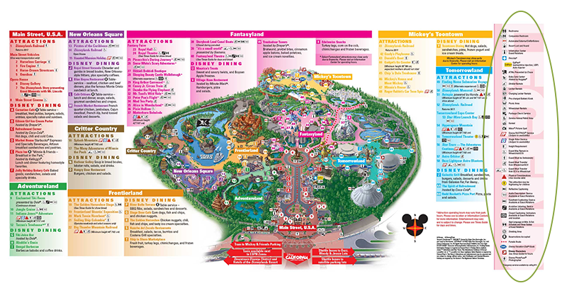
I can't speak to the actual accessibility of Disney for people who are vision, auditory, or mobility impaired, but I sure noticed all the notations on the map about accessibility, pictured below. The fact that it was there up front, as opposed to having to go looking for it to learn about it, impressed me quite a bit.

Map of Disneyland with a legend on the right highlighting ALL THE SERVICES. Click to embiggen.

Map of Disneyland with a legend on the right highlighting ALL THE SERVICES. Click to embiggen.

This is a text payphone! How cool is that? So necessary for anyone hearing impaired who doesn't have access to a cell for whatever reason!

This is a text payphone! How cool is that? So necessary for anyone hearing impaired who doesn't have access to a cell for whatever reason!

Disposal cans at Main St. USA

Disposal cans at Main St. USA

The trash cans are a thing of Disney lore. Websites give conflicting stats, usually citing either 20 or 30 steps maximum between trash cans. I didn't stop to count it out - my poor spouse had to wait for me to take pictures of them, I suspect neither he nor the other visitors would have appreciated me stopping to measure out paces between each of them - but they appear at much shorter intervals than I have ever seen trash cans anywhere else. The same websites cite Walt himself as instituting the policy of so many trash cans as part of lowering the bar to guests throwing out their rubbish properly. I suspect that we don't see this outside of Disney not because institutions are not interested in lowering the bar to using trash cans but because of how many staff hours it would take to empty that many cans. Space might also be a consideration, too, as who wants to give that much footprint to trash cans?

One type of space that the trash cans at Disney don't take up so much is visual space. They are incorporated into the decor of the attraction, so they don't stick out as utilitarian, they're part of the experience and novelty. The other place Disney does this really well is in the waiting areas to get into rides. Like airports, Disney hosts people who inevitably spend a large amount of time waiting in lines. However, unlike airports, Disney tries to make this wait time as pleasant as possible, and they dress the waiting area in decor matching that of the ride, essentially trying to make the wait itself part of the ride, too.

Of course, airports can't make your wait more entertaining by making the waiting resemble being on an airplane because the vast majority of fliers are far more interested in their destination than the ride. But there are definitely things they could do to make the wait, and the ride less miserable. Unfortunately, there's no incentive to do so. People don't pay to use airports, they pay the airlines, and no airline is going to spearhead improvements in the general airport when they won't inspire anyone to fly with them more often. In fact, there's incentive not to improve, as that "calculated misery cost" is what causes people to pay for things like TSA PreCheck and visitor lounges. Ditto coach vs. First Class on the planes themselves.

There isn't really a point to all this rambling, except to say that user-friendliness has a lot of aspects and that they can make a huge difference to our experiences, even for something as simple as waiting in a line. Necessary but unpleasant experiences can be mitigated by user-friendliness, while good experiences can be enhanced; conversely good experiences can be soured by user-hostile environments and bad ones are transformed from annoying to miserable. This is true on the web as well as in the real world, but I rarely see people comparing the two outside of niche interest sites.

So next time you have a really unpleasant experience somewhere, ask yourself if there's something that could be done to make it more pleasant. If possible, give feedback on it; few places are as user-hostile as airports, and many want to make themselves more welcoming.

*If you ever see me in a museum exhibit, you may find me staring at the ceiling to check out their lighting configuration, or critiquing the layout of object labels.