by Ariela
This is a followup to the post of several weeks ago about different types of calligraphy pens. While pens are, in many ways, the most important tool of the trade, it would be a lot harder to get good results without others.
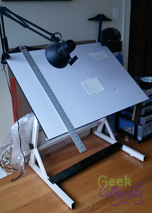
Ariela's drafting table with t-square hanging off it.
Drafting Table
You won’t get far without a good surface to write on. The sloped surface of a drafting table considerably reduces strain. When working on large surfaces, I increase the angle to bring the top closer to myself. Even when working on smaller pieces, the slant means that the pen meets the paper or parchment at a different angle than it would on a flat surface.
Mine is a Bieffe AF15, but brand matters much less than height and range of angles. As long as one adjusts to heights and angles that are comfortable for you, that's all that matters.
Good lighting is important while working. Many artists, myself included, answer this need by installing a swingarm lamp on one corner of their drafting table, but there are plenty of other solutions available.
T-Square
Making straight, parallel lines is one of the most important preparatory steps for calligraphy. Some drafting tables have a ruling tool built in. Mine doesn’t and I like it that way; there are times when I want to be able to use the entire surface of the table. Instead, I use a t-square together with the flat edge of the table to rule parallel lines. Mine is three feet long.

Ariela rests a triangle on her t-square.
Triangle
When making vertical lines, it isn’t always practical to flip the t-square and use it vertically; for one thing, the t-square is quite a bit longer than the table is tall, and jabbing myself in the gut is not fun. When I need to make a small to medium vertical line, I rest a triangle on top of my t-square.
Lettering Guide

Ariela rests a lettering guide on a t-square.
This little gizmo saves me so much time. Instead of measuring along the side of my writing area and marking each point at which I should draw a parallel line, I sit it on top of my t-square and it does all the spacing for me. (This is another way the slant of the drafting table helps – I can use gravity to keep the bottom of the lettering guide flush with the t-square.) I can change the line height by rotating the disc in the center between 3mm height and 10 mm height. If I want to work bigger than that, I can skip holes in the center or use the ones along the sides.
If you are a calligrapher and you don't have one of these, I highly recommend acquiring one. They are cheapest from Blick Art.
Lead Holder/Lead

Hand holding lead holder.
This is the original mechanical pencil. While you can now get leads of different weights to load into modern mechanical pencils, I prefer this one for a few reasons. You do sharpen this lead, unlike your standard mechanical pencil. This means that you can choose how much you sharpen it; if a super sharp lead tends to cause you to gouge holes in your paper, you can keep it a little bit dull. The lead is thicker than the 5mm or 7mm standard to mechanical pencils now, so I don’t snap it as easily when inserting it into the holes of the lettering guide. I also just like the feel of this pencil body, the weight and the balance. Others might prefer different pencil bodies. I tend to use a 2H lead, which provides a good balance between producing a line that is dark enough to see but doesn’t lay down enough lead to smudge much while working.
Guard Sheet
I put a piece of paper under my hand to prevent the oils from my hand from touching the paper too much as I rest my hand while writing. It can be any scrap piece of paper.
There are more tools still for when I need to do fancy schmancy things, but these are the ones that get used in basically every calligraphy project
Questions?
I love talking about the technical aspects of calligraphy. The best way to get in touch is to tweet @GeekCalligraphy.