New Art Print: Middlegame

If you’ve ever dreamed the impossible into being or are just a huge Seanan McGuire fan, this one’s for you.

How It Came to Be

Terri is an enormous fan of Seanan McGuire’s work. While urban fantasy isn’t generally Ariela’s cup of tea, we’ve been trying to find one of Seanan’s many works where Ariela enjoyed the book as much as Terri did so we could do art for it. We pitched a Wayward Children piece way back in 2019, but the series is tied up in a number of film and television options that prevented us from securing image rights. When Terri finished Middlegame, she told Ariela that she was having ideas that including “words and fancy math.” Ariela replied that this was doable, though she did need to finish the novel first. Terri then decided to skim the novel for quotes, resulting in this:

Image shows the page side of a trade paperback novel liberally sprinkled with blue and pink sticky note flags.

Image shows the page side of a trade paperback novel liberally sprinkled with blue and pink sticky note flags.

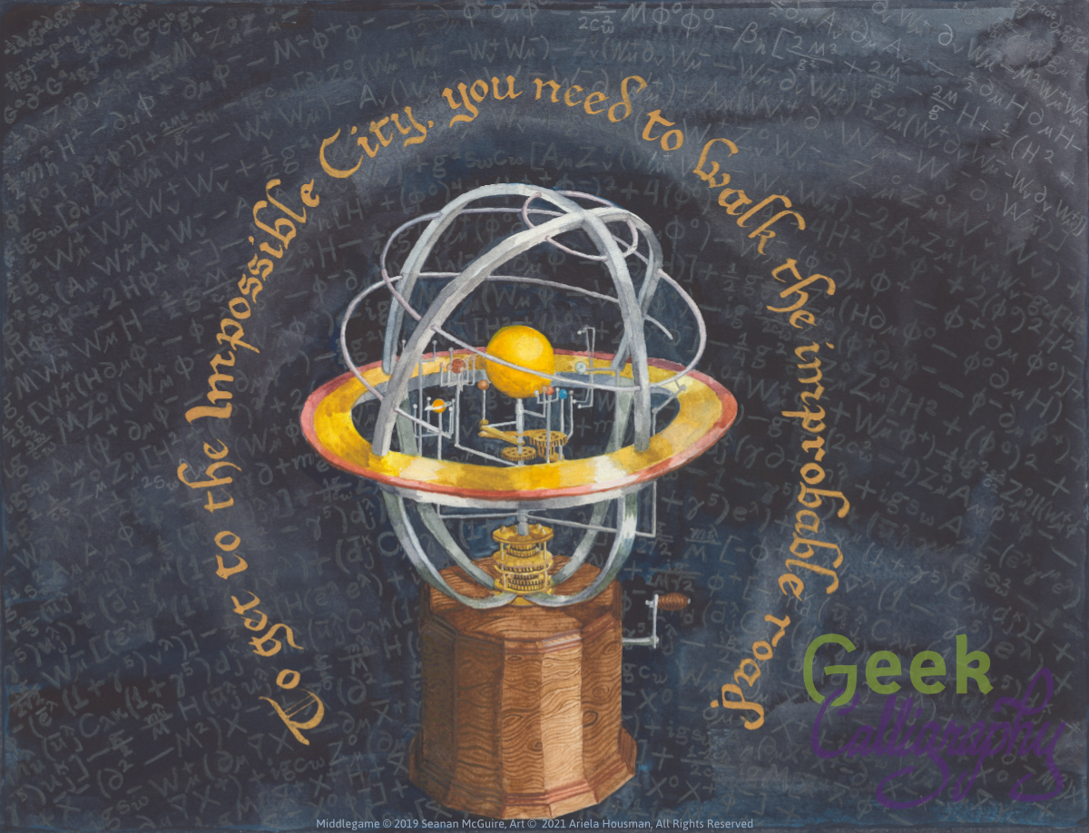
In the end we decided to go with the heart quote of the novel, arcing around one of the recurring images of the single through lines it contains. Creating this piece involved a number of varied items, including eBay reference images and a hula hoop. Think of them as ingredients in the alchemical process.

We soft launched this print at DisCon III to great success and are proud for it to be the first product we officially release in 2022.

The print features an orrery, showing the planets in a possible significant alchemical alignment.* The background is the Standard Model equation in the Langrangian form, in sweeping arcs.

The quote is both from Middlegame and Over the Woodward Wall, and tells you that:

“To reach the Impossible City, you need to walk the improbable road.”

This is a limited edition run of just 100 art prints in the 11”x14” size and only 20 in the 16”x20” size. Each print is matted on a black, archival-safe mat and comes ready to hang or to put in a standard 11”x14” or 16”x20” frame. Ships flat. 

“The improbable road spools onward, and outward, and the journey continues from here.”

*By which we mean “this is the planetary arrangement that the reference image had and Seanan didn’t tell us we needed a different one.”

New Stickers: Fanfic Time!

Have you ever felt the need to proclaim that you read or write fan fiction and are not ashamed? Then we’ve got the stickers for you!

It’s been quite the couple of years, hasn’t it? Between one thing and another* we haven’t released a new product since the end of 2019. But the end of 2021 draws nigh**, and we’d like to end the year on a high note celebrating something we both love.

How it came to be:

Terri & Ariela are both big fans of Olivia Dade’s most recent novels, Spoiler Alert and All the Feels. We’re also long time fan fiction readers. During a semi-regular business chat, Terri asked Ariela if we couldn’t do a sort of calligram tribute to the fictional Gods of the Gates series involving fanfic tropes. While Terri’s fanciful idea involving an urn proved highly impractical, Ariela immediately replied with “What about stickers that say ‘Proud Fanfic Writer’ and ‘Proud Fanfic Reader’?” Terri immediately agreed that this would be a smashing idea, and off Ariela went to design them.

Like our Fuck You, Pay Me prints and stickers, these stickers use beautiful lettering and decorative flourishes to announce an unpopular opinion in a Very Classy Way. The stickers are die cut vinyl, and will look great on your fanfic consumption/output device of your choosing.

Pre order your stickers today!


*Those things include a a divorce, a transatlantic move, a global pandemic, and the launch of possibly the world’s snarkiest zine between the two of us.

**Yes, we’re getting this in under the wire. It’s 2021, we’re doing our best.

New Art Print: Dragon Naturalist Nouveau

To finish out the year, we are happy to present a new licensed art print! If you’ve ever wanted to be a Victorian Lady Adventurer, this print is for you!

AP-201902-DragonNaturalist_matted.png

How It Came To Be

When you live in a different time zone from your business partner, a lot of the business conversation happens in a dedicated Slack workspace. One of the things we use it for is throwing ideas at each other to see what we should work on next. Back in May, the following exchange occurred:

Ariela: on a totally different topic, i might want to approach Marie Brennan about doing a Lady Naturalist art nouveau print
Terri: OOOHHH, CAN WE???????
Can we put wee Jewish things in it????

Both of us are very fond of Marie Brennan’s series (the first book of which is A Natural History of Dragons), as it’s the only genre series that we’re aware of that bases the European analog’s religion (Segulism) on Judaism, rather than a variant of Fantasy Christianity. In fact, this is so rare that when Terri was reading it on Ariela’s recommendation, it took her until Chapter 13 to realize that the Judaism had been there since the beginning.

The art is in the sepia-washed color palette of Steampunk to complement the Intrepid Scientist getup of our heroine (and the caeligers that fly through her later sky), set within an Art Nouveau frame. An arch of Draconean art breaks the sky and the two dragon sketches beneath it nod to the excellent illustrations by Todd Lockwood that fill all five books in the series.

This is a limited edition run of just 100 art prints. Each print is matted on a black, archival-safe mat and comes ready to hang or to put in a standard 11”x14”. Ships flat.

New Art Print: Tech Serenity 2.0

Need a reminder that taking a hammer to your servers is probably not the right move? Hang this in your cubicle to help you keep things on an even keel.

AP-201901-TechSerenity2.0.png

How It Came To Be:

While our original Tech Serenity Prayer is a synthesis of computer and calligraphic aesthetics, we wanted something that would fit more squarely in the computer aesthetic.

The original was written in ink, but the 2.0 is entirely computer generated. The text was set in the Classic Console font and then manipulated to create the light effects. Ariela had fun learning how to render the horizontal lines and slightly offset color halos that are the signature of a classic CRT monitor.

Closeup of the lettering showing the light halos and horizontal bars reminiscent of a CRT.

Closeup of the lettering showing the light halos and horizontal bars reminiscent of a CRT.

To keep this print both durable and easy to hang, we are selling a laminated version (rather than our standard matting and bagging) with a sawtooth tab that will fit nicely over a thumbtack or pushpin. Each print measures 8.5x11 and costs $12.

New Judaica Art Print: A Wonder(ous) Woman  אשת חיל

Let the valorous woman in your life know how Wonderful you find her!

Blue and gold Hebrew text from Psalms 31 in the shape of the Wonder Woman logo

How It Came To Be:

Sometimes Ariela’s creative brain is tripped by odd prompts. She began searching for a way to put a particular Jewish spin on Wonder Woman after seeing a woman put a Wonder Woman bib on her daughter at kiddush* lunch at synagogue on Sh’mini Atzeret (the Eighth Day of Assembly). Once she thought of referencing Proverbs 31:10-31, an acrostic poem that begins with the phrase “A Valorous Woman,” the connection seemed obvious.

Hebrew art has a rich history of micrography, tiny calligraphy formatted so that it makes up a picture when you stand back, so the first plan was to fit all 21 verses into the logo. This lasted until Ariela actually thought about the message we wanted to send with the piece. Then most of the poem - the parts that talk about a woman’s value deriving from what she does for her husband and children, frequently in terms of her skills as a housekeeper or acquiring wealth - got cut. Even Terri’s favorite verse, the one that says "Many women have been made great, but you have surpassed them all,” was subjected to the sword. We at Geek Calligraphy do not embrace the Smurfette Principle** in any form - we will not condone the idea that there can only ever be one awesome woman at a time.

While Terri’s recent love of Wonder Woman comes largely as a result of the amazing 2017 film, the logo that Warner Bros. redesigned for Wonder Woman was deemed too angular and complicated. So instead, we used the classic DC Comics logo, with its clean silhouette and iconic red, yellow and blue.

The version up top has yellow text, but we also have an extra shiny (literally) version with gold text.

Gif showing the gold foil on the print reflecting the light.

Each print is matted on a black, archival-safe mat and comes ready to hang. The matted dimensions are 8”x10”. Prints with yellow text cost $30, prints with gold text cost $40. Ships flat.


*Kiddush literally means sanctification. In this case, it refers to the food served at synagogue after the sanctification of the Sabbath or a holiday is said over a cup of wine.

**Note - there are two links here, because one is to an old NYTimes magazine article and may be behind a paywall. The second link is to a TVTropes article, where you can explore all sorts of other lovely tropes about women in fiction and media.


New Art Print: Lady Astronaut Nouveau

Do you remember where you were when you first heard about The Lady Astronaut of Mars? We do. While we can’t send you to the Moon or Mars, we can offer you a gorgeous Art Nouveau print for your wall that we hope will inspire you as much as Dr. Elma York inspires the both of us.

AP-201801-LadyAstronaut_Matted.png

How it Came to Be:

It’s rare that a character grabs both of us in the same way and doesn’t let go. Dr. York is both part of and an exception to that rule. A Jewish protagonist is rare enough for both of us to see. One as well researched and written as Elma York is practically a unicorn. Terri felt the need to tweet at Mary Robinette Kowal while listening to the audiobook:

On the other hand, Elma is solidly Ashkenazi, which leaves Ariela out somewhat as she no longer practices those specific traditions. While there is a mention of the Spanish & Portuguese community of Charleston that resulted in a massive twitter conversation between Ariela and MRK, that’s not enough representation for a community with deep roots in the Southern US that predate the founding of the country. So it’s bittersweet for her, while for Terri it was more than she’d ever seen before.

When discussing authors to approach for more licensed work, Terri brought up approaching Mary Robinette about doing something with these books. Ariela was looking to do more illuminated first pages, and didn’t see how a series set in the 1950’s would work with that aesthetic. Terri pushed, and Ariela conceded that she hadn’t done any Art Nouveau in a while and it would be nice to get back to that. While Ariela was still noodling around with the draft, she found out about the Lady Astronaut fanart contest, and in the middle of the Jewish high holy days Ariela decided that, sure, she was going to try to produce finished painting in less than three weeks in order to meet the contest deadline. It didn’t quite happen, but when we posted the final painting to social media, there were enough inquiries of “Where/when can I buy a print of that?” that we decided to ask MRK about licensing so that we could do a print run.

Needless to say, when Mary Robinette agreed to allow us to sell this print, there was much squeeing. So much squeeing. First of all, the fact that she liked it as much as she did had us fangirling all over the place, let alone allowing us a license to sell the piece. (The signed licensing contract was actually returned during Terri’s brother’s wedding. It is a sign of how excited we both are that it was a worthy interruption of the festivities for Ariela to text Terri about it.)

The circular text is from קדוש לבנה, the blessing of the Sanctification of the Moon, which Jews say once a month when the moon is close to full. It reads:

וְלַלְּבָנָה אָמַר שֶׁתִּתְחַדֵּשׁ עֲטֶרֶת תִּפְאֶרֶת לַעֲמוּסֵי בָטֶן שֶׁהֵם עֲתִידִים לְהִתְחַדֵּשׁ כְּמוֹתָה

And of the moon G-d said that it should renew itself as a crown of glory for those born of the womb, for they are destined to recreate themselves just as it does.

This is a limited edition run of just 100 art prints in the 11”x14” size and only 20 in the 16”x20” size. Each print is matted on a black, archival-safe mat and comes ready to hang. The 11”x14” is $55, and the 16”x20” is $85. Ships flat.

New Product: Anathem Illuminated First Page

For anyone who read Neal Stephenson's Anathem and though "I'd love to go live in a math," "I wish I had the opportunity to meet people from other universes in the polycosm," or just "Wow, that was a great book," our new art print is for you.

Art print featuring the definition of "Anathem" that opens the book of the same name written in English Caroline Miniscule one what appears to be a leaf. Print is matted with a white mat.

Created with the permission of Neal Stephenson (eeeeeeeeeeeeeeeeeeeeeeeeeeee! Ariela and Terri are both huge fans), we are proud to bring you a manuscript page produced in the Cartasian mathic style.

Written on a yellowing "leaf of a page tree" with delicate veining showing throughout, the body text is written in a delicate brown-black ink with the title in red. A directed acyclic graph makes up the initial letter 'A' in a nod to the polycosm.

This is a limited edition run of just 100 art prints. Each print is matted on a white, archival-safe mat and comes ready to hang or to put in an 11”x14” frame. Ships flat.  $55 each.

Scheduling Note:

While we normally do product releases on Wednesdays and blog posts on Mondays hereabouts, Jewish holidays are about to start, rendering any hopes of "normal schedule" utterly borked. We will be taking a short hiatus for Rosh HaShanah and Yom Kippur. The "Making Of" blog posts for this piece will be posted on Wednesday, September 26 and Wednesday, October 3.

New Sticker: Explode the Gender Binary

Want to adorn your stuff with a colorful burst and a reminder that humans are wonderfully complicated?

How It Came To Be

This has been a project rattling around in Ariela's mind since February, but it was put on the back burner until the "Penric's Demon" Illuminate First Page project was finished.

We are two straight, cis-gendered women. Neither of us is queer, but both of us feel constricted by traditional gender roles. Ariela is a very femme person with a day job in a traditionally masculine field (tech) who likes to play with power tools. Terri, on the other hand, finds femininity to be performative for her, rather than innate. And both of us are interested in moving beyond the religious role prescribed to us by dint of our sex. People are complicated, far more complicated than a single, simple binary can possibly reflect.

Given the success of Fuck You Pay Me, the first draft read "Fuck the Gender Binary." But eventually we went with "Explode" instead, because that's really what we want to do: break out of the confines, burst out in as many directions and dimensions as possible.

The colors in the center are primarily blue and pink, reflecting the binary that is being exploded, but it gets more and more colorful the further out the burst gets, reflecting the expansion of possibilities, the range of human nature.

The sticker is die cut and measures 3" x 2.38".

New Product: "Penric's Demon" Illuminated First Page Art Print

We are thrilled to announce our first licensed product:

Penric's Demon Illuminated First Page

"Penric's Demon" Illuminated First Page - Art Print by Geek Calligraphy, Licensed by Lois McMaster Bujold

Lois McMaster Bujold has been one of Ariela's favorite authors since a friend introduced her to the Vorkosigan Saga in 2010. When she began considering the possibility of illuminating published works, she thought it was a long shot to ask permission to play with Lois' latest works (which just so happen to feature a scribe as their main character, eeeee!), but figured it was worth asking. To her utter joy, Lois said yes!

Thus Ariela has calligraphed, illustrated, and illuminated the opening passage of the novella "Penric's Demon."

The layout of the page is inspired by two manuscripts in the British Library collection: Harley MS 4482 and Royal MS 20 D I. The text is written in the Fraktur alphabet, which is part of the Gothic Script family (Ye Olde English font).

The illumination at the bottom of the page shows Penric and Gans leaving Jurald Court on their way, so they think, to Penric's betrothal ceremony. A crow in the right margin hints at the path that actually lies in store.

Next Monday we will publish the first of three blog posts on the research and artistic choices that went into making an illuminated manuscript from the World of the Five Gods.

This is a limited edition run of just 100 art prints. Each print is matted on a white, archival-safe mat and comes ready to hang or to put in an 11”x14” frame. Ships flat.  $55 each.

New Product Line - Stickers

Do you like the sentiments of some of our prints, but lack the budget or space for wall art? Would you like to emblazon notebooks and laptops with Geek Calligraphy art? Well we have something special for you!

GeekCalligraphyStickers.png

how It Came To Be:

Terri is a big fan of funky stickers. Her planner and laptop are covered with them. Some are horribly punny (every planner MUST have a "Behold My Feminist Agenda" sticker), most are delightfully geeky. 

Someone suggested to us that we might want to turn our delightfully profane Fuck You Pay Me art print into a t-shirt. While we're still working on that, during a meeting with a fellow small artist about t-shirt options Terri stumbled on the idea that it might also make a great sticker. 

We soft launched the Pay Me sticker at Arisia to great success. This inspired Ariela to make our Cordthulhu print into a round sticker. When shown a proof, a friend promptly asked for one for all the laptops in her home. To complete the trio, we re-laid out the art of our wonderful Spoon Dragon. 

All of our stickers cost $5. They ship for free, but they are not tracked unless they are accompanying a larger item.