by Ariela
This blog post is the first of two on the making of the Anathem Illuminated First Page art print. The second post will be published on October 3.
I tend to be painstaking about the details of my work; I research thoroughly and try to make sure I have a reason for everything to be where it is. When I asked for permission to work with text by Neal Stephenson – an author who is known for his extensive research and attention to detail in everything from historical research to eating Cap’n Crunch – I knew that I was setting myself up for a lot of thinking before the art could happen.
Why Isn't It Written in Orth?
At Neal Stephenson's request, Jeremy Bornstein created an Orth alphabet and language notes. The first decision I made, once I got the green light from Neal’s agent to go ahead with this project, was that I wouldn't be using it.
First, this passage isn't in Orth. While I am certain there are some Neal Stephenson fans, myself included, who would squee happily over someone translating the definition of Anathem into Orth, there's not enough there to do it yet. I am not any sort of linguist such that I could do a credible job of building Bornstein's work out any further.
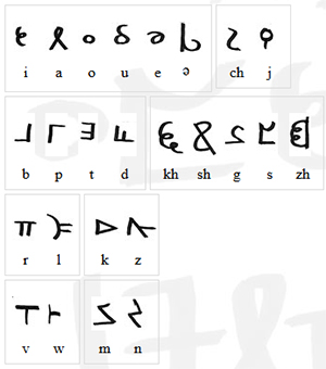
The characters of Orth invented by Bornstein. Go ahead and make “orthography” jokes.
Second, Orth and English are not a one-to-one substitution for sounds. Transliterating the passage into Orth letters would be clumsy and inaccurate. Even were I to do it, I doubt that the small number of fans who are familiar enough with Orth to recognize it on sight will ever see this art. Everyone else will just think that I put Greek letters and Tironian Notes in a box, shook them until they were thoroughly mixed, then wrote them down in whatever order I pulled them out. While that might make a fascinating drinking game for Medievalists, it's not going to result in comprehensible calligraphy.
Third, my game is broad-nib calligraphy, and the Orth alphabet is a rather unbeautiful monoline script. It is unfamiliar enough to most readers that, were I to make any significant alterations to make it "prettier," I might just make it unrecognizable instead. When calligraphing a passage like this, legibility is paramount.
Choosing English Caroline Miniscule
Once we’re staying in English, the question becomes, which English, or rather, Latin alphabet script to use?
The Mathic world, as a deliberately Luddite community within a larger, technically advanced world, doesn’t map onto any particular period in our history, so I can’t match it that way as I did with “Penric’s Demon.” But we can assume that Arbre has a similar history to our own from which the avout could pick and choose what to adopt into their society.
So what script, or even, what values would appeal to the Mathic world?
The Mathic world cares deeply about the transmission of knowledge. Presumably they would want to use a script that would be clear and easy to read. Based on the profligate use of leaves by Erasmas and the other avout, it seems there wouldn’t be sufficient pressure to conserve writing space to merit sacrificing any clarity in favor of a more compact script, as in Gothic hands.
Caroline miniscule was the chosen script of the Carolingian Empire, from last quarter of the 8th century CE to some time after 1200. Michelle P. Brown writes of it:
No other medieval 'reform' of script, or rather canonization of an evolved script, was as far-reaching and systematic as that of Caroline miniscule. Its successful diffusion throughout much of early medieval Europe was closely linked to an increase in intellectual activity based on the dissemination of texts… It offered a disciplined alternative to the plethora of national hands and sub-Roman scripts and, as part of a campaign to achieve standardisation of texts, contributed to a semblance of cohesion amongst the varied elements which formed the Carolingian empire.
A Guide to Western Historical Scripts from Antiquity to 1600, p. 66
When I read that, I knew I had found the script I wanted to use.
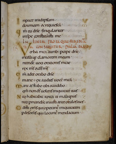
Page from the Ramsey Psalter showing beautiful English Caroline Miniscule hand. BL Harley MS 2904, f.7r
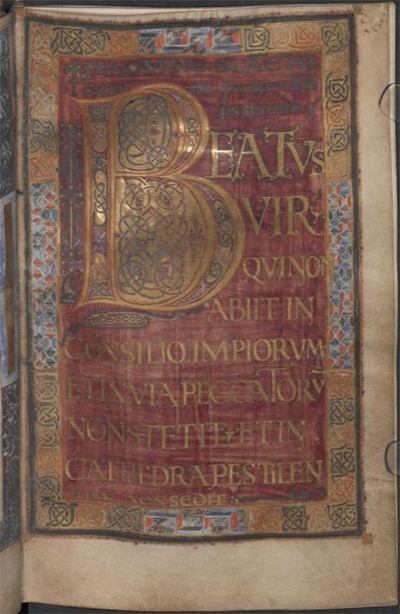
For my script exemplar, or the example from which I copied the script, I chose the Ramsey Psalter (BL Harley MS 2904), which is of a subgroup called English Caroline miniscule because of its geography. The Ramsey Psalter hand is so pretty it was used by Edward Johnston as the inspiration for his Foundational hand when he revived English calligraphy in the 1800s.
The one exception to the exemplar was the ‘s,’ which is the letter in the alphabet of the Ramsey Psalter that isn’t readily readable for a modern audience. Instead I used the English Foundational ‘s.’
Decorating the Text
Because the avout of 3000, or 3990, would have the entirety of the artistic history of Arbre from which to draw, figuring out how to decorate this piece was less about finding the right historical references than it was about figuring out Mathic values: what sort of value would they ascribe to the codex this page comes from? What resources, both time and material, would they devote to it based on that value? How would they expect to use it?
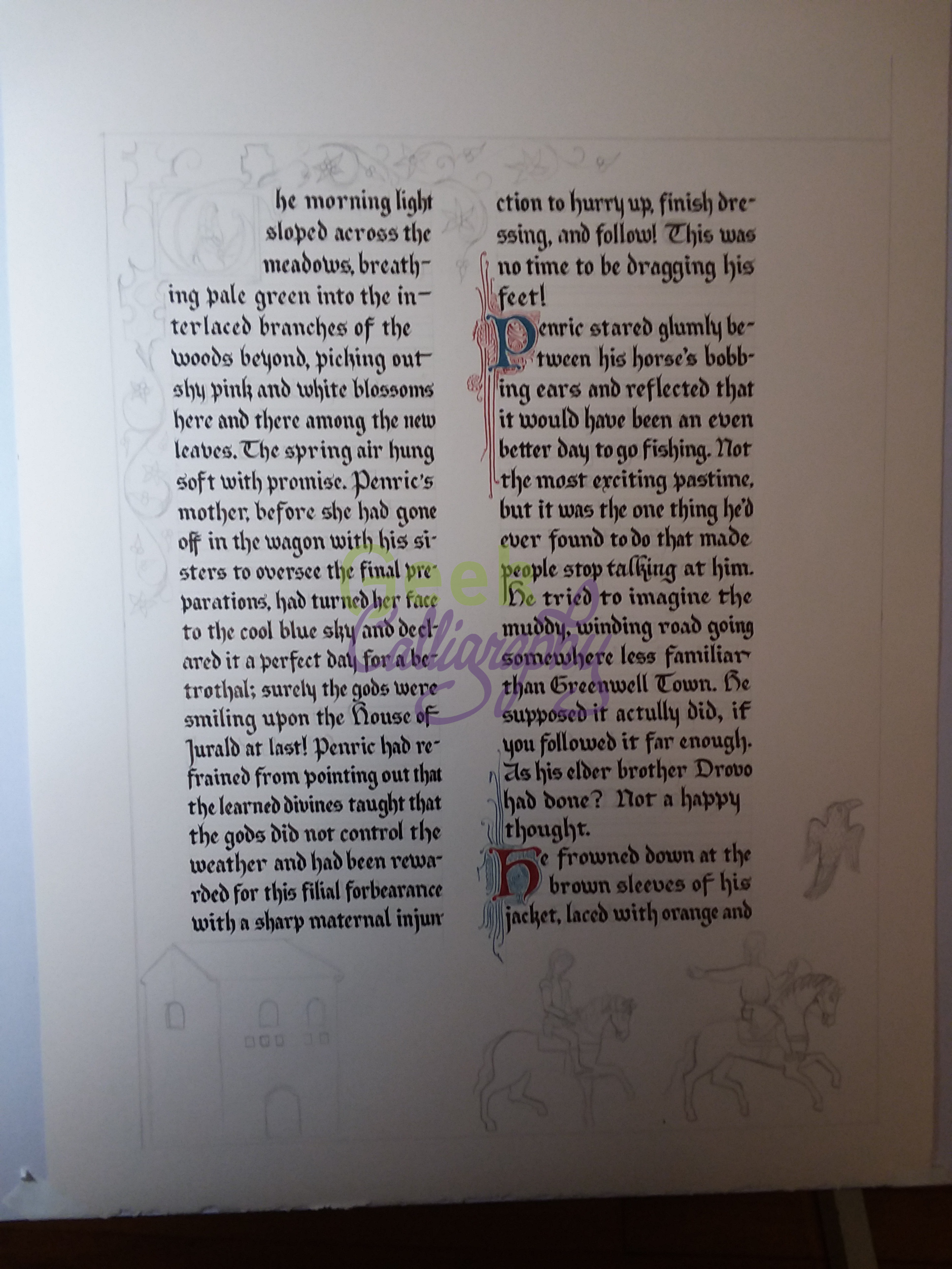
I decided that, on the scale of pure utility to luxury, a copy of The Dictionary would probably be a middle-grade manuscript. It would merit a skilled scribe copying it out in a clear hand rather than just being copied over by whoever happened to be free at the time. It would be laid out nicely and would have some amount of decoration, but it wouldn’t have any sort of figurative scenes, and it wouldn’t get any precious metal leaf or paint. (Since gold or silver is what technically makes a manuscript “illuminated,” this is really an illustrated manuscript.) Above all, it’s a manuscript that is intended to be functional, and its function is to convey meaning. That function may be enhanced by some amount of decoration, but it should not be obscured by it.
Based on that ideal, I decided to go back to Caroline miniscule manuscripts to draw inspiration for how to emphasize the titular word of the piece. Many Carolingian manuscripts use Roman capitals, usually in red ink, for the incipit (opening line) and explicit (closing line) of each passage or chapter to great visual effect and clarity. Moutier-Grandval Bible (BL Add MS 10546), Capitularies of Charlemagne, Louis the Pious, etc. (Beinecke MS 413), and Biblia latina utriusque Testamenti (Stiftsbibliothek Cod. Sang. 76) are some excellent examples of this style.
So inspired, in addition to writing “[A]nathem” in red Roman capitals, I also wrote the closing citation in the same fashion, though much smaller. Were this an actual leaf from The Dictionary, of course such a citation wouldn’t be necessary; but this is a display piece, not an actual random page from a codex. (Presumably Extramuros Arbre has historians and archivists who would hunt you down for cutting random pages from codices, or framing found ones rather than trying to unite them with the rest of the book, just as Earth does. Don’t mess with archivists, make it clear this is just a display piece.)
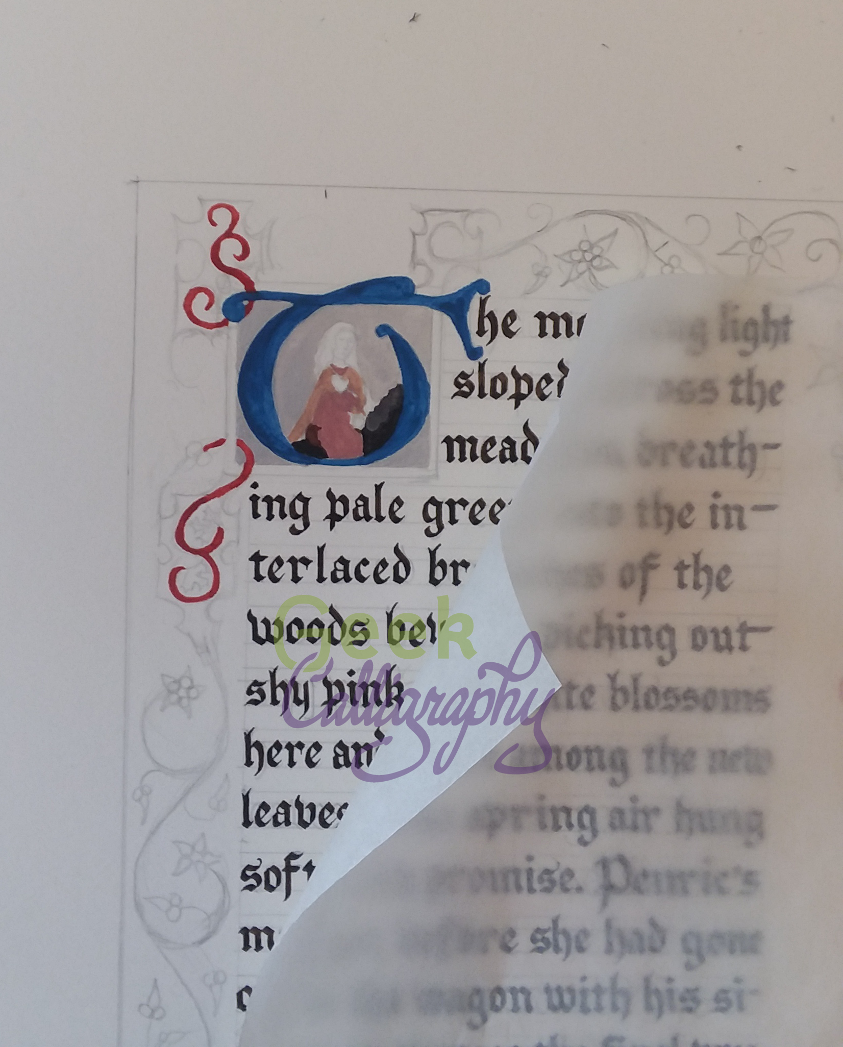
Directed Acyclic Capital A
As a display piece meant for fans of Anathem, I also wanted to include a special decorative flourish referencing the themes of the book. Clarity of meaning need not translate to “plain,” after all, and the mathic world would appreciate images that work on multiple levels.
After looking at the Dagulf Psalter (Österreichisches Nationalbibliothek, Cod. 1861), I spent part of an evening contemplating backing the title word in aperiodic tiling shapes, with no small amount of fascination and terror. It wasn’t so much the idea of drawing so many tiny shapes by hand that made my brain seize up, it was the aperiodic part. I’ve done enough radial symmetry work that looking at designs that are just a little off felt a bit like Erasmas’ description of Chapter 1 of The Book – rhymes and meter that are all just a bit off. Fortunately, I came to my senses. Tiling is for tiles, not for manuscripts. And the Dagulf Psalter is also known as the Golden Psalter for good reason: it is not any sort of middle grade anything, it’s as high luxury as they come. That includes the profligate usage of pigments to produce solid blocks of color behind text, which wouldn’t read well if it wasn’t then written in gold anyway.
Dagulf Psalter f.26v
I decided that a Directed Acyclic Graph would be a much better visual cue to the themes of the novel, but I wasn’t sure how to incorporate it. Once again, the answer came from a Carolingian manuscript convention. I was flipping through The Bible of Illuminated Letters by Margaret Morgan when it suddenly occurred to me that the loops of Ottonian capitals looked a bit like the loops of a DAG. From there, it was an easy leap. After checking with a mathematician that no, such a DAG wouldn’t be appallingly nonsensical, I just reproduced an Ottonian capital A with a bunch of additional termini and arrowheads. I also added a left leg, to the A, since again, I want it to be readable by a modern audience. Plus, I liked the visual balance it lent to the overall composition.
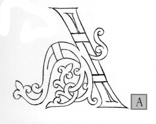
The Otonian capital ‘A’ from Margaret Morgan’s The Bible of Illuminated Letters. Note the lack of left leg.
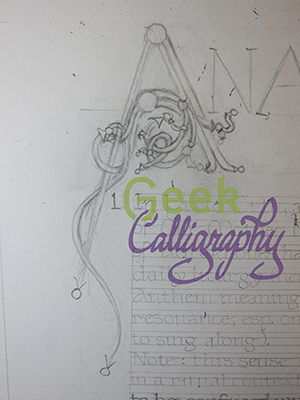
Draft of the DAG ‘A’ inspired by the Otonian letter.
Next time we will look at the practical considerations of making an Edharian manuscript page.