It's an honor...

Rocket ship logo of the Hugo Awards

Rocket ship logo of the Hugo Awards

by Ariela and Terri

Wow. A Hugo nomination.

Thank you so much to all of you. You are the ones who chose us for this honor and we deeply, deeply appreciate it. We love making art, but it’s especially gratifying to know that the art we have made has touched other people.

Also an enormous thank you Lois McMaster Bujold, Neal Stephenson, and Mary Robinette Kowal, for writing words that inspired us so deeply and were kind enough to open the door to us when we came knocking, asking for permission to play in their universes. It’s rather fitting for us to be nominated this year, when all of our public work was literally fanart of others’ writing.

And just look at this slate of nominees! We can’t believe we get to call these people our colleagues!

Likhain’s colorwork is so unbelievably phenomenal and Grace Fong’s use of space is extraordinary. Ariela has been a fan of both of them for years. Terri has been both a fan and a friend of Meg Frank for a while. This is Spring Schoenhuth’s umpteenth nomination, and frankly it is a crime that her jewelry is not more widely recognized as being fine art, because it is. And we don’t even know what to say about being nominated with Sara Felix, who has friggin’ designed not one but two Hugo bases.

And the whole ballot. That is, as Terri says, a whole lotta ballot. How the heck are we going to be able to pick favorites?!!?? Congrats to all of the nominees. So, so well deserved.

Wow.

Ariela here:

You may notice two names up at the top of this blog post and that “we,” which is plural, not royal. That’s because this is a two-person operation. And though it’s my name on that list, it really should be “Geek Calligraphy,” because this art is a team effort. Editors get their own category for the Hugos, but there isn’t one for Artist Wrangler, who is a bit like an editor, agent, manager, assistant, and marketer/publicist all rolled into one. Terri is my creative partner; she comes up with a good chunk of the ideas that turn into our art. Lady Astronaut Nouveau, for example, was the direct result of her demand that I do art for The Calculating Stars, and her input and feedback along the way means you got a very different product than you would have seen from me working on my own. Hugo rules may say that it’s my name on the ballot, but the world should also know about Terri’s contribution.

Thank you everyone again and we will see you in Dublin this summer!
Pesach is coming...

by Ariela

We are the House of Judah. Our coat of arms displays a matzah on a field of tin foil. Our words are Pesach is Coming.

A round matzah on a background of tin foil with the words “Pesach is Coming” in the Game of Thrones font


(Neither Terri or Ariela actually cover anything in tinfoil to kasher for Passover, but you get the idea.)

Enjoy your spaghetti, cheerios, bread, pretzels, bagels, etc. Enjoy them until they are gone. And remember kids, don’t feed the Passover-Industrial complex.

Geek Calligraphy at Capricon

by Ariela

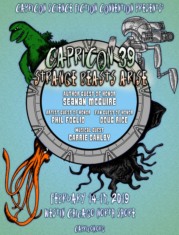
Flyer for Capricon 39: Strange Beasts Arise

I’m off to Capricon this weekend (Terri won’t be at this convention).

Art will be in the Art Show, both in the Gallery (which is auction sales) and Print Shop (buy it and walk out). Look for the green and purple signs and binders.

Ariela’s Capricon Program Schedule

Thursday, 6:30 PM: Beastly Beauty
Room: Ravinia A
Panel #: 199
Not all dangerous beasts fit the ugly monster stereotype. Sirens use beauty to capture their prey, as do many plants, bugs, and birds in the natural world. Serial killers are often physically attractive. Are humans hard-wired to trust beauty? And does that make the beautiful monster the most dangerous of them all?
(Ariela will moderate this panel)

Saturday, 11:30 AM: Art Show Docent Tour
Room: Ravinia C (Art Show)
Panel #: 280
Join artist Ariela Housman for a wander through the art show.

Saturday, 2:30 PM: Future Faiths
Room: Ravinia A
Panel #: 65
Is it possible that human beings riding in tiny, fragile little tin cans will face the vast reaches of space, with all its unpredictable dangers, without taking the religions of the world with them? If there will be Christians, Muslims, Buddhists, Hindus, Jews, Pagans, and others out there on the Final Frontier, how will their faiths adapt? Can a person still be a faithful Wiccan if s/he lives on a non-terrestrial planet? In what direction should the faithful Muslim pray? Will Christians believe that Jesus can save non-human sentient beings too? Why do so many writers resort to made-up religions, rather than extrapolating the evolution of real ones?

Sunday, 10:00 AM: Random Panel Topic
Room: Botanic B
Panel #: 164
What happens to the panel ideas that get rejected? They are reborn here as random panel topics! Our panelists will choose topics (at random, of course) and speak expertly on them for 5 minutes each. You'll be rolling on the floor with laughter!

Hope to see you there!

Where to find Terri, Ariela, and Geek Calligraphy Art at Arisia 2019

Arisia Logo

by Terri and Ariela

As we explained, we have decided to attend Arisia this year. We will be keeping our ears and eyes open, but we are cautiously hopeful that we, and everyone else, will be able to have a safe and enjoyable con.

If you aren’t there this weekend because of a principled boycott of the convention, we hope that you will support the artists and vendors who depend on Arisia sales for their livelihoods.

If you're on staff/volunteering for the convention, you can catch us at the Art Show reception in our business colors. Otherwise, you can see our work there (and us, from time to time). Protip: our art is cheaper at conventions than it is online!

You can also see us on these panels:

Terri’s Schedule:

Saturday, 11:30 AM: Neurodivergent Protagonists
Room: Franklin
Panel #: 301
So many mental health issues can make us feel disproportionately terrible for minor, everyday mishaps, and the culture of "neurodivergent character = villain" doesn't help. Instead, let's talk about neurodivergent protagonists and stories about people working around or even using their Quirky Brain Stuff to save the world and live happily ever after.

Sunday, 2:30 PM: Jewish SFF
Room: Tremont
Panel #: 201
It can be hard to find Jewish stories that don't focus on the Holocaust. Luckily, there are many works relating to Judaism in science fiction and fantasy. Naomi Novik and NS Dolkart are two Jewish authors who include Jewish characters and themes in their works. Marie Brennan based the world religion of her Natural History of Dragons series on Judaism. Let's celebrate Jewish authors, worlds, and characters!

Monday, 10:00 AM: Fluff and You: The Worth of Fun Reads
Room: Tremont
Panel #: 294
"Beach reads," "candy," "fluff," "guilty pleasures," -- so many words to downplay the fact that we may be reading something "less than literary"! But fun reads have worth of their own, and lightness and artistic merit are not mutually exclusive. Join the panelists as they discuss the delights of fluff, their favorite works, and moving away from a culture of shame.

Ariela’s Schedule:

Saturday, 1:00 PM: Girl Power in Anime
Room: St James
Panel #: 156
In anime, many female characters tend to fall into one of two stereotypical groups: weak and meek or angry warrior women. There are characters who go deeper, who might even make good role models. From the girls in Studio Ghibli to Junko Kaname in Puella Magi Madoka Magica to Mikasa Ackerman in Attack on Titan and beyond, who are these strong, nuanced female characters? What about them screams "GIRL POWER!" Which characters or tropes are doing a disservice to women today?

Saturday, 4:00 PM: Female Relationships in Fiction
Room: Beacon Hill
Panel #: 196
Though great strides have been made in recent years, we still hunger for depictions of complex relationships between women, whether familial, platonic, or romantic. What are we still lacking? What stories about female love would make the panelists' hearts sing?

Saturday, 5:30 PM: Clothing Modifcation
Room: Winthrop
Panel #: 361
Whether you're making a cosplay or something for everyday wear, learn to extend the life and utility of off the rack or second hand garments. Take a thrift store find and turn it into something amazing or save a favored piece from the trash pile with creative solutions for poor fit and minor stains and tears.
(Ariela will moderate this panel.)

Sunday, 1:00 PM: First Steps for New Costumers
Room: Cambridge
Panel #: 378
So you want to be a costumer, but don't know where to begin? Then this panel is for you. Our group of veteran costumers tell you how to get started in the hobby with everything from tips and tricks to demystifying the terms and expectations that are out there. We all had to start somewhere, so let us help you do the same.
(Ariela will moderate this panel.)

Sunday, 5:30 PM: Treatsments of Abuse in SFF
Room: Beacon Hill
Panel #: 429
While discussing Lethal Weapon, Junot Diaz, and toxic masculinity in a Fireside Fiction essay last year, author Brandon O'Brien reminded us that "We need to teach and remind men as often as possible that recovery means responsibility." How has SFF treated cycles of abuse and recovery, and how can it do better? Which books/shows/movies get it right?

2018 Hugo Eligibility Post: Best Fan Artist

by Ariela

2018 was a hard year. While I didn’t make much new art, I am extremely proud of what I did.

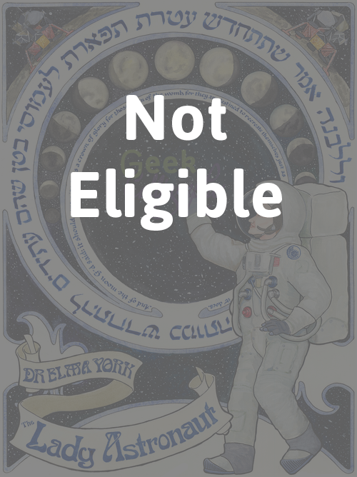
The Hugo Committee has decided this is not eligible.  Lady Astronaut Nouveau Inspired by The Calculating Stars by Mary Robinette Kowal. Licensed by Mary Robinette Kowal.

The Hugo Committee has decided this is not eligible.

Lady Astronaut Nouveau
Inspired by The Calculating Stars by Mary Robinette Kowal.
Licensed by Mary Robinette Kowal.

Anathem Illuminated First Page From the novel Anathem by Neal Stephenson. Produced with permission from Neal Stephenson.

Anathem Illuminated First Page
From the novel Anathem by Neal Stephenson.
Produced with permission from Neal Stephenson.

“Penric’s Demon” Illuminated First Page From the novella “Penric’s Demon” by Lois McMaster Bujold. Licensed by Lois McMaster Bujold.

“Penric’s Demon” Illuminated First Page
From the novella “Penric’s Demon” by Lois McMaster Bujold.
Licensed by Lois McMaster Bujold.

Explode the Gender Binary sticker Watercolor and digital.

Explode the Gender Binary sticker
Watercolor and digital.

Hugo Category Eligibility

Once again, I am eligible for the Best Fan Artist Hugo category. If you are able to nominate for the Hugos, please nominate me as “Ariela Housman,” as the award is for the artist, not the business. (This doesn’t recognize Terri’s hard work and the way she contributed, which is annoying. Any rocket which I may eventually win will really be part hers.)

In a sense, this feels like the first time I really belong in the Fan Artist category, since three of the four pieces above these started as art by a fan of books, even though they are licensed and whatnot.

Explanatory Thingee About Hugo Category Eligibility

Some Hugo categories (Best Professional Artist, Best Fan Artist, Best Semiprozine, and Best Fanzine) are defined by whether the work done was professional, semi-professional, or fannish. The definition of what is a “professional” publication is somewhat technical. A professional publication either (1) provided at least a quarter the income of any one person or, (2) was owned or published by any entity which provided at least a quarter the income of any of its staff and/or owner.

-TheHugoAwards.org

For the purposes of Hugo categories, you are only a Professional Artist if your stuff gets published in a Professional Publication. So you can make a living entirely for years by selling your SF art directly to other people and still not be considered a Professional Artist for the purposes of the Hugos if your art was never included in a publication that earns according to the above criteria.

When making prints was harder and there wasn't much in the way of direct-to-fans selling outside of conventions, this made sense. Today it is ridiculous, but the rules are the rules.

A Note About Lady Astronaut Nouveau’s Consideration

Update: The Hugo Committee has ruled that Lady Astronaut Nouveau is not eligible. Our post announcing that and our response is here.

When considering whether or not to nominate an artist, only their art which is (1) completed in 2018, and (2) meets the criteria of the category, in this case, Fan Art. An excerpt from the description of the Best Fan Artist category:

Again note that the work by which artists should be judged is not limited to material published in fanzines. Material for semiprozines or material on public displays (such as in convention art shows) is also eligible.

-TheHugoAwards.org

By this metric, whether or not Lady Astronaut Nouveau meets the criteria of Fan Art is questionable, as it was neither published in a semiprozine nor displayed in a convention art show. However, it was posted on this website and blog, Mary Robinette Kowal’s blog, and Mary Robinette Kowal’s Pinterest Gallery for Lady Astronaut fanart. Given the wording “not limited to” and “such as” in the category description, we’re reading the examples of semiprozines and convention art shows as just that, examples, and the list thereof as inclusive but not exhaustive. We think that being on the internet is about as public as a display gets, so Lady Astronaut Nouveau should be included when considering Ariela’s 2018 body of work.

Should the Hugo Committee think otherwise, we will remove it from all Eligibility posts about Ariela’s 2018 work.

Arisia 2019 - Go or Cancel?

By Terri & Ariela

Well, frak. It sums up our feelings.

Well, frak. It sums up our feelings.

When the Internet blew up surrounding several accusations of mismanaged Incident Reports by the Arisia Corporation’s Executive Board, we faced a very difficult decision. Do we stay with a convention that has been a very important source of both income and fun for us, or do we boycott as many are doing? This was compounded by the fact that Terri is now living in Israel for two years, and going to Arisia means an expensive international plane ticket.

Neither of us wants to support an environment in which assaults are not taken seriously or handled properly. While Arisia has an extensive Code of Conduct and a dedicated Incident Response Team, it’s clear that changes need to be made in who this team consists of and how they manage both official and unofficial reports.

Our difficulties in making this decision were further complicated by the vagaries of space and time. Ariela first heard about it on a Thursday night, when Terri was already in bed. By the time both of us were up the next day, Terri was about to bring in Shabbat. And what with one thing or another, by the time we managed to sit down and have a discussion about what to do, the window for a principled exit to effect change had closed: the former president had been kicked out, most of the EBoard had resigned, and an external review team had been contracted to revamp the IRT processes. At this point, publicly stepping away would signal dissatisfaction with the changes that are taking place, not disgust with the initial problem. And while we think that the changes made so far are not sufficient to call the problem fixed, we want them to continue this process.

Because of these efforts, we are cautiously giving the convention a last chance. We will be watching carefully to see how these changes are implemented. If we are unsatisfied, we will no longer be attending or exhibiting at Arisia until we can be sure that everyone in attendance is safe.

We ask that if you choose to boycott the convention, you support the artists and vendors who rely on it for their income. These people do not deserve to be punished for the actions of others. We will be posting a list of all of these in early January, before the convention.

Calligraphing Out Loud

by Ariela

I don’t talk much about my day job over here. 35 hours a week I work on the technical back-end of email marketing and on website analytics for the Union for Reform Judaism (I’m not Reform, I just work for the institution, in case that wasn’t clear.) I take inspiration for my tech-related calligraphy projects from it, but otherwise I assume that no one is coming to the Geek Calligraphy blog to hear me blather about non-profit marketing or database integration woes. But this time I am going to talk about my day job, because I am doing something over there that has surprising applications to calligraphy.

For the past few months I have been doing a professional development program called Working Out Loud. I started it because lately I have had trouble focusing on long term projects and have found myself instead reading news coverage of the dumpster fire that is the world instead. Not that staying informed is bad, but this wasn’t healthy news consumption, and it wasn’t resulting in much action on my part; I just read and read and felt nauseated and distressed. I wanted help getting my focus back. I was initially reluctant to give it a try – I am deeply skeptical about corporate professional development programs – but a coworker whom I trusted vouched for it, so I signed up.

The five elements of Working Out Loud are relationships, generosity, visible work, purposeful discovery, and a growth mindest.

I was surprised to find myself far more inclined to apply the lessons from the program to my calligraphy work than to my day job, and not in the ways that might be expected. Yes, Geek Calligraphy is a small business and a “startup,” but instead of causing me to get more business-y about it, it wound up encouraging me to go the opposite way, particularly on Twitter, in two significant ways.

First, I decided to share more of my responses to things I am reading on Twitter. Mostly that takes the form of telling authors when I am reading and enjoying their book. I didn’t do that much before because I figured that authors get enough noise at them on Twitter, they didn’t need one more person up in their mentions. But the Working Out Loud exercises on “the gift of attention” inspired me to start. Most of those posts have gotten likes from the authors, so I guess they don’t find it annoying after all 😊 In one case I even took a selfie (I never think to take selfies, and when I do I am terrible at them) to show exactly how gobsmacked and touched I was by a certain passage in a book that resonated with me very deeply.

Second, I decided to make more of an effort to share process shots on social media. As a perfectionist, I find the idea of sharing images of my work in progress scary. How can I let people see anything less than my best finished product? But the exercises in being vulnerable, and above all the encouragement to work in a visible way while in community with other people, i.e. “working out loud,” encouraged me to give it a try. In September I shared process shots of a piece on Twitter as I was working on it, and I was surprised at the positive responses I got. Given how much I enjoy watching work-in-progress videos from my favorite artists online, I suppose I shouldn’t have been so shocked, but it never occurred to me that others would view my work the way that I look at theirs.

We just did Week 8 (of 12), and it contains a Habit Checklist. My circle leader, Larry Glickman, suggested printing it out but, ha, I wasn’t just going to print it out! I don’t do boring printouts on my walls, I do calligraphy. And, in the spirit of the Working Out Loud ethos, I want to make it available to anyone who will find it helpful for their personal use.

WorkingOutLoudHabitChecklist_watermark.png

Download a printable PDF of the calligraphy. Feel free to print it out for your own use. It’s black and white for maximum friendliness to workplace printers. (No commercial reproduction, please.)

Would I recommend Working Out Loud to other people?

Yes, but with two caveats.

First caveat is that the program assumes that participants have a certain safety margin in their personal circumstances. I mean that in a financial sense, in a physical safety sense, and in an emotional labor sense. On the financial side, the program doesn’t require a significant outlay of money, but it does require time, and of course, time is money. In terms of physical safety, Working Out Loud encourages public vulnerability, which can be dangerous for people of marginalized identities, both in the physical world and online. For survivors of abuse or violence, it can be a panic-inducing prospect. WOL does emphasize that each exercise is always up to you and you should never do anything that doesn’t work for you, but the repeated calls for voluntary vulnerability could be very off-putting for those for whom vulnerability is not optional. In terms of emotional labor, the program encourages participants to be generous with their time and their expertise, which is lovely, but very hard to do when the world already expects you to work for free. Of course it is different to choose freely to give of yourself, but for some people and in some professions that needs to be preceded by a cost-benefit analysis of “will doing this for free once cause an expectation of free labor ever after?” Again, WOL doesn’t demand that you do any exercise that doesn’t work for you. But these are some things it is helpful to be aware of so that you can choose whether Working Out Loud will be a good program for you.

The second caveat is that I haven’t found any awareness in the course that, for some, the program will run up hard against structural inequalities. If your main resource is your network and your community is struggling deeply, they will have fewer resources to help you get ahead. Study after study shows that unconscious bias is alive and well, to say nothing of conscious prejudice, and it will make expanding a network and demonstrating work much harder for some people than for others. Expecting a self-improvement program to overcome systemic inequalities would be totally unrealistic, not to mention unfair. But awareness of the limitations in the face of such problems is crucial.

I do still recommend Working Out Loud. I am even making plans to start my own circle with some friends in the geeky professional community after I finish my first circle.

Finished "Lady Astronaut" Fanart

by Ariela

Woo! This round of Jewish holidays is over and it is time to get back to a normal work schedule (at least for those of us who don’t have Indigenous People’s Day off from work). To celebrate, here is the finished version of the Lady Astronaut / The Calculating Stars fanart that I started just before Rosh HaShanah.

The circular text is from קדוש לבנה, the blessing of the Sanctification of the Moon, which Jews say once a month when the moon is close to full. It reads:

וְלַלְּבָנָה אָמַר שֶׁתִּתְחַדֵּשׁ עֲטֶרֶת תִּפְאֶרֶת לַעֲמוּסֵי בָטֶן שֶׁהֵם עֲתִידִים לְהִתְחַדֵּשׁ כְּמוֹתָה

And of the moon G-d said that it should renew itself as a crown of glory for those born of the womb, for they are destined to recreate themselves just as it does.

The unfinished version was my entry in the Lady Astronaut fanart contest. You can see pictures of it in process by searching my Twitter feed for the #fanart hashtag.

I have a Pinterest board of all the reference images I used when working on it. (I haaaaaaated painting that Lunar Lander, and I had to do it twice, because I am a glutton for punishment.)

And here is a crummy cell phone picture of my paint palette just after I finished.

Paint palette with lots of dark blues and greens and purples and greys, some whites, a yellow, and a light blue. Eraser, brushes, and two cups of water in the background.

Would you be interested in buying a Lady Astronaut Nouveau art print?

We are gauging interest in an art print run of the Lady Astronaut Nouveau fanart. If you would buy one, please enter your email address below.

Should we produce an art print, we will email everyone who expressed interest to let them know.

The Making of Anathem Illuminated First Page: Constructing an Edharian Manuscript Page

by Ariela

This is the second of two blog posts on the making of the Anathem Illuminated First Page art print. Read the first part here.

Where last week’s post concentrated on historical inspirations and references in imagery, this one goes into the material concerns of making a manuscript page that looks like it came from the Concent of Saunt Edhar.

Writing on a Leaf from a Page Tree

First, I want to give a major shoutout to Neal Stephenson for coming up with a plausible and sustainable paper culture model for Arbran maths. Parchment would not have been practical, both in the volume of paper usage shown in the math, and also because they would have needed a large number of skins and the math presumably doesn't a sufficient number of herd animals. Paper production likewise probably couldn't have kept apace without mechanization or a large number of avout papermakers. Details like this keep enthusiasts (not Enthusiasts) like me happy.

It seems that, even with all the sequencing, page trees don’t produce perfect writing surfaces. Only one in ten leaves is suitable for collection, drying, cutting, and use, with many having veins that are too prominent to allow for easy writing. This probably means that the leaves that make the cut have visible, but not excessively raised veins. I considered the possibility that page tree leaves would be sequenced to grow with perfectly parallel veins that could be used as ruling lines for writing, but decided that this was improbable: it would limit the uses of the paper by forcing all writing to be approximately the same size and eliminating certain kinds of folding of the leaf because it would cause the rules to orient in the wrong direction. Moreover, if the veins weren’t perfectly parallel, that would also be cause for disqualifying a leaf from use, which Erasmas would surely have mentioned. So the leaves probably have a pattern of veins similar to those of Earth trees from a similar climate to that of the Concent of Saunt Edhar.

After completing a full draft of the piece, I washed watercolor paper in a yellow brown and, once it had dried, painted a full system of leaf veins in slightly darker brown. I wanted them to be visible, enough that it would be clear this is a leaf, not parchment or paper, but not pronounced enough to be distracting from the text.

Finished underpainting with guide lines for the text positioning penciled in.

Finished underpainting with guide lines for the text positioning penciled in.

Only half the leaf is visible and it is landscape-oriented rather than portrait. This has to do with how handmade books are bound. Four or five pages are stacked, oriented horizontally, and then folded about the x-axis and stitched together at the fold. This is called a ‘quire’ or a ‘gathering.’

How a ‘gathering’ or ‘quire’ of four or five sheets of paper or parchment are stacked and then folded along the the center to create a small booklet of 16 or 20 pages.

How a ‘gathering’ or ‘quire’ of four or five sheets of paper or parchment are stacked and then folded along the the center to create a small booklet of 16 or 20 pages.

Copyists write on these quires, which are then collected and, after first checking and re-checking that they are in the correct order, sewn together to form a codex. Assuming page tree leaves, like Earth leaves, tend to grow longer than they grow wide, this means that, when a rectangle with the largest possible surface area is cut from it and oriented horizontally, the central vein will also run horizontally. 

A landscape-oriented cut on a portrait-oriented leaf that is so much taller than it is wide is inefficient.

A landscape-oriented cut on a portrait-oriented leaf that is so much taller than it is wide is inefficient.

A landcape-oriented rectangular cut out of a landscape-oriented leaf makes much better use of the available surface.

A landcape-oriented rectangular cut out of a landscape-oriented leaf makes much better use of the available surface.

Once a rectangular piece is cut out of the leaf, it is folded down the middle so that it can be used in a quire.

Once a rectangular piece is cut out of the leaf, it is folded down the middle so that it can be used in a quire.

Incidentally, this is a verso, or left-hand page. The wider margin, which is the outer margin, is on the left, as are the pinpricks that would be used to align the text with all the other pages in the book.

Inks and Pigments

Once we have the writing support, aka what we’re writing on, we need to figure out what to write with. Erasmas mentions writing with a quill and ink, but what was his ink made of? As a middle-grade manuscript with decoration but no illumination or figurative illustration, this manuscript’s marginalia would be drawn in several different colors of ink.

The Concent of Saunt Edhar seems to engage in quite a bit of trade, but presumably traded goods are less abundant and more valuable than ones that can be produced from local resources. Mining isn’t mentioned as an activity at the math, so all mineral-based pigments would probably be too scarce to be used on this manuscript. Accordingly, I largely confined myself to colors that could be made from plant matter that could be grown at Saunt Edhar, or at least in an Earth climate similar to that described at the math.

The main body of the text is in a brown/black color similar to that of iron gall ink. This actually came down to an aesthetic choice, because it was equally likely that the Edharians could have made carbonic ink from lamp black. Carbonic ink is much blacker than iron gall ink. While there’s no mention of fire-based light sources, presumably some burning could be done just to produce ink. But I like the brown-black of iron-gall ink better.

The red color is similar to what might be produced from the madder plant, and the blue is similar to a product of woad, both of which grow well in the western European climate.

The exception to the plant-based pigments rule is the white, which is based on chalk white. Since chalk halls feature prominently, we can assume that there is a plentiful supply of calcium carbonate at hand that could also be used for white paint on manuscripts. Bonus: way less toxic than lead!

Disclaimer: just as I did not write this on an actual leaf, I did not actually use paint derived from madder, woad, or calcium carbonate. Using the watercolors I had on hand, I did my best to color match those displayed in the Traveling Scriptorium’s online Medieval Manuscripts Ink & Pigment Sampler.

And that’s it.

For those who are interested, I have a Pinterest board of manuscripts and other images I looked at while working on this project.

And finally a big ‘thank you’ to Neal Stephenson and his agent, Liz Darhansoff, for giving me permission to do this project.

The Making of the Anathem Illuminated First Page: Plundering History for References

by Ariela

This blog post is the first of two on the making of the Anathem Illuminated First Page art print. The second post will be published on October 3.

I tend to be painstaking about the details of my work; I research thoroughly and try to make sure I have a reason for everything to be where it is. When I asked for permission to work with text by Neal Stephenson – an author who is known for his extensive research and attention to detail in everything from historical research to eating Cap’n Crunch – I knew that I was setting myself up for a lot of thinking before the art could happen.

Why Isn't It Written in Orth?

At Neal Stephenson's request, Jeremy Bornstein created an Orth alphabet and language notes. The first decision I made, once I got the green light from Neal’s agent to go ahead with this project, was that I wouldn't be using it.

First, this passage isn't in Orth. While I am certain there are some Neal Stephenson fans, myself included, who would squee happily over someone translating the definition of Anathem into Orth, there's not enough there to do it yet. I am not any sort of linguist such that I could do a credible job of building Bornstein's work out any further.

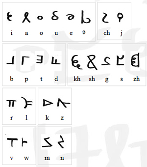
The characters of Orth invented by Bornstein. Go ahead and make “orthography” jokes.

The characters of Orth invented by Bornstein. Go ahead and make “orthography” jokes.

Second, Orth and English are not a one-to-one substitution for sounds. Transliterating the passage into Orth letters would be clumsy and inaccurate. Even were I to do it, I doubt that the small number of fans who are familiar enough with Orth to recognize it on sight will ever see this art. Everyone else will just think that I put Greek letters and Tironian Notes in a box, shook them until they were thoroughly mixed, then wrote them down in whatever order I pulled them out. While that might make a fascinating drinking game for Medievalists, it's not going to result in comprehensible calligraphy.

Third, my game is broad-nib calligraphy, and the Orth alphabet is a rather unbeautiful monoline script. It is unfamiliar enough to most readers that, were I to make any significant alterations to make it "prettier," I might just make it unrecognizable instead. When calligraphing a passage like this, legibility is paramount.

Choosing English Caroline Miniscule

Once we’re staying in English, the question becomes, which English, or rather, Latin alphabet script to use?

The Mathic world, as a deliberately Luddite community within a larger, technically advanced world, doesn’t map onto any particular period in our history, so I can’t match it that way as I did with “Penric’s Demon.” But we can assume that Arbre has a similar history to our own from which the avout could pick and choose what to adopt into their society.

So what script, or even, what values would appeal to the Mathic world?

The Mathic world cares deeply about the transmission of knowledge. Presumably they would want to use a script that would be clear and easy to read. Based on the profligate use of leaves by Erasmas and the other avout, it seems there wouldn’t be sufficient pressure to conserve writing space to merit sacrificing any clarity in favor of a more compact script, as in Gothic hands.

Caroline miniscule was the chosen script of the Carolingian Empire, from last quarter of the 8th century CE to some time after 1200. Michelle P. Brown writes of it:

No other medieval 'reform' of script, or rather canonization of an evolved script, was as far-reaching and systematic as that of Caroline miniscule. Its successful diffusion throughout much of early medieval Europe was closely linked to an increase in intellectual activity based on the dissemination of texts… It offered a disciplined alternative to the plethora of national hands and sub-Roman scripts and, as part of a campaign to achieve standardisation of texts, contributed to a semblance of cohesion amongst the varied elements which formed the Carolingian empire.

A Guide to Western Historical Scripts from Antiquity to 1600, p. 66

When I read that, I knew I had found the script I wanted to use.

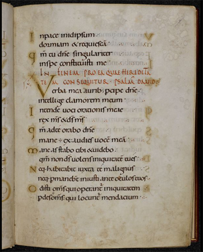
Page from the Ramsey Psalter showing beautiful English Caroline Miniscule hand. BL Harley MS 2904, f.7r

Page from the Ramsey Psalter showing beautiful English Caroline Miniscule hand. BL Harley MS 2904, f.7r

For my script exemplar, or the example from which I copied the script, I chose the Ramsey Psalter (BL Harley MS 2904), which is of a subgroup called English Caroline miniscule because of its geography. The Ramsey Psalter hand is so pretty it was used by Edward Johnston as the inspiration for his Foundational hand when he revived English calligraphy in the 1800s.

The one exception to the exemplar was the ‘s,’ which is the letter in the alphabet of the Ramsey Psalter that isn’t readily readable for a modern audience. Instead I used the English Foundational ‘s.’

Decorating the Text

Because the avout of 3000, or 3990, would have the entirety of the artistic history of Arbre from which to draw, figuring out how to decorate this piece was less about finding the right historical references than it was about figuring out Mathic values: what sort of value would they ascribe to the codex this page comes from? What resources, both time and material, would they devote to it based on that value? How would they expect to use it?

I decided that, on the scale of pure utility to luxury, a copy of The Dictionary would probably be a middle-grade manuscript. It would merit a skilled scribe copying it out in a clear hand rather than just being copied over by whoever happened to be free at the time. It would be laid out nicely and would have some amount of decoration, but it wouldn’t have any sort of figurative scenes, and it wouldn’t get any precious metal leaf or paint. (Since gold or silver is what technically makes a manuscript “illuminated,” this is really an illustrated manuscript.) Above all, it’s a manuscript that is intended to be functional, and its function is to convey meaning. That function may be enhanced by some amount of decoration, but it should not be obscured by it.

Based on that ideal, I decided to go back to Caroline miniscule manuscripts to draw inspiration for how to emphasize the titular word of the piece. Many Carolingian manuscripts use Roman capitals, usually in red ink, for the incipit (opening line) and explicit (closing line) of each passage or chapter to great visual effect and clarity. Moutier-Grandval Bible (BL Add MS 10546), Capitularies of Charlemagne, Louis the Pious, etc. (Beinecke MS 413), and Biblia latina utriusque Testamenti (Stiftsbibliothek Cod. Sang. 76) are some excellent examples of this style.

So inspired, in addition to writing “[A]nathem” in red Roman capitals, I also wrote the closing citation in the same fashion, though much smaller. Were this an actual leaf from The Dictionary, of course such a citation wouldn’t be necessary; but this is a display piece, not an actual random page from a codex. (Presumably Extramuros Arbre has historians and archivists who would hunt you down for cutting random pages from codices, or framing found ones rather than trying to unite them with the rest of the book, just as Earth does. Don’t mess with archivists, make it clear this is just a display piece.)

Directed Acyclic Capital A

As a display piece meant for fans of Anathem, I also wanted to include a special decorative flourish referencing the themes of the book. Clarity of meaning need not translate to “plain,” after all, and the mathic world would appreciate images that work on multiple levels.

After looking at the Dagulf Psalter (Österreichisches Nationalbibliothek, Cod. 1861), I spent part of an evening contemplating backing the title word in aperiodic tiling shapes, with no small amount of fascination and terror. It wasn’t so much the idea of drawing so many tiny shapes by hand that made my brain seize up, it was the aperiodic part. I’ve done enough radial symmetry work that looking at designs that are just a little off felt a bit like Erasmas’ description of Chapter 1 of The Book – rhymes and meter that are all just a bit off. Fortunately, I came to my senses. Tiling is for tiles, not for manuscripts. And the Dagulf Psalter is also known as the Golden Psalter for good reason: it is not any sort of middle grade anything, it’s as high luxury as they come. That includes the profligate usage of pigments to produce solid blocks of color behind text, which wouldn’t read well if it wasn’t then written in gold anyway.

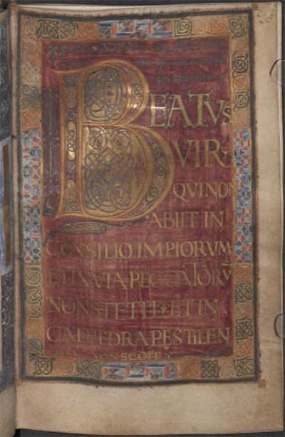
Dagulf Psalter f.26v

Dagulf Psalter f.26v

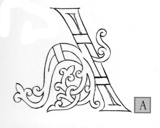
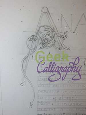
I decided that a Directed Acyclic Graph would be a much better visual cue to the themes of the novel, but I wasn’t sure how to incorporate it. Once again, the answer came from a Carolingian manuscript convention. I was flipping through The Bible of Illuminated Letters by Margaret Morgan when it suddenly occurred to me that the loops of Ottonian capitals looked a bit like the loops of a DAG. From there, it was an easy leap. After checking with a mathematician that no, such a DAG wouldn’t be appallingly nonsensical, I just reproduced an Ottonian capital A with a bunch of additional termini and arrowheads. I also added a left leg, to the A, since again, I want it to be readable by a modern audience. Plus, I liked the visual balance it lent to the overall composition.

The Otonian capital ‘A’ from Margaret Morgan’s The Bible of Illuminated Letters. Note the lack of left leg.

The Otonian capital ‘A’ from Margaret Morgan’s The Bible of Illuminated Letters. Note the lack of left leg.

Draft of the DAG ‘A’ inspired by the Otonian letter.

Draft of the DAG ‘A’ inspired by the Otonian letter.

Next time we will look at the practical considerations of making an Edharian manuscript page.