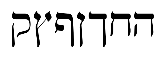
Why Hebrew and English on the Same Page Always Looks Terrible

by Ariela

One of the persistent woes of anyone who works in a field that requires putting corresponding Hebrew and English text together in the same field is that they just don't play nicely together. Today we are going to unpack why this is.

They Are Different Lengths

English is a wordy language. You need a lot of words to say what other languages say in comparatively few. While this can make for some beautiful reading experiences in the hands of a skilled wordsmith, it makes it harder to make it take up equivalent space with a translation. Hebrew is on the other end of the spectrum, being a fairly terse and compact language. When you translate between an unusually wordy language and an unusually terse one, the one passage will invariably be longer than the other, even though they say the same things.

Let's take an utterly banal example:

'The quick brown fox jumps over the lazy dog' in English (Calibri) and Hebrew (Arial).

'The quick brown fox jumps over the lazy dog' in English (Calibri) and Hebrew (Arial).

This is the same short, ridiculous sentence in English and Hebrew. In English it is 9 words comprised of 44 characters, 8 of which are spaces. In Hebrew it is 7 words comprised of 35 characters, 6 of which are spaces. You can also see that the Hebrew line is shorter. It doesn't make a lot of difference here, but over the course of multiple sentences and paragraphs it adds up considerably.

They Are Different Heights; or, English Has Capital Letters

Now we're moving into the visual aspects of the alphabets themselves. 

A sentence or paragraph in most English fonts will have capital letters and lower case letters. It may have some letters that dip below the bottom line, and it may have some lower case letters that nonetheless have a top part that sticks up. Here are the terms for these different heights:

Inspired by the x-height diagram on Wikipedia.

Inspired by the x-height diagram on Wikipedia.

Note that the top of line-height is a little taller than the ascender and the bottom a little lower than the descender.

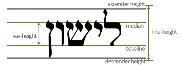
Now let's take a look at Hebrew when it is put in an analogous set of lines.

HebrewTypographyHeight.png

Since Hebrew has no capital letters, it is missing the cap-height line, and its vav-height line is significantly higher than the x-height.

While the proportion of the distances between various lines will vary from font to font (this is part of why font that are the same size will have different sized letters), Hebrew will appear heavier than any English font that has capital and lowercase letters.

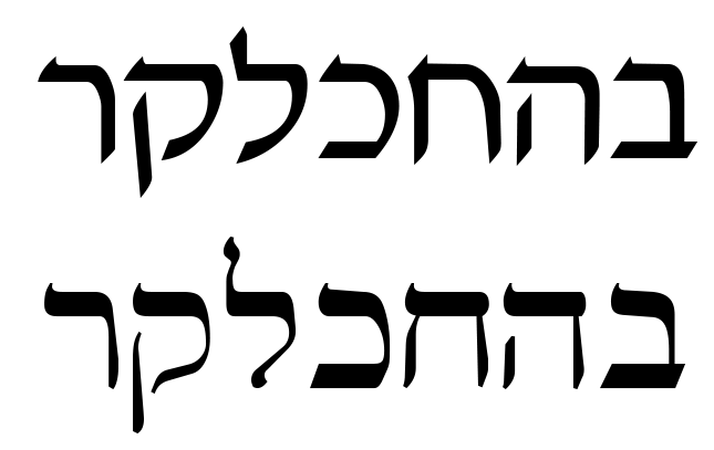
Let's put those two words, with their attendant lines, side by side. For the sake of argument, we are going to assume that the line-heights are the same here. (If you want to know more about why that assumption is usually wrong, take a look at the Wikipedia article on leading.)

First, this is what they look like when the line-heights are matched up.

HebrewEnglishTypographyComparison1.png

Notice how the Hebrew baseline is lower than that of the English, yet the median is higher.

Now let's try it with the baselines lined up.

HebrewEnglishTypographyComparison2.png

Now the baselines are lined up, so it is easier to see exactly how much taller the Hebrew letters are than the X-height. But the line-heights no longer start and end at the same point. Again, the exact mis-matches will vary depending on what fonts you use, but there will be mismatches nonetheless.

It is also easy to see, with these two lined up next to one another, how much heavier the wide part of the lines on the Hebrew are than in the English. Which brings us to our next problem point.

They Have Diametrically Opposed Contrast

Contrast is the font term for how the thick and thin of a letter is distributed. The standard contrast for Latin alphabets is for the vertical lines (strokes) to be as heavy or heavier than the horizontal ones.

Times New Roman font. Note the thicker vertical lines and the thinner horizontal ones.

Times New Roman font. Note the thicker vertical lines and the thinner horizontal ones.

Elephant font. This font has extreme contrast.

Elephant font. This font has extreme contrast.

Reverse contrast is the term for fonts where the opposite of the standard weight distribution is used, and they tend to draw attention to themselves. While this can be great for signage, tends to make for a rotten reading experience for an entire paragraph or longer.

Wyoming Spaghetti Plain font. It's a reverse contrast Latin alphabet font. Would you like to read a book set in this typeface? If a website put all their body text in it, would you take it seriously?

Wyoming Spaghetti Plain font. It's a reverse contrast Latin alphabet font. Would you like to read a book set in this typeface? If a website put all their body text in it, would you take it seriously?

Hebrew, on the other hand, usually has heavier strokes on the horizontal than on the vertical. The contrast can vary a little or a lot, but that's the standard for the Hebrew square script (as opposed to Paleo-Hebrew, which was derived from the Phoenician alphabet and isn't used anymore).  

Vilna font. Compare the contrast here to that of Times New Roman or Elephant.

Vilna font. Compare the contrast here to that of Times New Roman or Elephant.

This is part of why those English fonts that are supposed to look like Hebrew look so appallingly bad. Only part, mind you. It's generally a silly idea.

Kanisah font. I understand why people were curious enough to make one of these, but I don't know why we continue to use it. Can't we declare this experiment failed already?

Kanisah font. I understand why people were curious enough to make one of these, but I don't know why we continue to use it. Can't we declare this experiment failed already?

Moreover, Hebrew tends toward a higher contrast than English. Times New Roman is a very standard degree of contrast in English and Vilna is only slightly on the heavier side for Hebrew. The contrast level in Vilna is much closer to that of Elephant, which is considered rather extreme and stylized for English.

When you stick Hebrew and English on the same page, the weight of the lines in their alphabets are at right angles with one another. As your eye moves between the two, your brain needs to keep reversing its expectations of contrast in order to recognize the letters. Even if you don't notice it consciously, it contributes to the weirdness.

Paragraph-level issues: Perceived Whitespace and Text Direction

Between different levels of contrast and different heights of their core letters, when you view a paragraph of English next to a paragraph of Hebrew, even were the baselines and lineheights to match up perfectly, they will give a different sense of blackspace vs. whitespace.

Here are the first five verses of Leviticus, in Hebrew and English, both in 12 pt font.

Hebrew in Keren, English in Times New Roman. Notice the disparity in length despite being the same text. Also notice how, despite both being 12 pt font, the lines are not level with one another.

Hebrew in Keren, English in Times New Roman. Notice the disparity in length despite being the same text. Also notice how, despite both being 12 pt font, the lines are not level with one another.

If we apply a blur to these texts, it The difference in visual weight distribution becomes more apparent.

First 5 verses of Leviticus blurred.png

Despite being the same size, nominally, the Hebrew appears darker and appears to have more space between the lines.

These two texts are also arranged in the more common Hebrew-on-the-right-English-on-the-left layout. This means that when trying to read the texts, they seem to be on a collision course toward one another.

HebrewEnglishSideBySide.png

Recently, some publishers, Koren most notably, have been experimenting with lining texts up the other way. This results in the texts appearing to run away from one another.

HebrewEnglishSideBySide2.png

In other words, when you have Hebrew and English texts side by side, there are going to be problems no matter how you arrange them.

The Letters Are Made of Different Shapes

This doesn't cause as much differentiation between the two as you might think. In my opinion (and this is my blog), it causes less visual friction than the difference in contrast. But it's still there.

The Latin alphabet is composed almost entirely of vertical lines and rounded strokes. The angles, where it has them, tend to be acute and sharp.

English letters made of circles and straight lines. Calibri font.

English letters made of circles and straight lines. Calibri font.

English letters with angles. Calibri font. Notice how acute the angles are?

English letters with angles. Calibri font. Notice how acute the angles are?

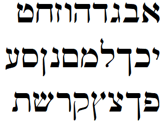
Hebrew, on the other hand, is made up almost entirely of horizontal and vertical lines, and where it has angles they tend to be around 90 degrees and rounded (or sometimes turned into mini t-junctions).

The same letters in Davka and Vilna fonts

The same letters in Davka and Vilna fonts

The difference in shapes between Hebrew and English fonts will always make them somewhat distracting when in close proximity to one another.

Bonus: Hebrew and English Serifs Are Not the Same

Serifs, according to the most widely accepted theory, started as the flicks a pen or brush makes at the end of a stroke, then became stylized as carvers, first of stone, then woodblock, worked with them, and finally cast metal movable type, each approximated and altered them to suit the specs of their own medium.

Not all Latin alphabet fonts have serifs. These body paragraphs are written in a sans-serif font (Asap). Our headers, however, are in a serif typeface (Libre Baskerville). As with most Latin serif typefaces, they have serifs at the terminus of most straight strokes. Hebrew, on the other hand, has almost nothing that could be called a serif. Letters that have a horizontal bar on their upper sides usually have a slight upward flick on the left, but the bottom of the letter is usually correspondingly rounded, meaning it is not a true serif.

Davka David font. Notice the upward flicks on the left side of the upper horizontal bars.

Davka David font. Notice the upward flicks on the left side of the upper horizontal bars.

Vilna font. This font also has little flicks on diagonals, but they don't look like Latin alphabet serifs.

Vilna font. This font also has little flicks on diagonals, but they don't look like Latin alphabet serifs.

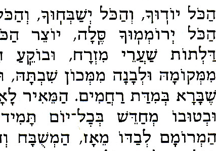
Text from the Sim Shalom prayer book. This font is one of the few that attempts a slab serif on the upper left of horizontal strokes. It is widely considered ugly and unpleasant.

Text from the Sim Shalom prayer book. This font is one of the few that attempts a slab serif on the upper left of horizontal strokes. It is widely considered ugly and unpleasant.

Eric Gill, who was one of the best early modern Latin alphabet font designers (if a rather terrible human being), made a Hebrew font as well. He put serifs on it. This is it.

Gill Hebrew. Note the serifs. Now go bleach your brain.

Gill Hebrew. Note the serifs. Now go bleach your brain.

I have shown this font to five Hebrew readers before publication of this blog post, and the responses have all been some variation of "AAAAGHHHHHH! My eyes! Kill it with fire!" (I hear he made an Arabic font as well that Arabic readers said was basically illegible and thus never put into production. If it was anything like this, we're glad the world was spared.)

Extra Bonus: Hebrew Uses Expansion, English Doesn't (mostly)

This is a super picky difference, but as a calligrapher, it's one that changes your entire experience of writing.

There are two ways to produce thick and thin lines when writing: translation and expansion. Translation refers to how you move your pen through space, how the angle of the nib changes in relation to the horizontal.

This video of Seb Lester drawing famous logos by hand shows how to make thicker and thinner lines by translation. Lester uses a pen with a poster nib, which has zero flexibility.

Expansion is when the thickness of the line changes based on how hard you press. Let's go back to Vilna font in Hebrew again and look at some of the downward strokes:

Hebrew Downstrokes.png

Those are trying to reproduce widening of the stroke toward the bottom produced by increases in pressure on the pen nib.

English serif fonts don't have anything like that. English sans-serif fonts definitely don't have anything like that. The fonts that do retain this kind of thick/thin are the ones based on pointed pen hands, like Copperplate, or brush fonts.

Edwardian Script ITC font.

Edwardian Script ITC font.

All the thick lines there are stand-ins for pressing more heavily on those strokes.

Unfortunately, this kind of font is also ill-suited to be paired with Hebrew fonts. It's based on writing done with a pointed pen, while Hebrew tends to imitate broad pen hands, even though both use expansion. English pointed pen hands tend to be sharply angled, while Hebrew ones tend to be quite upright. Pointed pen fonts are cursive, which is to say that they join letters together, but ligatured Hebrew fonts are basically unknown. There are exceptions to all of these rules, but none of those exceptions pair much better (and some of them are hideous by themselves).

What can we do about it?

Unfortunately, there's no way to solve these problems. The best we can do is to try to mitigate them.

If you have a choice of fonts, which is not always possible if you are working with an institution where fonts are dictated by branding guidelines determined without thinking about this problem, try to choose mono-line fonts for both Hebrew and English so that the problems of opposing contrast are eliminated.

If you are creating fonts from scratch, try to create ones that have baselines, ascender heights, and descender heights that all line up.

If you are working on a very small amount of text, like a logo, put the English in either all caps or all lower case and use the same weight of line for both fonts.

Try putting one above the other, or otherwise creating visual space between them, to de-emphasize the difference in text length and text-direction.

If you have to put them next to each other, justify your paragraphs.

And, when all of this doesn't work perfectly and it still looks weird, remember that it is not a personal failure.
New Product Line - Stickers

Do you like the sentiments of some of our prints, but lack the budget or space for wall art? Would you like to emblazon notebooks and laptops with Geek Calligraphy art? Well we have something special for you!

GeekCalligraphyStickers.png

how It Came To Be:

Terri is a big fan of funky stickers. Her planner and laptop are covered with them. Some are horribly punny (every planner MUST have a "Behold My Feminist Agenda" sticker), most are delightfully geeky. 

Someone suggested to us that we might want to turn our delightfully profane Fuck You Pay Me art print into a t-shirt. While we're still working on that, during a meeting with a fellow small artist about t-shirt options Terri stumbled on the idea that it might also make a great sticker. 

We soft launched the Pay Me sticker at Arisia to great success. This inspired Ariela to make our Cordthulhu print into a round sticker. When shown a proof, a friend promptly asked for one for all the laptops in her home. To complete the trio, we re-laid out the art of our wonderful Spoon Dragon. 

All of our stickers cost $5. They ship for free, but they are not tracked unless they are accompanying a larger item.

Capricon Schedule

by Ariela

I'm off to Capricon 38 in Wheeling, IL this weekend!

Art will be in the art show, both hanging and in the Print Shop. 
(Capricon's Print Shop is the place to go for things you can buy and walk out with immediately. Anything hanging in the show proper is up for auction; even if you are the only bidder, it cannot go home with you until Saturday night.)

I will also be doing artist demo from 11:30 to 5 on Friday, so if you want to see me at work, or just come by and chat, come to the art show!

Ariela's Panel Schedule

Friday, 10:00 AM: The Messiah/Hero Complex
Room: Botanic Garden Ballroom B
Panel #: 221
Many stories, video games, and legends revolve around the idea of a young "chosen one" who is going to progress through the hero's journey regardless of what they do to get there. How much of that story comes from the Christian dogma embedded in Western storytelling? What storytelling goes beyond this timeless trope?

Saturday, 11:30 AM: Buffy at 20
Room: Botanic Garden Ballroom A
Panel #: 183
Last year (2017) marked the 20th anniversary of Buffy the Vampire Slayer. How has the show held up, and why do we still care?
(I'll be moderating this panel)

Sunday, 10:00 AM: Random Panel Topic
Room: Ravinia Ballroom A
Panel #: 168
What happens to the panel ideas that get rejected? They are reborn here as random panel topics! Our panelists will choose topics (at random, of course) and speak expertly on them for 5 minutes each. You'll be rolling on the floor with laughter!

Hope to see you there!

The Importance of Finding the Right Artist for the Job (as Demonstrated by American Airlines)

by Ariela

The American Airlines Safety Video. It must be seen to be believed.

The American Airlines Safety Video. It must be seen to be believed.

For the first time in at least a decade, I flew American Airlines on a recent visit to my in-laws. Thus, I was rather taken aback when I saw the American Airlines safety video. What on earth did I just see? What were they thinking? And how many mirrors and disembodied hands should I expect on my airplane?

When I posted to Facebook to that effect, my brother-in-law (sister's husband, not one of my spouse's family whom I was visiting) pointed out that it was probably trying to do the same thing the Virgin America safety video did, it just failed. I hadn't seen that one before, so I watched it and concluded that he was right. Me being me, I then watched the Making Of videos for both of these safety announcements. (For those of you who would like to do likewise, here is the American Airlines Making Of video, and here is the Virgin America Making Of video.)

I was struck by the utter difference in the approaches articulated in the two. Both talked about doing something "completely different" and "unlike anything seen before," but then Virgin started talking about entertaining the people watching the video. The first thing that American Airlines talked about was sound design.

The lead composer talked about going through an airplane and an airport and building the soundtrack out of the sounds made by the plane and the various features of the airport (like the baggage carousel). This approach reminds me of how I tend to create ketubah (Jewish marriage contract) art for clients who aren't precisely sure what they want; I ask them to give me a list of things they find visually pleasing, a list of things that are important to them, and I try to make a coherent whole out of that. It can lead to many "easter eggs" in the art. But here's the thing: it was completely the wrong approach to take when making the American a safety video.

Let me explain. A custom ketubah is made for one primary audience: the people getting married. They are already inclined to spend time looking at it, so they don't need to overcome a barrier to entry. And when I assemble the art out of elements of their lives, interests, and visual preferences, I am making out of things that are inherently relevant to them. All of that is basically the opposite of the situation with an airplane safety video. The audience has to be as wide as possible instead of very specific. For the vast majority of that audience, there is no inherent interest in that subject, and the indifference and even irritation felt by the viewers has to be overcome before they will pay attention. An audio hook is probably better than a visual one, because it is easier to look somewhere else than to completely tune out sound (without the help of very expensive earplugs or headphones). Do you know what won't catch people's attention on an airplane? Sounds heard in the course of the ordinary function of an airplane. Do you know what people who aren't inherently interested in airplanes aren't going to consider a fascinating easter egg worth watching a whole video to find? A soundtrack made of airplane sounds.

The American Airlines video seems to be a single take, a video form that is experiencing a bit of a vogue right now. Not being involved in any way with video-making, I don't know exactly how difficult that is, but I imagine it is extremely tough and great demonstration of skill on the part of everyone involved. The physical effects and set crew on this video in particular did some impressive work. But their work isn't presented in a venue that is likely to get it appreciated. Numerous studies have been done on the perceived value of an item based on its packaging and presentation, and all of them show that the same item is valued differently depending on context. An airplane safety video is not a context that many people value. Remember the stunt with the virtuoso violinist playing in the subway? It's the same thing here.

So if those are all the reasons that American Airlines' safety video came off as bizarre at best, why did Virgin America's Safety Video succeed? The answer is that they were doing something that played to the strengths of the medium. They got pop entertainers, people whose job it is to be engaging to wide audiences, to make their video. An American Idol alum wrote the song. The dance was choreographed by a So You Think You Can Dance choreographer. Both of those shows are designed to showcase technical brilliance in their chosen craft packaged in a way that makes it easy for someone who is not heavily involved in song or dance to appreciate it. It shows.

American Airlines made a piece of concept art and Virgin America made a piece of pop art. Both are brilliantly executed by their teams, but the venue called for pop art, not concept art. Maybe it was less an astute marketing decision than it was luck; both companies are trying to showcase their essence, and Virgin's roots are as a music company while American's roots are in airplanes.

It is entirely possible to be a brilliant artist in your medium and be the wrong artist for a particular job.


Ariela's 2017 Hugo Eligibility Post

by Ariela

New year, new awards seasons.

I am eligible again for nomination in the Fan Artist category in the Hugo Awards. (For the long explanatory thingee about why I am not eligible in the Professional Artist category, please see the end of this post.)

Here is a short reminder of the art I did in 2017. Only these pieces, not things from previous years, should be considered when you make your nominating decisions. Given the nature of the year, my art was less SFnal and more Angry-Feminist-Who-Tries-To-Be-Intersectional in theme, but the only thing I regret about that is that I didn't have more time to do more of it.

Click images to embiggen them.

Art Prints

Greeting Cards

Coloring Pages

Doodles

Long Explanatory Thingee About Hugo Category Eligibility

Some Hugo categories (Best Professional Artist, Best Fan Artist, Best Semiprozine, and Best Fanzine) are defined by whether the work done was professional, semi-professional, or fannish. The definition of what is a “professional” publication is somewhat technical. A professional publication either (1) provided at least a quarter the income of any one person or, (2) was owned or published by any entity which provided at least a quarter the income of any of its staff and/or owner.

-TheHugoAwards.org

For the purposes of Hugo categories, you are only a Professional Artist if your stuff gets published in a Professional Publication. So you can make a living entirely for years by selling your SF art directly to other people and still not be considered a Professional Artist by the Hugos if your art was never included in a publication that earns according to the above criteria.

When making prints was harder and there wasn't much in the way of direct-to-fans selling outside of conventions, this made sense. Now, let's just leave it at "not so much."

Please note also that in order to be eligible for consideration for the Fan Artist category, the art on which I should be judged must also be displayed in public venues, such as art shows at cons.

The Last Jedi - Thoughts & Reactions

By Terri & Ariela

Poster for The Last Jedi

Poster for The Last Jedi

Hoo boy, that was a movie, right?

Now that we have both seen it, and we suspect that most of you who want to have seen it to, here are our thoughts on it. For those who have not seen it yet, this post consists almost entirely of spoilers.

Terri's Thoughts

Once again, Disney's acquisition of LucasFilm and making sure that George Lucas isn't allowed anywhere near a Star Wars script or director's chair has paid off. I loved this movie.

Now, I will not say it was without flaws. It was perhaps 3 movies crammed into one, and ended at least twice that I could see. But the structural and pacing problems paled in comparison to the excellent dialogue, beautiful sets, profound character development, wonderful storytelling, and kickass representation.

For once in my SFF life, the strongest and most powerful characters in a movie were OLDER WOMEN! General Leia Organa and Vice Admiral Amilyn Holdo took no nonsense and made the hard calls. I do not know how I'm going to get through Episode IX without either of them. And they were deeply feminine women. As someone who sees femme as a deeply performative aspect of her personality (rather than natural and inherent), this was unique. Generally I can identify with women in an SFF setting because they are tough, wearing pants and covered in Space Grease/wearing Practical Fantasy Armor. For once, I was identifying with women wearing massive quantities of jewelry, fancily styled hair and dresses. This was new, and also has resulted in my deep need to do a screen accurate recreation of Vice Admiral Holdo's costume. 

As to some of the complaints about the powers of the Force, they didn't bother me at all. This is where I have to admit that I have been reading Star Wars licensed fiction since I was 14 years old, starting with Timothy Zahn's Heir to the Empire trilogy. I gave up somewhere during the New Jedi Order novels. Why is this relevant? Two reasons.

Reason one: as far as those novels were concerned, the prequels didn't exist (most of them were written long before any of those movies had been made). So there was no understanding of the Jedi Order before Obi-Wan Kenobi starts training Luke Skywalker on the Millennium Falcon. Need a character to accomplish the impossible? Pow, they're a super strong Force user. Jedi can't form attachments? Luke gets married and has a kid. Leia doesn't know how to do much with the Force? Well, that's largely because she's spent too much time being in government. So no, ForceTime didn't bother me. Neither did Leia rescuing herself from being blown off the bridge. Oh, and Luke can project himself across the galaxy? Kyp Durron pulled starships out of gas giants with the Force. There's a character whose mind was dropped into another body with the Force. So spare me your complaints about Leia saving herself. The Force can do whatever the script writer needs it to do. 

Reason two: I am an unabashed Star Wars fan. I've read the books (and was deeply sad when Disney axed that canon), watched the Only Relevant Films more times in my childhood/adolescence than I care to count, used to play a Star Wars parody game on my computer in my bedroom, owned Star Wars Monopoly and kicked everyone's butt at Star Wars Trivial Pursuit. I used to play Princess Leia in my imaginary games. I am one of the people who isn't really capable of much deep critical thinking about a good Star Wars movie.  I will gladly read and watch other people's critical thoughts about the topic (and often appreciate their insights), but don't have the mental distance from what I love so much to be able to think about it in a way that examines it. So I largely gush, while Ariela below will provide you with more critical insights.

Ariela's Thoughts

Where Terri is a lifelong and devoted Star Wars fan, I am a much more casual appreciator. I enjoyed the original trilogy, but I didn't see it properly until I was in high school and I didn't adopt it into my core fandoms. So my expectations going in were very different.

I can see why this movie is divisive. Some of the most cherished tropes from the original trilogy are torn apart here (mostly to my satisfaction). It had some problems and I get that if you didn’t like the other parts, the problems might not be get-over-able. But I liked it.

I liked that it was new. I was never particularly surprised by anything in The Force Awakens because it was such a beat-for-beat sendup of A New Hope, but I was genuinely surprised by some things that happened here.

I love older Leia and Luke and the ways in which they have changed. Perhaps this is because I am older than I was when I saw Star Wars for the first time, I am tired and disillusioned, and I like seeing those changes mirrored in my heroes. But I also think that these changes are genuinely positive.

I like that Leia has learned that “jumping in a spaceship and blowing something up” is only the right move sometimes. Not that it’s never the right move, Leia is too wise to fall for that, but that there are times when another tactic is called for. Considering how much that technique was valorized in the original trilogy, this is a surprising backpedal.

Ditto Vice-Admiral Holdo not telling Poe her plan. In the original trilogy, Luke just kind of walked onto the base and was admitted to the inner circle of the rebellion immediately, given responsibility and access to all the rebel plans. Ditto Jyn Erso. Not so here. Poe has been working for the Resistance for a while, but that doesn’t mean that the people in charge need to get his approval for their plans. (Particularly shocking that a woman doesn’t need to get a man’s approval for her military plans, I know, or that an older woman might have any role to play other than the wise grandma type or a witch.)

In general, I saw far more older women on screen here than I am used to seeing. Carrie Fisher and Laura Dern are both well past the Hollywood sell-by date set for women, but they had large roles in a film aimed at a general audience. But the crowd scenes at Canto Bight also featured a surprising number of older women.  More older women on screen, please, kicking butt and also being generally present, but in the future, can more of them be women of color? (Is it any wonder some fragile masculine souls needed to cut all the women out of the movie? We are so goshdarn present in it.)

I like that Luke is disillusioned by his own mistakes, and that it is a young woman who shows him that he is wrong.

I love the lack of sexual tension in the films. I love that Rose is never subject to the Male Gaze TM, and that she is allowed to be a full human being, with expertise and ideals and an interest in someone. (If you’re going to ask with whom I ship Finn, I think Finn has too recently learned to be a person on his own and he is not ready for a relationship with anyone yet. I am in favor of Poe crushing on him, though.) I love that the movie shuts down the idea of romantic tension between Rey and Kylo Ren. Jill Bearup has pointed out that film language for romantic tension and antagonism can sometimes look the same; TLJ goes out of its way to point out that NOPE, romantic tension is not happening here. Rey has no interest in seeing Kylo Ren in any state of undress, thank you very much.

I love that Finn and Rose fail at their quest. All of the indicators for their success were there: the unbeatable odds, the one final hope, it’s a trope checklist, and it still fails. I love that because sometimes we do fail, and that doesn’t mean we shouldn’t try, and that trying and failing doesn’t mean you aren’t a hero.

So what didn’t I like? Well, a lot.

For one thing, there was so much going on that the movie feels overstuffed and un-cohesive. Our three protagonists from TFA are split up, each having their own adventures, and it’s hard to find a common thematic thread between them.

I’m also rather sick of the “giant, oppressive organization is coming for a progressively smaller and smaller ragtag group of people fighting back” trope. Exiting the movie, my spouse quipped, “At this rate, the next movie’s Resistance will consist of Finn and BB8 armed with nothing but a toothbrush.” (To be fair, I would watch that movie in a heartbeat.) But we’ve done this before. I’d like to see some new stories, or at least tell the same story in a different way, like Rogue One did.

I was also rather disturbed at how Finn and Rose dealt with the kids who are enslaved/indentured on Canto Bight. I get that they couldn’t take the kids with them and still complete their original mission. And I get that, from a thematic standpoint, they needed to be left there to sow the seeds of the next generation of the Resistance. But neither of them seemed to have any sort of qualm about leaving those children to be abused further. I would have been far more comfortable had either one of them acknowledged that leaving them there means they also failed to rescue people being oppressed, the very mission of the Resistance. I want acknowledgement that leaving the kids was a terrible thing to do and a horrid choice to have to make, to balance those kids’ freedom against the survival of the Resistance.

I also feel somewhat confused by the only common theme I could find in the movie, which is the older generation giving way to the new. We have now seen three of the older generation of the Resistance – Holdo and Luke in this movie, Han in the previous one – sacrifice themselves willingly so that the new generation can go on. On the Dark Side, Kylo Ren killed Snoke so that he can come into his own power. On the surface, this sends a kind of awesome message: the older generation needs to give way to the younger, but the Light side does it by consent and the Dark Side does it by force. I’m all for highlighting consent! But the more I think about it, the less that idea holds up. You can’t undo an unjust power system by waiting for those in power to consensually relinquish their privilege. In this, Kylo Ren is right that you need to tear it all down. Unfortunately, he isn’t interested in doing what he says; he’s only interested in tearing down just enough that he winds up at the head of the existing power structure, then using his new power to expand his dominion. (Oh crap, in addition to being a metaphor for neo-Nazis, is Kylo Ren also an allegory for false allyship?) So yeah, I don’t know what to make of this.

I want to watch it again, which I won’t get to do until it comes out on Netflix or Amazon Prime, but this is the first time I have wanted to re-watch a Star Wars movie in a while.

New Product: Zombie Coloring Pages

Celebrate undead love in whatever greusome colors strike your fancy!

Zombie Wedding Coloring Pages by Geek Calligraphy

How It Came To Be:

The next entry in our coloring page catalog comes from our greeting cards. 

We usually need a low key product release for January, because the third Wednesday of the month usually comes right on the heels of Arisia, when both of us are profoundly Ded of Con. Coloring pages definitely fit that bill. 

All of our zombie couples are available for $2 each, or you can get a bundle with everyone for $5. Have fun!

(We hope this goes without saying, but PLEASE respect our copyright and intellectual property. When you buy the download, that is for your unlimited use, but not for sharing around and not for posting elsewhere online, except as you proudly display your pretty results. If you do post said pretty results, please tag us!)

Ded of Con... Again

We are still at Arisia! Terri's in a panel right now, and Ariela's busily checking us out of the Art Show. If you wanted art that you saw in the show but couldn't snag it, you can always buy it on the website. We hope if you were here that you had a good time! We sure did.

Chibi Terri is standing next to a purple and green mug that goes up to her shoulder, dunking a teabag. She is saying "Still not enough tea to be awake. (Gonna need a bigger mug)."

Chibi Terri is standing next to a purple and green mug that goes up to her shoulder, dunking a teabag. She is saying "Still not enough tea to be awake. (Gonna need a bigger mug)."

Come See Us At Arisia

By Terri & Ariela

The Arisia Logo.

The Arisia Logo.

As is our personal and business tradition, we will both be at Arisia this weekend January 12-15 at the Westin Boston Waterfront. We've got tons of art in the Art Show, and will both be appearing on panels! This is Terri's first time on Arisia panels and she is very excited. 

If you're on staff/volunteering for the convention, you can catch us at the Art Show reception in our business colors. Otherwise, you can see our work there (and us, from time to time), and see us on these panels:

Ariela's Schedule:

Friday, 7:00 PM: Costuming on a Budget
Room: Faneuil
Panel #: 457
Costuming can be an expensive hobby as the elements of a costume and the supplies needed to create them can add up quickly. We'll discuss how to get the most out of your dollar through the use of inexpensive fabrics and notions, alternative techniques or materials, and how to plan ahead so you can find time and ways to save the most money. Many elements can be sourced through thrift stores or even your own closet, and putting individual pieces to work in multiple costumes can help, too.

Saturday, 4:00 PM: Judaism's Influence on SF/F
Room: Marina 2
Panel #: 385
Jewish theology and culture permeates SFF & fandom from popular comics to well-known science fiction stories, which filters down in unrealized ways to fandom. What effect has Judaism had on the development of SF/F and fandom in general? Join our panel of knowledgeable fen to learn about Jewish influences.

Saturday, 5:30 PM: Depicting Diversity in Visual Art
Room: Douglas
Panel #: 279
Most figure drawing techniques are based on an idealized human form. This simplifies the drawing process, but it often leaves artists ill-prepared for representing characters of diverse age, size, gender, ethnicity, ability, etc. How can artists practice representing more diverse characters, and how can art education be improved to help them learn these skills?
(Ariela will moderate this panel.)

Sunday, 10:00 AM: Out of the Shadows: Spiritual Traditions in SFF
Room: Marina 2
Panel #: 340
SFF tends to fictionalize to practitioners of real-world spiritual beliefs in fantasy, inhabiting the liminal space between "normal" society and the supernatural world. These practitioners and their beliefs are often lazily and irresponsibly portrayed, creating further misinformation and stereotype. Our panelists will look at stories about practitioners of real spiritual beliefs in fictional settings and which portrayals are respectful and responsible.
(Ariela will moderate this panel.)

Sunday, 1:00 PM: Hats & Headwear for Costumers
Room: Faneuil
Panel #: 466
Hats and headwear can add another level of style to your costume and tie the entire look together. Learn techniques on how to make them, re-purpose old hats, make foundations for headpieces, resources available, and how to keep them on your head.

Terri's Schedule:

Sunday, 1:00 PM: Parents with Infants & Toddlers Meetup
Room: Paine
Panel #: 354
We have run into each other in panels, in hallways, and in elevators with strollers, but have we really *met*? Let's let the kids run around for an hour, catch our breath, bemoan cluster feeding/colic/climbing/teething/growing pains, and celebrate the fact that we're OUT OF THE HOUSE and among our people.

Sunday, 2:30 PM: Down with Grimdark, Up with...
Room: Marina 1
Panel #: 324
Grimdark stories, ones that focus on darkness and angst, have been prevalent throughout SFF recently. However, many people are pushing for change, with suggestions such as Solarpunk, Genderpunk, and Hopepunk, ones that focus on a bright future. Solarpunk is focused on green energy and sustainability, whereas Hopepunk is about people choosing love over hate, and fighting for that possible bright future. Will these new genres will gain a foothold? What other "punks" do you see emerging in SFF?

Monday, 11:30 AM: When Your Child Discovers Fanfiction… and more
Room: Marina 2
Panel #: 301
Description Being a fannish parent can mean the joy of witnessing fannish firsts – discovering fanfiction, the first cosplay or convention. Our panelists will talk about being a fannish parent to a fannish child, and the joys that come with your child discovering new parts of fandom they want to be involved in, and the challenges of navigating parts of fandom that are not always child-appropriate.


There are Friday Night Services at Arisia this year that are open to anyone who wishes to attend. They will be held at 5:30pm in Paine (2W). We will both be in attendance. Terri will be leading the Kabbalat Shabbat portion of the services, with some bonus fandom tunes.

We can't wait for the convention and we hope to see you there!

New Product: Spacescape Art Prints

Looking for an artistic way to remind yourself of just how completely awe-inspiring the universe is? We've got some prints for you, featuring a spaceship exploring the stars and some very eloquent quotes.

AP-201703-spacescapeE.png
J-201703-SS-H.png

How It Came To Be:

We wanted to finish the year with a very science fiction piece of art. The space ship and background art comes courtesy of the SpaceScape Ketubah. The text on the English print is a quote from Babylon 5, courtesy of Ambassador Delenn: "We are starstuff. We are the universe made manifest, trying to figure itself out." The Hebrew quote comes from Psalms, Chapter 92, Verse 6: "מה רבו מעשיך ה' מאוד עמקו מחשבותיך - How great are your creations, oh Lord, Your thoughts are vastly deep."

Ariela took advantage of the shorter text to have some fun with the lettering in a way that isn't possible with a text the length of a ketubah and formed the letters out of stars.

The prints come matted and are available in three sizes:

Small - 8" x 10" - $30
Medium - 11" x 14" - $45
Large - 16" x 20" - $60