There's a New Way to Support Our Work!

by Ariela

There are lots of ways to support creators you like. Up until recently, the only ways to support us have been to buy our art and to spread the word about our art. Today we are adding a third option: buying us "coffee."

Ko-fi logo

Ko-fi logo

Ko-fi is a free service that allows fans to give money to creators in small amounts, amounts roughly equivalent to buying them a coffee.

Y U No Patreon?

Patreon is probably the best known crowdfunding service for creators, but it has never really been an option for us. Patreon's reward system tends to depend on offering special perks each month for the highest donors, either in the form of early releases or additional content. Our content doesn't tend to be sequential such that getting access to it early would be particularly enticing, and we're already working to our maximum capacity to get each product released each month and complete commissions so creating more content isn't an option for us right now.

That's why Ko-fi is a good model for us. We recognize that there are plenty of reasons why someone may appreciate our work without wanting or being able to buy our art. But we hope that people will be inspired to support us in other ways.

So, will you buy us a coffee?

P.S. Some of you may be finding this a little ironic. After all my loathing of coffee is legendary. I don't have anything witty to say about it other than to shrug and say that I am not actually being paid in coffee, so I can use it to buy tea, or, more likely, matboard for art. Also, Terri does like coffee, and she is half of this outfit.

Calligraphy Tools: Beyond Pens

by Ariela

This is a followup to the post of several weeks ago about different types of calligraphy pens. While pens are, in many ways, the most important tool of the trade, it would be a lot harder to get good results without others.

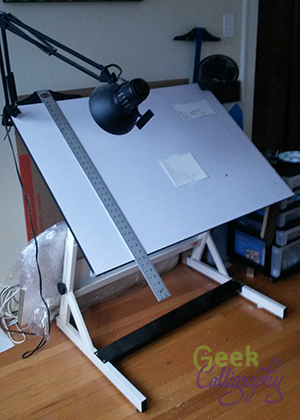
Ariela's drafting table with t-square hanging off it.

Ariela's drafting table with t-square hanging off it.

Drafting Table

You won’t get far without a good surface to write on. The sloped surface of a drafting table considerably reduces strain. When working on large surfaces, I increase the angle to bring the top closer to myself. Even when working on smaller pieces, the slant means that the pen meets the paper or parchment at a different angle than it would on a flat surface.

Mine is a Bieffe AF15, but brand matters much less than height and range of angles. As long as one adjusts to heights and angles that are comfortable for you, that's all that matters.

Good lighting is important while working. Many artists, myself included, answer this need by installing a swingarm lamp on one corner of their drafting table, but there are plenty of other solutions available.

T-Square

Making straight, parallel lines is one of the most important preparatory steps for calligraphy. Some drafting tables have a ruling tool built in. Mine doesn’t and I like it that way; there are times when I want to be able to use the entire surface of the table. Instead, I use a t-square together with the flat edge of the table to rule parallel lines. Mine is three feet long.

Ariela rests a triangle on her t-square.

Ariela rests a triangle on her t-square.

Triangle

When making vertical lines, it isn’t always practical to flip the t-square and use it vertically; for one thing, the t-square is quite a bit longer than the table is tall, and jabbing myself in the gut is not fun. When I need to make a small to medium vertical line, I rest a triangle on top of my t-square.

Lettering Guide

Ariela rests a lettering guide on a t-square.

Ariela rests a lettering guide on a t-square.

This little gizmo saves me so much time. Instead of measuring along the side of my writing area and marking each point at which I should draw a parallel line, I sit it on top of my t-square and it does all the spacing for me. (This is another way the slant of the drafting table helps – I can use gravity to keep the bottom of the lettering guide flush with the t-square.) I can change the line height by rotating the disc in the center between 3mm height and 10 mm height. If I want to work bigger than that, I can skip holes in the center or use the ones along the sides.

If you are a calligrapher and you don't have one of these, I highly recommend acquiring one. They are cheapest from Blick Art.

Lead Holder/Lead

Hand holding lead holder.

Hand holding lead holder.

This is the original mechanical pencil. While you can now get leads of different weights to load into modern mechanical pencils, I prefer this one for a few reasons. You do sharpen this lead, unlike your standard mechanical pencil. This means that you can choose how much you sharpen it; if a super sharp lead tends to cause you to gouge holes in your paper, you can keep it a little bit dull. The lead is thicker than the 5mm or 7mm standard to mechanical pencils now, so I don’t snap it as easily when inserting it into the holes of the lettering guide. I also just like the feel of this pencil body, the weight and the balance. Others might prefer different pencil bodies. I tend to use a 2H lead, which provides a good balance between producing a line that is dark enough to see but doesn’t lay down enough lead to smudge much while working.

Guard Sheet

I put a piece of paper under my hand to prevent the oils from my hand from touching the paper too much as I rest my hand while writing. It can be any scrap piece of paper.

There are more tools still for when I need to do fancy schmancy things, but these are the ones that get used in basically every calligraphy project

Questions?

I love talking about the technical aspects of calligraphy. The best way to get in touch is to tweet @GeekCalligraphy.

"I Like It" =/= "It's Good"

by Ariela

Quick followup on last week's post about my Hugo ballot. I mentioned a few times that I voted for things that I didn't enjoy. I don't think I mentioned the flip side as much, where there were things I enjoyed very much that I didn't vote for, but that happens, too.

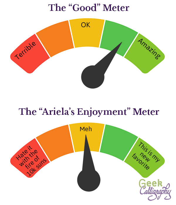
The "Good" Meter and "Ariela's Enjoyment" Meter are different things.

The "Good" Meter and "Ariela's Enjoyment" Meter are different things.

Because here's the thing: just because I enjoy something doesn't mean that it is "good" by any metric except the "does Ariela enjoy it?"-o-meter. I enjoy some things that I recognize as being bad by any number of metrics. Candy corn, for example, is terrible for you, and not actually that tasty, I just love it. I also hate all coffee, even high-quality coffee; my lack of enjoyment of anything I have to put in my mouth that includes coffee says nothing about how good a product it is. There are also things that I enjoy that are good, like a perfectly cooked meal, and things that are bad that I don't enjoy, like undercooked chicken.

So, too, with media. I enjoy some horrendous things, and there are some things that I recognize as being superbly skillfully done that are just not my cup of tea. And when I vote for the Hugos, I am trying to indicate that I think something succeeds in the metrics of innovation, craftsmanship, skill, and execution. It's not really about what I liked, it's about what I think exemplifies everything I want to see in the field of Spec Fic. And yes, we can - and do - argue about what the field of Spec Fic should be. But anyone who thinks that the field of SF should consist of only what they personally enjoy, with nothing for anyone else, is probably not worth talking to.

I want there to be SF for people who like things that are dramatically different than what I like, and I want the offerings for them to be good. I want them to have things they love, things that speak so deeply to their experience that fandom becomes part of their identity. Just because I don't share it doesn't mean it shouldn't be awesome for them. I also want good reading and viewing options for me, and I hope they would support me in my desire for same.

So, for me, the Hugos are not about voting for the things I enjoyed the most, they are about voting for the furtherance of the genre.

Ariela's (Partial) Hugo Ballot

by Ariela

Logo of the Hugo Awards

Logo of the Hugo Awards

Voting for the Hugo Awards ends in a little less than a month. Terri and I are both supporting members and, when not attending Wiscon, prepping for other art shows, and working on new products, we've both been steadily working our way through as many of the works up for voting as we can.

I am by no means done, but here is my ballot for some of the categories that matter most for me, with some notes as to my thoughts and choices:

Best Fan Artist

Because the Hugos have not changed their criteria for Professional Artist since they were invented, the Fan Artist category is the one that most artists fall into, whether art is a source of income for them or not. So this is actually where most of my artistic colleagues are up for awards. I will be voting as follows.

  1. Likhain (M. Sereno)
    Mia is an astonishingly talented artist and if I could place her higher than first, I would do it. Her use of color is breathtaking. And I have an extra soft spot for her work because she occasionally incorporates calligraphy, and does it very well.
  2. Vesa Lehtimäki
    Vesa does some truly gorgeous photo editing. I do photo editing for my day job and know exactly how hard it is, so this blows me away. 
  3. Spring Schoenhuth
    Spring does some of the most beautiful geek-themed jewelry, and works at a size that increases her difficulty factor exponentially. While I see geeky jewelry at nearly every con, most of them are made from premade, mass-produced pieces. Spring is the only one I know who does this kind of work from scratch.
  4. Elizabeth Leggett
    Elizabeth is an extremely technically accomplished artist, but she doesn't rank higher for me because I see lots of similarly themed art around. For art to be Hugo-worthy for me, it needs to not only be technically skilled, but also original.
  5. Ninni Aalto
    I suspect I am missing the best parts of Ninni's work due to language barrier; the ones without language don't really do it for me.
  6. Steve Stiles
    Steve is an amazingly prolific artist, but since we are judging just based on output in the past year, I haven't seen anything from him in the past year that really grabbed me.

Best Novel

Novels are my favorite thing to read and what I read the most of. I had already read a number of the nominees before nominations opened, much less after they closed.

  1.  A Closed and Common Orbit, by Becky Chambers
    I adored The Long Way to a Small, Angry Planet, which was an utterly delightful reading experience. But it lacked the emotional punch that the sequel delivers here. I'm a sucker for "what does it mean to be a person?" books, and this one comes at it from both ends in a devastating way.
  2. Ninefox Gambit, by Yoon Ha Lee
    I will admit that I couldn't finish this one, which I started before award season. I bounced off it in much the same way I bounced off Ancillary Justice my first time around. Serious culture shock, working too hard to absorb the world to be able to sit back and enjoy the story. Though I finished AJ on my first attempt, it took me until my third readthrough to just enjoy it. I suspect it will be the same here. As is, I recognize the technical accomplishment already.
  3. Too Like the Lightning, by Ada Palmer
    This is another incredibly rich worldbuilding work. I am impressed, but I suspect that the later books will bring more payoff. If this volume doesn't Hugo, I suspect the third book in the trilogy will.
    While I was impressed, I am also somewhat troubled by feedback I have heard from the trans and non-binary communities about some of the gender views expressed therein. I hope that the later volumes address this.
  4. The Obelisk Gate, by N.K. Jemisin
    I voted for The Fifth Season and was incredibly gratified when it won. While this volume is no less skillful, it suffers from middle-installment issues - we've already met most of the characters and we've been introduced to the world. While there are astonishing revelations (Sassun's sections broke my heart), it's all about building up to The Stone Sky.
  5. All the Birds in the Sky, by Charlie Jane Anders
    This book is skillfully written, but it just didn't wow me as much as everything above. Frankly, it wasn't my cup of tea, but it might be yours, so you should still check it out.

I didn't actually read Death's End by Cixin Liu. I voted for Three Body Problem, even though I didn't enjoy it at all, because I felt that it was both technically brilliant and extremely innovative, and that it made a significant contribution to the field of SF lit. However, there are limits to my dutifulness, and having not enjoyed either of the first two installments in the series, I'm not going to put myself through the third. So it is not on my ballot. Mind you, I am not voting it below "No Award," I am just leaving it off the ballot entirely, as I haven't read it and cannot rank it.

Best Novella

This is a partial list, as I have not yet finished reading everything in the category, and I do intend to.

  1. The Ballad of Black Tom, by Victor LaValle
    This one blew me away. 
  2. Every Heart a Doorway, by Seanan McGuire
    Years ago I came to the reluctant conclusion that, though my friends love it, Seanan's writing is not my thing. This, however, really impressed me. It's a fresh take on the very tired trope of portal fantasies.
  3. Penric and the Shaman, by Lois McMaster Bujold
    I adore everything Bujold writes, and though liking something isn't enough to make it award-worthy, in this case, I think it is. I am enjoying the exploration of the magical and theological issues Bujold is taking us through with this entire series.
  4. A Taste of Honey, by Kai Ashante
    This was well executed, but it didn't have the wow-factor of the works above it.

I haven't read The Dream-Quest of Vellitt Boe or This Census Taker yet. I do plan on reading them both, despite This Census Taker being on the Rabid Puppy ballot. I don't always dignify a Puppy nominee with reading, but Mieville doesn't seem to be wrapped up with them like, say, Wright is.

Best Series

Ah, the one-time category. Thank goodness I had read at least some of almost all of them before now, because if I tried to read them all in Award Season, I would have drowned in the attempt.

  1. The Vorkosigan Saga, by Lois McMaster Bujold
    I mentioned my love of Bujold above, and the Vorkosigan Saga is where she has done almost all of her most innovative work. It is always one of my first recommendations to someone looking for new reading material in the SFF field. It also covers an astonishing breadth, from space opera to political intrigue to romance.
  2. The Temeraire Series, by Naomi Novik
    Again, I love "what does it mean to be a person" books, and Temeraire's struggle to get dragons recognized as people in Europe speaks deeply to me. Also, I happen to love Regency period stuff. A+ highly recommended.
  3. The Peter Grant/Rivers of London Books, by Ben Aaronovich
    I only started this series, but 2.5 books in, I am mostly enjoying it. I love Peter's constant efforts to approach magic scientifically, and I love that he is foiled not by magic being magical (or not just by that) but by his lack of access to resources, and sometimes by his own distraction. I'm less thrilled by his constant commentary on the women he meets; it gets really tiresome.

I haven't read any of The Expanse by S. A. Corey, and I don't expect to have the time to do so before the close of voting, but I will check it out later. October Daye was my first introduction to Seanan McGuire, and as I mentioned above, really not for me. I read the first two books and decided I didn't need any more. Likewise, I read 1.5 books from The Craft Sequence by Max Gladstone and decided it wasn't my cup of tea. I will be leaving all three of these series off my ballot. Again, I am not voting them below No Award, I am just leaving them off.

So that's a partial look at my Hugo ballot. I am still working my way through the novelettes and short stories and have no idea when I will have a chance to watch Arrival, which is the last of the Long Form Dramatic Presentation nominees I want to watch.

What's on your ballot?

Geek Calligraphy Guide to Pen Types

by Ariela

I get a lot of questions from people who are interested in learning calligraphy. They cover a range of topics, but a lot of them concern materials. So today, I am going to talk about pens.

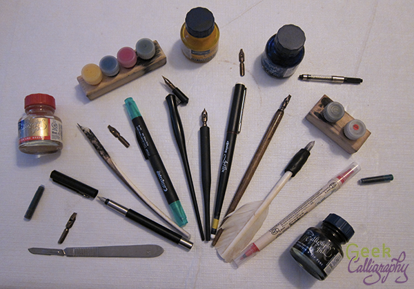
That's a lot of pens.

That's a lot of pens.

Like many things, there's no one right pen for all things. You need to use the correct tool for the job, and sometimes it comes down to a matter of personal preference.

I am going to go through the biggest categories of calligraphy pens and talk a little bit about what projects they are great for and what my favorite brands are.

Felt Tip Calligraphy Markers

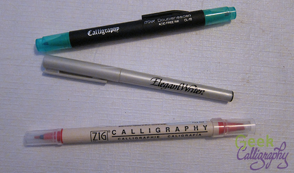
A very small sample of the number of felt tip calligraphy markers out there

A very small sample of the number of felt tip calligraphy markers out there

What they are good for:

Felt tips are great for beginners who are just starting out. They don't require any sort of learning curve for care and feeding of the pen, the inkflow, etc., which frees the user up to concentrate on learning pen angles and strokes.

As markers, they require no maintenance beyond remembering to cap them when you're done. They come in a rainbow of colors and you can buy them in any art store and many office supply stores as well.

They are also nice for casual projects and for taking along when you need to go somewhere, as they are the least likely to leak.

What they're not good for:

Felt tips are not great at creating thin lines. For projects that require hair-thin lines, felt-tips are not your friend. They are also not good at subtle changes in pen angle and pressure. The line quality and ink density are also not great. Work you do with them may be prone to fading.

Ariela's Favorite Brands:

Zig makes a nice variety of colors and they have double-tipped markers, which I like very much for the two-in-one. But they are pricier than a lot of the other brands.


Cartridge/Fountain Pens

Several uncapped fountain pens with cartridges and a bottle of ink.

Several uncapped fountain pens with cartridges and a bottle of ink.

What they are good for:

A good fountain pen with good ink will give you the most consistent ink flow of any tool available.

Cartridge pens provide better line quality than felt tips, with good thick and thin. They also travel pretty well.

The roundhand nibs of cartridge pens tend to be fairly rigid. This may be a feature or a bug depending on your preference.

If you need to write a whole lot with the same nib width, and you will use the pen regularly, a cartridge pen is probably the best tool for the job.

What they are not good for:

These are not pens to buy on a budget. Note my first sentence about "good" pens with "good" ink; that means pricey. Cheap pens and ink may give you okay results, but they may also be made of fail. Buying ink in cartridges is an even more expensive proposition than in bottles, and refillable cartridges are not everyone's cup of tea, though I rather enjoy the process.

Good fountain pens also need to be bought from a specialty store. You cannot walk into Michaels or your local craft store and buy one. Chances are that you will find Sheaffer's and Manuscript, and believe me, they are made of DO NOT WANT.

Cartridge pens need to be cleaned regularly. If you use your pens at least every other day, you can get away with only cleaning them every couple of cartridge changes/refills, but if you only use it occasionally you should clean it after every use. Cleaning them can be pain in the tush. Leave them uncleaned for long enough, and you will probably need to replace the whole pen as many companies don't sell replacement parts individually anymore (though you can always check Ebay!).

As mentioned above, the roundhand nibs on calligraphy pens with cartridges tend to be pretty rigid. If you like a flexible pen or need to get variations based on pen pressure, this is the wrong tool for the job.

For my money, I hate grinding the nibs on cartridge pens, but your mileage may vary.

I find that the variety of nib widths offered by cartridge pens is much narrower than for dip pen nibs.

If you want to use lots and lots of colors, then you need to have lots and lots of pens, or be prepared to wait a long time between switches as you clean and dry your pen.

Ariela's Favorite Brands:

I am a loyal devotee of Rotring Art Pens, though they have been cutting down their calligraphy line of late. 0.6 nibs are no longer to be had for love nor money, and 0.9s are only available on Ebay once in a blue moon. I like Rotring because they give good inkflow for a fairly inexpensive pen (by fountain pen standards), and they disassemble completely, which makes cleaning them - and especially drying out the parts afterward - much easier than the ones that don't break down so fully.

Unfortunately, my next favorite brand, Osmiroid, is no longer in production, though there are plenty of them floating around eBay. It's a workhorse brand with good value for your money. In the debit column, their nib and feed don't separate from the grip, which makes them harder to clean. However, the barrels of Osmiroid pens are shorter than the Rotring pens, which means they feel better in my hand.


Dip Pens

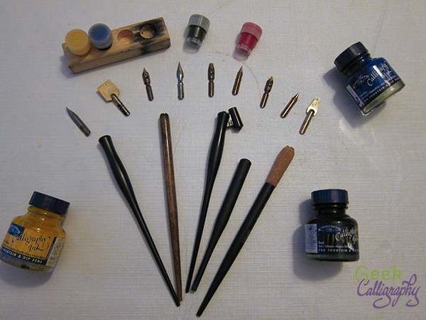
Just a few of the options available for dip pen nibs, pen bodies, and ink.

Just a few of the options available for dip pen nibs, pen bodies, and ink.

What they are good for:

If you want a variety of options, dip pens are the go-to. You can get nibs in so many sizes and shapes you may experience decision paralysis. Want roundhand nibs? Spoon nibs? Poster nibs? Copperplate nibs? Left-hand nibs? We have all those and more in a variety of sizes and flexibility.

Dip nibs are the most responsive to subtle changes in pressure and angle, and they have the widest thick and thin range. Some are more responsive than others and you can get a nib that is as responsive to pressure as you personally like.

Many, but not all, nibs are interchangeable, so you can also customize your pen experience a lot. You can pair any number of nibs with any number of pen bodies, and you can even alter an existing pen body or commission a new one if you really want something super special.

While the volume of nibs to buy can add up to a significant price tag, each nib is pretty cheap and there are very affordable pen bodies, making dip pens a very affordable option.

Ink is available in a rainbow of colors, which you can switch between easily with just a wipe of a cloth.

The pens need to be cleaned after each use, by which I mean dunked in water or a pen cleaner and then wiped off thoroughly. Don't put your nibs away wet. That's all.

What they're not good for:

There's a steep learning curve for dip pens. You don't suddenly switch from felt tips and ballpoints/biros to a dip pen without a serious adjustment period. In my opinion this is a skill well worth the time and effort, but beginners, you have been warned what you are getting yourselves into.

Ink can be blobby and distribute unevenly between a freshly dipped pen and one that needs to be dipped again. This gets easier and less apparent the more experienced the user, but it will never be quite as regular as a good cartridge pen.

If you have to write a large amount in a short amount of time, the time spent turning to dip the pen in the ink is wasted motion. If you are in a hurry, this is probably not the best pen for the job.

Ariela's Favorite Brands:

For broad nibs, I adore Mitchell roundhand nibs. But I am in the "bendier is better" camp. For those who like an inflexible nib, I hear that Brause is the go-to. Some of them also have built-in reservoirs, if that's your jam (it is most definitely not mine). If you are new to calligraphy, you may need to try both to figure out what you like.

I am brand agnostic when it comes to spoon nibs, G nibs, and EFs. I have some Hunts and some Speedballs that I quite like, but I have been itching to try out Leonardt brand as well as some of Brause's bendier nibs like the Blue Pumpkin.


Quills

Ariela's quills and equipment.

Ariela's quills and equipment.

What they are good for:

Even moreso than metal nibs, quills are flexible, customizeable, and responsive to subtle shifts in pen angle and pressure. When used skillfully, a quill will yield a line quality like nothing else. Since each quill is cut and re-cut multiple times, you get to cut it in just the way you like, with the angles that you like, and the ink channels the way you like them.

If you are looking to do historically accurate reproduction or reenactment, quills are very probably what you will need (unless you are looking to mimic a time and place where reed pens were de rigeur).

What they aren't good for (aka, all the reasons we no longer use quills much):

Quills wear out quickly. If you  are writing a lot, you may need to re-sharpen your quill multiple times daily. They can be touchy about humidity levels, causing the tines to split annoyingly along the ink channel in dry temps.

Cutting quills is a whole separate skill set from writing with them, but unless you are part of a large operation where you have a dedicated quill cutter, you really cannot write with quills without learning to cut your own, which is also time-consuming and frustrating. Hint: if you had been part of one of those large operations, you would never have been allowed to progress to writing without first learning the grunt work of cutting quills.

As mentioned above, quills are very responsive instruments. This means that if you don't have a lot of experience and fine motor control, they can respond in ways you wish they wouldn't.

Quills can be annoyingly narrow to grip. It is simply not comfortable to firmly grasp something that small for a long period of time. After trying out several different fixes, I solved this issue by making grips out of Sugru, but goodness only knows what the scribes of yore did.

Ariela's Favorite "Brands:"

So far I have only worked with turkey feathers, but I hear goose feathers are better for tiny work, so I should get some of those for my mezuzah work (letters on mezuzot are teeny!).


Reed Pens

I don't actually use them at all, so I don't have any recommendations here.


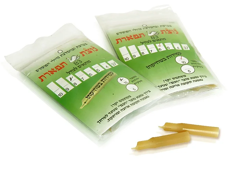
Image from MerkazHasofrim.com

Plastic Nibs

What they are good for:

Yes, they are a thing that exists.

I have never heard of these being used by anyone except Torah scribes. It makes sense: they want something they don't have to shape themselves, but can't use metal because, aside from Kabbalistic squeamishness about using metal other than gold in the production of a Torah, safrut ink literally eats through metal nibs.

What they aren't good for:

I haven't actually ever tried one of them, but I cannot imagine that they are better than metal nibs for anything (except not being eaten by safrut ink).


Where To Buy Good Pens

If you want to buy pens in person, Dick Blick/Utrecht actually stocks a decent selection of nibs in-store. They also sometimes have Rotrings, so definitely check them out. 

If you have a local stationers, they may have good pens, or they may not. The older the store, the more likely they still stock good pens. Call or go in and look, but be prepared to come away empty-handed.

If you are shopping online, I cannot recommend John Neal Booksellers enough. If you are ready to take the plunge into buying parchment for something other than Jewish holy texts (which have a bunch of extra requirements), try Pergamena.


A Note on Inks

Ink behaves differently at different temperatures and humidities. It is also a matter of preference. I have a strong liking for Winsor & Newton brand ink, but I know other calligraphers who swear by Higgins, which I cannot abide. You may need to buy a bunch and try them out. And the ink you like best in the summer may not be the one you like in the winter.


A Note on Papers

A lot of your writing experience is determined by the paper on which you are writing. Even a great pen will not make writing on crummy paper much better. If you aren't having any luck with any pens, it might be time to try a different paper.

When not writing on parchment (real parchment, the kind made from animal skins, not the paper that gets called parchment by art stores), I like writing on Bristol, which is fairly inexpensive and doesn't bleed much.


Any Other Questions?

You can always ask me on Facebook or Twitter. As long as I have time, I am happy to chat about the tools of the trade.

Employing A Sensitivity Checker

by Ariela

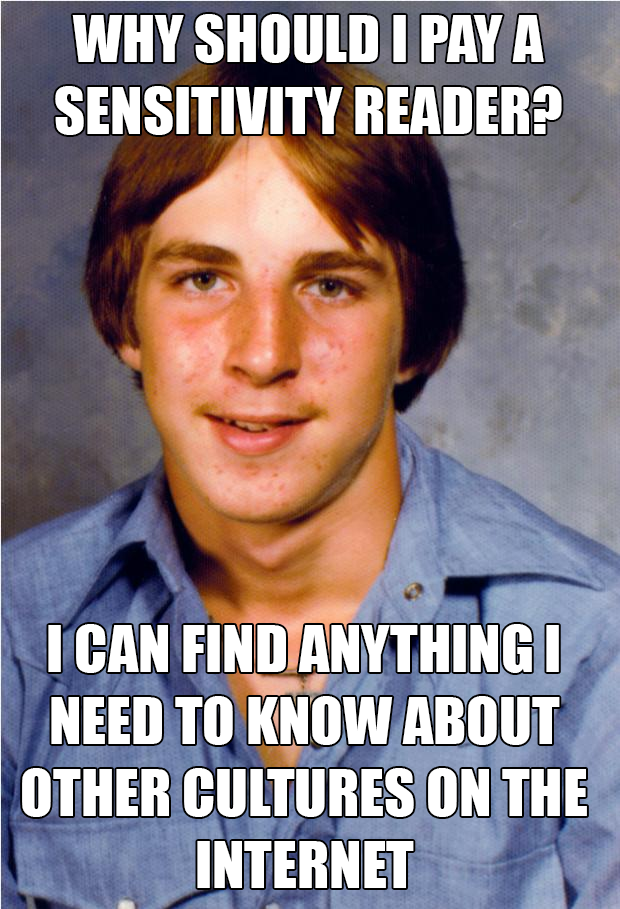
Old Economy Steve longs for the days when he could avoid people telling him how offensive his views are.

Old Economy Steve longs for the days when he could avoid people telling him how offensive his views are.

Sensitivity readers have been quite the hot topic in some parts of teh interwebs lately.

What is a sensitivity checker? When a creative type, in my case an artist, wants to use cultural elements from a culture not their own, you employ someone from that culture to act as an expert guide, telling you things that are important to know, and giving feedback that should help you to portray the culture in question accurately and in a way that is not offensive. This can cover anything from preventing embarrassing errors like those from our Jewish Stock Photography Fail Blog, to the horribly offensive error of making Nazis the good guys in a Holocaust novel supposedly told from the point of view of a Jewish girl (we won't link to that book, but here is a scathing review by Katherine Locke). 

In some ways, it is no different than consulting any other expert so you don't make ignorant mistakes, but here the stakes aren't just your own embarrassment but the possibility of perpetuating oppression of real people. 

I recently had my first serious sensitivity check. Our product release next week will include a picture of a keris, which is a Malaysian dagger with serious cultural significance. That's the sort of thing you don't want to just assume you can just chuck into a piece of art when you don't know anything about the culture surrounding it. Thanks to the wonders of Twitter, we were connected to Jia-Ling Pan, who was incredibly helpful. We highly recommend her, if you need a sensitivity check for anything from Malaysia. (Let us know if you would like to be put in touch; she said she would prefer a referral than a link.)

Here are a few basic takeaways from the process.

1. Pay them.

This should go without saying, but alas, it needs to be said. Giving someone a crash course in the intricacies of one's culture isn't a privilege, it is work. Listening to and answering questions, many of which may be ignorant and even offensive is hard work. Giving constructive feedback is work.

This is true for art and even more true for reading a manuscript, which takes a heck of a lot longer.

Pay them. If one cannot afford to pay someone from the culture one is writing/singing/art-ing/movie-making about to do a sensitivity check, then one doesn't get to play in that sandbox.

This doesn't mean you don't get to create, just that this particular avenue is not available. Lack of money sucks. It sucks for you as a creator, but it also sucks for people whose culture gets trampled over insensitively and are then asked to help someone else make sure they're doing it right for free. Sensitivity checkers need to be paid.

2. Listen to what they have to say, and give them space to talk.

You employ a sensitivity checker because they know things you don't. Sometimes that means answers to your questions, but other times that means telling you the answers to questions you didn't even know should be asked. Give your sensitivity checker some unstructured space to talk rather than framing everything within a Q&A. Your questions are shaped by your own assumptions after all, and they may not translate into the culture you are trying to learn about. You might even wind up getting more material out of it in ways you didn't anticipate.

3. Accept what they have to say.

Sometimes a sensitivity checker will say things you don't want to hear. You have to be willing to go into the check alert to the possibility that you might have to rework part of your project, a lot of your project, or even scrap your project entirely. The earlier you ask, the less likely this will be, so check early and often! Though even that is not a guarantee.

It's never easy to hear negative feedback, particularly when it means losing a lot of work. If you are only interested in affirmation and will come up with reasons why you don't need to take the negative feedback too, don't bother to have a check done at all. 

Mary Robinette Kowal has an excellent blog post about this. Please check it out.

4. No Group is Homogenous.

As in any group, different people will react to the same thing in different ways. Just because your sensitivity checker reads things one way doesn't mean that other people won't have a different take. Having more than one sensitivity checker is a good idea, particularly if the source material is emotionally significant or you are using a lot of it. And even if all your readers say it's fine, there's no guarantee that someone else will not be offended. Which brings us to:

5. Your creation is your responsibility.

If someone else is offended by the thing you made, even if you had a sensitivity checker, the responsibility is yours. It is not the job of a sensitivity checker to tell you how to do something so that you cannot be criticized for it; they're just there to give your their own read, and possibly make a best guess at how others may feel. The mere fact that you hired a sensitivity checker is not a shield against criticism, and if the work offends someone, then it is not the sensitivity checker's fault. It is on you to own up to any damage caused and decide how to proceed, apologize, make amends, fix it, etc.

Coda: Sensitivity checking is not a substitute for #OwnVoices

#OwnVoices is a campaign to lift up the work of people in various marginalized identities telling their own stories. It is not enough to have white people telling stories centering People of Color, or straight people telling stories about LGB people, or cisgendered people telling stories about trans people. No matter how skilled or well-intentioned the creator, they will not get it all. People have a right to portray themselves. And we should support them when they do by patronizing their work.

That said, I am very much not in the camp that says it is never okay for someone to portray a person outside their own identity. That leads to other kinds of erasure and normalizes the idea of homogenous societies. But when we do paint pictures of other people, with words or brushes or songs or cinema, we need to make sure we do it with care and respect. That's where sensitivity checkers are so important.

Find a Sensitivity Checker for Your Own Work

There are lots of people out there who do this work. Writing in the Margins is a great directory if you are looking for someone to keep you from accidentally putting your foot in it.
Jewish Stock Photography Fails

by Terri & Ariela

The world of stock photography is an inherently odd place to visit. Where else can you get photos of kitchen demolition side by side with any flower you could possibly think of? 

Themed stock photos can get... interesting. Just typing "$_HOLIDAY Stock Photos" into a Google Image search can set off nightmares or fits of giggles. Really, there are things that should never be Earth Day themed. But when you start searching for stock photography of non Christian religious holidays, the photos don't just look strange, they look like an alien's attempt to pass as a Hyoo-man. For example, there seems to be a compulsive need to put either matzah, a tallit,* or a Ḥanukkah menorah in almost all of them to scream JEWISH very loudly. Even if the image is tagged for a holiday containing none of these ritual objects or foods. Like Tu B'Shvat.**

Ariela's day job involves email marketing for the Union for Reform Judaism. This means finding images to go in said emails and results in her spending a lot of time combing through stock image catalogs, particularly around Jewish holidays. This, in turn, led to her IMing Terri in fits of disbelief so that someone else could share in the WTF-ery.

But why should we limit the horror to just the two of us? So we present: Bad Jewish Stock Photography. And when we say bad, we mean REALLY BAD.

We have not included images in this post that are just mis-tagged, like when you search for Passover and get Easter results. That's wrong and sometimes offensive, but not what we're listing here. All photos are watermarked with the image source, unless we can no longer find them at the source. We acknowledge that this post is very image heavy. The captions contain the best descriptions we can write, the commentary on the images is in the body text of the blog post below them.

And yes, we know about this article in The Forward. But that photo isn't even the tip of the Jewish stock photography fail iceberg. It's a small chip off the glacier.

Image shows an open Hebrew prayerbook on a stand, a blue velvet kippah with silver embroidery, a ḥanukkiyah with all its candles lit, and a folded tallit with black and silver stripes.

Image shows an open Hebrew prayerbook on a stand, a blue velvet kippah with silver embroidery, a ḥanukkiyah with all its candles lit, and a folded tallit with black and silver stripes.

This one originally came from iStock, but can no longer be found there. The lit ḥanukkiyah with the tallit is bad enough - a tallit is worn during the day and the ḥanukkiyah is lit only at night - but if you look closely at the text of the open book, it is open to the evening service for Yom Kippur, i.e. not a text you would ever need at Ḥanukkah. Anyone who knows any Hebrew could have told them not to do this.
This was the photo that originally inspired Ariela to do an ongoing series on bad Jewish stock photography.

Image shows a wood framed slate with "HAPPY PASSOVER" written on it in stylized chalk lettering. Surrounding the frame clockwise from noon are: pieces of square machine made maztah, un-shelled walnuts, a red-brown haggadah, red tulips with yellow st…

Image shows a wood framed slate with "HAPPY PASSOVER" written on it in stylized chalk lettering. Surrounding the frame clockwise from noon are: pieces of square machine made maztah, un-shelled walnuts, a red-brown haggadah, red tulips with yellow stripes, a wine glass on its side with a splash of wine still left, a bottle of pink wine on its side, a stack of three round hand made matzahs on a white cloth, more un-shelled walnuts, a leaf of lettuce with an egg on it, and more tulips.

It's Passover, not Easter. Why the tulips? Also, why is a mostly drunk wineglass lying on its side? How is that happy?

Image shows an older balding man wearing a tallit and holding an open siddur standing next to a table. To his left is a seated woman with short hair, to her right is a young boy in a sweater vest, button down shirt and Hanukkah themed suede kippah. …

Image shows an older balding man wearing a tallit and holding an open siddur standing next to a table. To his left is a seated woman with short hair, to her right is a young boy in a sweater vest, button down shirt and Hanukkah themed suede kippah. To the right of the older man is a seated man in a long sleeved polo shirt with a red satin kippah. There is someone seated next to this man, but the image cuts off everything but some arm in a blue sleeve. On the table is a silver plate with square machine made matzah and an unlit ḥanukkiyah with all of the arms holding blue and white striped candles.

The image description for this photo on Thinkstock is "Parents and their son and a rabbi at a Hanukkah ceremony." Just what is a Hanukkah ceremony, pray tell? There is very little to say about this image that the provided description doesn't cover. The words, they escape us.

Image shows a tallit with blue and gold stripes over white painted wooden slats. Positioned over the tallit are (clockwise from top): glass bowl with honey and wooden dipper, two broken sheets of square machine made matzah, a ḥanukkiyah lying flat o…

Image shows a tallit with blue and gold stripes over white painted wooden slats. Positioned over the tallit are (clockwise from top): glass bowl with honey and wooden dipper, two broken sheets of square machine made matzah, a ḥanukkiyah lying flat on its side, a shofar, and a silver kiddush cup partially filled with wine and sitting on a silver coaster.

The only thing this picture illustrates effectively is "We have no meaningful understanding of Jewish holidays."

Image shows a lit red pillar candle sitting on the pages of an open Hebrew prayerbook.

Image shows a lit red pillar candle sitting on the pages of an open Hebrew prayerbook.

No. Just no. You might wish to pray by candlelight, but if we ever catch you with a lit candle on your siddur, we will hurt you.

Image shows a tallit with blue and gold stripes on a rough wooden surface. Arranged on and beside the tallit from left to right are: a teal suede kippah with a silver border, 4 mostly empty silver kiddush cups in a diagonal line, and a shofar.

Image shows a tallit with blue and gold stripes on a rough wooden surface. Arranged on and beside the tallit from left to right are: a teal suede kippah with a silver border, 4 mostly empty silver kiddush cups in a diagonal line, and a shofar.

Once again, juxtaposition fail. One does wear a kippah to the Passover seder, but not a tallit. And a shofar isn't a Passover ritual object at all.

Image shows a blue and gold striped tallit (with atarah showing this time, for variety) on wooden slats. Over the tallit are (from left to right): a shofar, a black suede kippah with a gold border embossed with Jewish stars, and matzah. Once again, …

Image shows a blue and gold striped tallit (with atarah showing this time, for variety) on wooden slats. Over the tallit are (from left to right): a shofar, a black suede kippah with a gold border embossed with Jewish stars, and matzah. Once again, juxtaposition fail.

This is a whole genre. See more here

The Crown Jewel of the Collection

This has been scrubbed from all the stock sites we could find. We don't blame them. What the heck were they thinking?

Yes, that is a model of the Ark of the Covenant positioned next to a piggy bank sporting clovers and "good luck" painted on its side. The two are positioned so that the carrying rod of the ark appears to be jammed up the piggy's butt.

There was another in this same series that showed the same model of the Ark perched on the top of someone's foot with what appeared to be an industrial site in the background. We don't understand.

We have never run across any other Jewish Stock Photography fail so egregious, and we hope we never will.


*Prayer shawl worn by Jewish adults during daytime services. It is only ever worn at night once a year, on the eve of Yom Kippur.

**The 15th day of the month of Shvat (lunar month, generally falls around February). Often referred to as "Jewish Arbor Day," the Talmud lists this date as "the new year for trees." In the Mediterranean, this is often the beginning of springtime. It is celebrated by eating dried fruit and planting trees.


Did you enjoy this post? Help us keep writing more of them.

How Movies (and TV) Fail at Writing with Quill Pens

by Ariela

I don't know of any profession that feels it is well and accurately represented by pop cultural portrayals. Lawyers complain about courtroom dramas, police complain about crime procedurals, etc. So it probably won't surprise you that media portrayals of people writing with quills are, well, less than realistic.

Exhibit A:

Hermione Granger, portrayed by Emma Watson, using a quill all wrong.

Hermione Granger, portrayed by Emma Watson, using a quill all wrong.

I love me some Harry Potter, but the quills in the movies make me growl inarticulately. I mean, leaving aside the fact that all quills in the HP universe must be enchanted, because there is no other way that a child who grew up using pencils and biros (ballpoints, for those of us reading the US editions), could possibly just pick up a quill and write with it. No chance. 

Feather anatomy, courtesy of Ask a Biologist, Arizona State University

Feather anatomy, courtesy of Ask a Biologist, Arizona State University

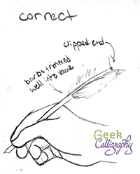
*ahem* As I was saying, the movie's portrayal of writing with quills is actually pretty standard for onscreen depictions. And it's wrong. Those super wispy bits down by Hermione's hand are called the downy barbs, and I don't know of any scribe who doesn't trim those away. Apart from making the quill harder to grasp, they will pick up ink every time you dip your nib. Yuck. Most of us trim further up the shaft as well, right into the vane (see handy guide to parts of a feather). Some trim all the barbs away and leave the pen as just the central shaft.

Also, most of us clip the opposite end of the quill. Writing with a pen that has an overlong barrel will unbalance the pen, whether it's a felt-tip or a quill. And, depending on how you sit while you write, you might wind up poking yourself with the opposite end in the eye or up your nose. Yeah, not fun.

An illustration of the issues mentioned above. Using a quill that hasn't been properly trimmed is terrible.

An illustration of the issues mentioned above. Using a quill that hasn't been properly trimmed is terrible.

Holding Quill Correctly - Geek Calligraphy

Yet pop culture persists in this myth, and I persist in being cranky about it on Twitter.

So piqued by it was I that, while wandering the National Gallery in London last month, I started snapping pictures of paintings of people writing with quills. Since these paintings date to times and places when people actually used quills, they're all correct depictions. I had thought that it would make a good tumblr - Paintings of People Depicted Using Quills Correctly - but I was prevented from starting it by my utter bewilderment at the tumblr interface. (Anytime anything gets posted to tumblr for Geek Calligraphy, Terri is the one doing it. G-d bless managers.) But Mary Robinette Kowal suggested that I could make a Pinterest board instead.

So, behold:

There's not a whole heck of a lot there yet, but it will grow.

Also, as a bonus, please enjoy pictures of these souvenir "quills" which I found in the Tower of London gift shop. Appropriate placement, really, as these are not writing devices but torture devices. [cowers]

The image does not properly convey the terrible quality of the metal pen nib slapped on the end of this "plume."

The image does not properly convey the terrible quality of the metal pen nib slapped on the end of this "plume."

Yes, that's a ballpoint shoved in the end of this quill. Because the untrimmed shaft wasn't enough.

Yes, that's a ballpoint shoved in the end of this quill. Because the untrimmed shaft wasn't enough.

Love Interests and Agency in the Face of Adversity: Analyzing Lois McMaster Bujold Characters

by Ariela

Be warned, this post contains spoilers for Mira's Last Dance, and everything else written by Lois McMaster Bujold.

This post did not turn out the way I thought it would. I have been wanting, for a few weeks, to burble about Lois McMaster Bujold's latest novella, Mira's Last Dance, the Penric series in general, and LMB's ouvre as a whole. I was all set to talk about how LMB writes male protagonists interested in women, but that the women they are interested in are not Love Interests but rather fully-realized characters with their own motivations and how awesome that is. Shortly before I could take some time to sit down and write it, Lindsay Ellis came out with a review of Beauty and the Beast and why it is not about Stockholm Syndrome but does have a bunch of other problems. At 14 minutes in, Ellis starts a thought that culminates in this quote:

[Women's] narratives usually have them being less active agents than being thrown into circumstances which they must then survive

Ouch.

"Thrown into circumstances which they must then survive" sure sounds like it describes a lot of LMB's love interests. (Note, this is female characters who are not the primary protagonist and are the subject of romantic interest by the male protagonist; Cordelia Vorkosigan, Royina Ista, and Fern Bluefield aren't included.) But does the first part apply? Let's take a look.

Love Interests or "Love Interests," And does that Preclude Agency?

I'm going to start with Miles Vorkosigan's love interests, because for me the Vorkosiverse is the baseline of LMB's writing.

Elena Bothari

Elena Bothari

Elena Bothari

Miles' first love interest, Elena, is definitely born into circumstances which do not endow her with much agency. The daughter of a deeply disturbed father who views the degree of her success at the societally prescribed female role as the measure of his redemption from his past sins, she is also the foster daughter of Cordelia Vorkosigan who views Barrayaran society with a mix of anthropological indulgence and Betan horror. The social messaging surrounding her says that the only worthwhile vocation is to be a soldier, but bars her from enlisting by sex. Barrayar is, to Elena, a situation to be endured.

Miles creates the Dendarii Mercenaries for a whole host of reasons, but in the processes uses them to gift Elena with her childhood aspiration of becoming a soldier. But Elena does not then turn around and fall into his arms. She takes the opportunity he offers her, but refuses to be beholden to him for it. Instead, she marries someone even lower on the Barrayaran social ladder than she, a deserter; someone who has been completely excommunicated by Barrayaran society. Marrying Baz is a complete repudiation of her father's expectations of her, but also of the narrative's expectations of her as a Love Interest.

Later on, in Memory, Elena quits the Dendarii as well.

"All my childhood, all my youth, Barrayar pounded into me that being a soldier was the only job that counted. The most important thing there was, or ever could be. And that I could never be important, because I could never be a soldier. Well, I've proved Barrayar wrong. I've been a soldier and a damned good one...And now I've come to wonder what else Barrayar was wrong about. Like, what's really important."

Elena was certainly born into circumstances she needed to survive, but when she was offered an out, she took it. And after some time, she also re-evaluated her life goals and changed direction. This doesn't sound to me like a character lacking in agency.

But Elena was never actually Miles' lover. Let's take a look at some others.

Elli Quinn

Elli Quinn

Elli Quinn

Quinn is the one on this list who fits neither clause of Ellis' statement. She is not put in circumstances she is forced to survive more than any other mercenary. She chooses to be a mercenary, chooses to become Miles' lover, and when he leaves the mercenaries, she refuses to go with him. She wants Miles on her terms or she won't have him. While her motivation is never delved into much, she clearly loves her job and wants to do it to the best of her abilities. She will not sacrifice her career or herself for a boyfriend. Quinn has as complete agency as anyone can who chooses to live in a society with rules and in relation to others.

Sergeant Taura

Taura

Taura

Taura is in many ways Quinn's polar opposite on this scale in that she gets to choose almost nothing. Bred as an experimental genetically-engineered super-soldier, she grows up as a prisoner. When she meets Miles, he is on a mission to retrieve her creator and kill her, or rather, recover the tissue samples her creator had stored in her and dispose of the evidence. Miles offers her the chance to leave the Dendarii at Escobar after her rescue, but considering that would leave her in a strange society, knowing no one, with no coping tools, it's not surprising she refuses. She is bred to be a super-soldier, after all, and she does grow into her role in the Dendarii. Later she sets out to live life as fully as she can and seems to succeed. Based on characterizations, if she decided later that she wanted to give up mercenary life and take up woodworking, or anything else equally disparate from being a soldier, I believe Miles would have supported her fully. But the fact of the matter is that of his love interests, she seems to be the least independent, to have her choices most constrained by circumstances. I don't think this necessarily makes her a less realized character, but in light of general trends of the narrative arcs of female characters, it's kind of troubling.

Ekaterin Nile Vorvayne Vorsoisson

Ekaterin Nile Vorvayne Vorsoisson Vorkosigan

In many ways, Ekaterin is the embodiment of the kind of female story arc Ellis named in the quote up top. We first meet her trapped in marriage with an emotionally abusive man, held to it by her son, her social conditioning, and her family's expectations. It is the quintessential circumstance a woman is forced to survive in the Western narrative. When her husband is killed, the range of possibilities available to her opens up somewhat, but when she returns to Barrayar in A Civil Campaign, her family promptly tries to marry her off again, being unable to conceive of her in any role other than wife and mother.

While she has more options in A Civil Campaign, she still feels herself to be in very straightened circumstances. Miles, having apparently learned nothing since his effort to give Elena a military career, attempts to give Ekaterin a career in gardening, or at least a jump start on one, as a ploy to keep her close to him. His plot comes apart, he asks her to marry him at entirely the wrong time, and Ekaterin feels backed into quitting both the garden project and her association with him lest she lose her independence. This is one of the points where Ekaterin's agency becomes apparent: her rejection of her other suitors up until this point could have been a plot device to have her end up with Miles, but here she shows that it's an intrinsic character trait. But honestly, while it's agency, it's really minimal agency. She has said no to Miles, but she has not had any chance to say yes to herself yet.

Ekaterin does eventually choose Miles after her family forbids her from interacting with him. Ekaterin herself lampshades the reverse psychology involved by comparing it to how her son carried on about toys. And ultimately she chooses him not because she feels backed into a corner by her family but because she decides that Miles can aid her in her self-actualization, now that he has been talked out of trying to do it for her. Still, the lack of exploration of other options for Ekaterin in the narrative - aside from her insistence that she is going to remain single, which is brushed off by all the other characters - is troubling. We do see her stand up to Miles in later books, but "I can stand up to my husband" is not much of a life goal.

Ivan's love interest: Akuti Tejaswini Jyoti ghem Estif Arqua

Tej

Tej

Like Ekaterin, half of the story of Tej and Ivan's romance is from Tej's point of view. And the main character arc of the story is hers: how will she reconcile the demands her family places on her with her own inclinations? Ivan's arc, realizing that he loves Tej and enjoys being married to her, then trying to get her to stay with him, is not nearly as interesting.

Tej almost seems like an answer to the profusion of Strong Female Characters TM* that we have in the genre. Tej's family wants her to be a Strong Female Character TM (for their purposes, of course), and she wants none of it. Her self-actualization involves sitting on a beach drinking fruity alcohol and reading. Her character arc highlights the difference between action and agency. And marrying Ivan is not the way she fulfills herself; the way she does that is by refusing to go back to Jackson's Whole with her family. If anything, Ivan is the reward she gets for standing up for herself.

So ultimately, Tej is not a standard Love Interest with no motivations of her own, nor is she a woman who lacks agency and must merely endure. She surely has to endure at the beginning of the story, but it is the same sort of endurance any hero might have to undergo whose character arc is started by the murder of their family; the difference is that LMB doesn't give short shrift to the emotional toll and the exhaustion such a tragedy would evoke.

Not Pictured Here

I'm going to skip Rowan Durona, who is only briefly present in the narrative of Mirror Dance, Beatriz from The Curse of Chalion, because she very nearly is a standard Love Interest off the assembly line, and Ijada from The Hallowed Hunt, because I didn't actually like that book all that much. Which brings me finally back around to the character who inspired this post in the first place.

Nikys Arisaydia Khatai

Nikys Khatai

Nikys Khatai

When we are first introduced to Nikys, she has definitely been thrown into circumstances she must survive. Her husband, chosen for her by her brother, has died after a long, lingering illness. Now a ward of her brother's, she endures his imprisonment on false charges and his refusal to take advantage of her attempt to rescue him. And then she must endure the flight to save her brother's life, to a destination not of her choosing.

At the end of Penric's Mission, it seems like she will end up together with Penric. At the end of Mira's Last Dance, it seems like she has declined, but Penric is staying to pursue her. But while she exercises a choice not to follow Penric back to Adria, it seems like a choice made from a place of fairly profound powerlessness. She is, ultimately, being asked to choose between following her brother or following Penric, with no option to follow herself.

No, Nikys is not a standard Love Interest in that she is a fully realized character with her own desires and motivation, but of all the women listed here, she seems to be the one most lacking in agency. Nikys seems to fit Ellis' description of women's narratives.

My Fave is Problematic. Now what?

Cover of Mira's Last Dance by Lois McMaster Bujold

Cover of Mira's Last Dance by Lois McMaster Bujold

There really ought to be a "My Fave is Problematic Dance." Whenever I realize something uncomfortable about something I love, I am taken with a desire to run away, and frequently I do put down the book, or pause the movie/tv show, and take a lap around the room before coming back. It would be a lot easier if there were a short dance I could do that would also communicate to anyone watching why I suddenly have shpilkes (Yiddish for "nervous, restless energy").

But after I would do that dance, I would come back to the thing, whatever it was, that I put down, because it is okay to like problematic things. Sometimes the good aspects outweigh the problematic ones enough that it doesn't stop you from enjoying something. And that's okay! Just don't pretend like the problematic parts aren't there. And maybe also seek out some works that are not problematic in that way (though they may be problematic in others).

Speaking of different ways to be problematic, a word about the criteria used in this post. When Lindsay Ellis referred to the troubling trend of women's narratives involving less agency and more survival, it was not a blanket condemnation of survival narratives. Survival narratives, where characters are thrown into untenable, uncomfortable, or even lethal situations they must then endure can be fascinating! For people suffering oppression in particular, such narratives can be empowering because they recognize the truth of their experiences and the strength it takes to persist in such circumstances. Problems arise when those are the only narratives told about certain classes of people.

I adore Lois McMaster Bujold, and she is generally quite good about not writing Love Interests TM who are woman-shaped props in the narrative there for the male hero to win. But it would be nice to see her write some more narratives where women aren't merely enduring. Gentleman Jole and the Red Queen was a lovely break from this pattern. More, please! (Also more non-white, non-straight, non-cis protags, too, while we're at it. A Bel book, maybe?)

Visitor Friendliness and Hostility: On Airports and Disneyland

by Ariela

My geekery takes a lot of forms. I like things that are considered culturally geeky: comics, SFF, etc. I also have a day job in tech. But today I want to geek out about something I haven't spoken about much on this blog: usability.

In between aspiring to be a professional artist when I was a child and then circling back around to actually become one as an adult (with an ongoing dog-leg into non-profit technology), I spent my high school and college years wanting to go into exhibit design for history museums. This meant that I spent some time learning about visitor flow in physical spaces as well as in websites.* Since I spent a week in London recently, I thought a lot about usability in the real world, between doing touristy stuff at historic sites and museums and flying in and out.

Heathrow security prep station. This photo is from futuretravelexperience.com. I did not get my own as I didn't want to hold up a line by taking photos.

Heathrow security prep station. This photo is from futuretravelexperience.com. I did not get my own as I didn't want to hold up a line by taking photos.

Let me say, for all the terrible things that people say about Heathrow, I found it quite visitor-friendly. Before going through security, they have preparation stations set up. They're little counters where you can sort your stuff out. They not only have trash cans, they also have designated receptacles where you can dump liquids out of your bottles, and they have plastic bag dispensers for your small liquids. At security itself, the bins are bigger than in American airports. Not only that, but instead of having carts of them at the head of the line, the empties are returned to the start point by gravity rollers underneath the conveyor belt that brings the full ones through the screener. They had security personnel at each conveyor belt assisting you. Oh, and you get to keep your shoes on. It not only made the onerous process of going through security rather less terrible, it also made it faster, so there wasn't much of a wait.

This image of dense crowds at an airport is from TravelAndLeisure.com. Sure looks leisurely to us. Oh wait, no it doesn't.

This image of dense crowds at an airport is from TravelAndLeisure.com. Sure looks leisurely to us. Oh wait, no it doesn't.

Contrast this to an American airport. There's nowhere convenient to prepare to go through security. There's nowhere nearby to dump liquids, which means that the person who inevitably forgot to empty their water bottle has to run back to find someplace, holding up the line. They certainly don't provide plastic bags for small liquids either. No one assists you as you prepare your stuff to go through the screener - the security personnel near that side of the conveyor belt tend to walk around shouting reminders to put your laptop in a bin by itself, etc. There's no automatic return of bins, so that can be another holdup. It's not actually designed for maximum inefficiency and misery during the process, but it seems to come close. Nobody likes being in an American airport, and security is everyone's least favorite part.

Water fountains for people of all heights in California Adventure.

Water fountains for people of all heights in California Adventure.

If I had to name the opposite of an American airport, I would choose Disneyland. I went to Disneyland for the first time in September 2016, and I was blown away by the user-friendliness of the place. A lot of this was just because it was actually designed with the idea that people who aren't adults have a right to be accommodated. There were changing stations in all the bathrooms, usually multiples. Water fountains came in several different heights. As an adult who needs shoes to see 5' tall, believe me, there's a difference in the comfort of seats designed for multiple heights and ones designed for the average adult. But a lot of it has nothing to do with children.

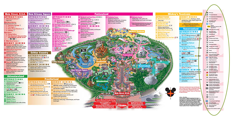
I can't speak to the actual accessibility of Disney for people who are vision, auditory, or mobility impaired, but I sure noticed all the notations on the map about accessibility, pictured below. The fact that it was there up front, as opposed to having to go looking for it to learn about it, impressed me quite a bit.

Map of Disneyland with a legend on the right highlighting ALL THE SERVICES. Click to embiggen.

Map of Disneyland with a legend on the right highlighting ALL THE SERVICES. Click to embiggen.

This is a text payphone! How cool is that? So necessary for anyone hearing impaired who doesn't have access to a cell for whatever reason!

This is a text payphone! How cool is that? So necessary for anyone hearing impaired who doesn't have access to a cell for whatever reason!

Disposal cans at Main St. USA

Disposal cans at Main St. USA

The trash cans are a thing of Disney lore. Websites give conflicting stats, usually citing either 20 or 30 steps maximum between trash cans. I didn't stop to count it out - my poor spouse had to wait for me to take pictures of them, I suspect neither he nor the other visitors would have appreciated me stopping to measure out paces between each of them - but they appear at much shorter intervals than I have ever seen trash cans anywhere else. The same websites cite Walt himself as instituting the policy of so many trash cans as part of lowering the bar to guests throwing out their rubbish properly. I suspect that we don't see this outside of Disney not because institutions are not interested in lowering the bar to using trash cans but because of how many staff hours it would take to empty that many cans. Space might also be a consideration, too, as who wants to give that much footprint to trash cans?

One type of space that the trash cans at Disney don't take up so much is visual space. They are incorporated into the decor of the attraction, so they don't stick out as utilitarian, they're part of the experience and novelty. The other place Disney does this really well is in the waiting areas to get into rides. Like airports, Disney hosts people who inevitably spend a large amount of time waiting in lines. However, unlike airports, Disney tries to make this wait time as pleasant as possible, and they dress the waiting area in decor matching that of the ride, essentially trying to make the wait itself part of the ride, too.

Of course, airports can't make your wait more entertaining by making the waiting resemble being on an airplane because the vast majority of fliers are far more interested in their destination than the ride. But there are definitely things they could do to make the wait, and the ride less miserable. Unfortunately, there's no incentive to do so. People don't pay to use airports, they pay the airlines, and no airline is going to spearhead improvements in the general airport when they won't inspire anyone to fly with them more often. In fact, there's incentive not to improve, as that "calculated misery cost" is what causes people to pay for things like TSA PreCheck and visitor lounges. Ditto coach vs. First Class on the planes themselves.

There isn't really a point to all this rambling, except to say that user-friendliness has a lot of aspects and that they can make a huge difference to our experiences, even for something as simple as waiting in a line. Necessary but unpleasant experiences can be mitigated by user-friendliness, while good experiences can be enhanced; conversely good experiences can be soured by user-hostile environments and bad ones are transformed from annoying to miserable. This is true on the web as well as in the real world, but I rarely see people comparing the two outside of niche interest sites.

So next time you have a really unpleasant experience somewhere, ask yourself if there's something that could be done to make it more pleasant. If possible, give feedback on it; few places are as user-hostile as airports, and many want to make themselves more welcoming.

*If you ever see me in a museum exhibit, you may find me staring at the ceiling to check out their lighting configuration, or critiquing the layout of object labels.