
by Terri
Since we appear to have declared September to be Artist's Rights Month, I wanted to do a example* of the commission process gone right.
Full Disclaimer. I am the one requesting the commission from the artist in question. I have been friends with Ariela as well as a handicrafter myself for long enough that I fully appreciate how much work and effort goes into custom anything. I Get It, and tailor my expectations accordingly.
I knit a lot, and have fallen fair down the rabbit hole of interchangeable knitting needle sets.** As such, I need a case to hold all the various parts so that they don't get lost all over the house. I outgrew the binder that came with my first set*** about two years ago, though I pushed it to its absolute limit. Knowing that other people had success with worm binders, I purchased one from Bass Pro.**** Once I'd overstuffed it with my needles and cables, I realized that I didn't care for it at all. It would work as an interim piece and I would wait until some room in the budget opened up for something nicer.
I happened to come into a bit of fun money due to a survey, and decided now was the time. I approached Grace Fross, of Graces Cases on Etsy. Thankfully, this is relatively easy to do, although you are stuck in a proprietary messaging system.***** I had seen one of her products that I hoped could be adapted to better suit my needs. I also had seen something else that might have worked, and I could show her pictures of that. Both of these things will be important later.
While I opened the conversation with something relatively short, it referenced an existing product and how it might be adapted:
| me: | Would you be interested in making a $_STYLE style case, but with more pages? |
| Grace Fross: | Both the Standard and deluxe cases have more pages including a page for 2 sets of tips. But if you were thinking of a different layout then we do take custom orders. |
Once I knew that a custom piece was a possibility, I was able to further elaborate what I wanted:
| me: | I was looking for something that can store enough tips for 4+ sets of needles plus cables. I'm willing to pay custom prices. Something with as many pages as a Deluxe, but with the internal layout of the Tips Too. |
| Grace Fross: | We do lots of custom orders in a wide variety of layouts. There are a few restrictions though because sewing machines will only go through a certain number of layers. Custom orders have a wait list of around 10 - 12 weeks and there is a 20% surcharge. With custom you can select from fabrics I have on hand or supply your own in addition to a layout designed to fit your needles. |
| me: | The restrictions and surcharge are reasonable and understandable. So is the waiting list. |
Note the bolded text. I agreed up front to whatever Grace wanted to charge me for her work, before she even quoted me her terms. This might not always be the case for someone seeking a commission. If you don't know what the baseline price is, don't commit like I did. But I had an idea of what the general prices were based on the items in her Etsy shop, and was willing to pay up to half again as much for something that worked for me. Knowing what you can and are willing to spend is an important part of any custom commission. Also note that Grace was up front with the waiting list and pricing for custom work. I was able to make a decision about whether or not I could afford the work before anyone had expended time, effort or money. If I hadn't been willing to pay or wait, I would have responded as follows:
| me: | Thank you for your time. I'm sorry, but I don't think that this is going to fit within my current budget or time constraints. |
| me: | Do you require a deposit? |
| Grace Fross: | No deposit needed. |
| Grace Fross: | If you haven't heard from me by the end of this week, please remind me |
That delightful surprise was an important part of an artist's responsibility to communicate clearly. Without that, I would have happily waited, but with it I knew things would be speeding up a little.
Now I will sing Ms. Fross's praises, as she truly is the Fabric Whisperer. I mentioned that I like purple, and she came up with this gorgeous batik fabric for me:
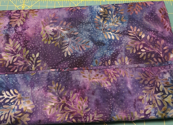
Anyone who knows me well knows just how much I jumped up and down when I saw this.
At this point, further snippets of back and forth conversation would just devolve into jargon about what I wanted. Which, again, demonstrates communication. I was able to point Grace to another Etsy listing to demonstrate some particulars of what I wanted. Once she saw that, she was able to let me know that she would try to get it finished soon, but she did have a show that she needed to finish her inventory for. And once again, she checked in with me on the pricing, now that she was able to have precise numbers for me.
All of these things were laid out BEFORE any work was completed. All told, only a couple of hours in back and forth time were spent (which, had I not gone with this, would have been time not recompensed). And in the end, everyone was happy. I got what I wanted, Grace Fross was paid fairly. And that's a commission gone right.
*I ramble. The post won't be short.
**This was my first set. I have since discovered another company that uses the same manufacturer (cross-compatibility FTW) and am completely powerless in the face of pretty wood.
***Alas, it no longer ships with that binder. Nor do they make that binder any longer. Hence the need for something else.
****Yes, the sort you buy for storing fishing lures. Yes, this means I'll never stop getting Bass Pro catalogs. I've somewhat resigned myself to it.
*****Ms. Fross would like you to know that customers can also approach her via her email address at the GracesCases website.
The "Starving Artist" Trope Needs to DIAF: A Labor Day Post

Image reads "I am an artist. This does not mean I will work for free. I have bills just like you. Thank you for understanding.
Image found on thephotographer4you.com
by Ariela
"The Starving Artist trope needs to DIAF."
I have been having the same, or similar conversations, in various forms, a lot of late on social media. So I decided to write about it at more length than I can in 140 characters, even in consecutive tweet. The topic is only somewhat related to Labor Day, not being about an Artists' Guild or other organized labor movement. But it is about recognizing the labor of artists and valuing it properly, so I thought this would be an appropriate time to post about it.
You probably know the trope of the Starving Artist; it's quite common in American culture. It's the one that says that artists almost never make enough money to make ends meet and that aspiring artists have no sense of practicality and make no plans to support themselves while they blithely pursue their art. This trope needs to Get Gone.
The Starving Artist trope was popularized during the Romantic era in Europe and America, which peaked around 1800-1850. In America, it had a large overlap with the Bohemian movement. Both of these groups valorized the idea of devotion to art - be it writing, visual arts, music, etc. - to the exclusion of all else, particularly material concerns. In these environments, the Starving Artist was an aspirational model, not a negative image.
The 1980s and 90s saw a bunch of movies, TV shows, songs, and other artistic projects showing the young artistic hopeful arriving, usually in NYC or LA, with just a suitcase and a few dollars in their pocket, also presenting this image in a positive light. Jonathan Larson's musical Rent, based strongly on Puccini's Romantic-era opera La Bohème, was probably the pinnacle of this trend, though I'm sure some people would put in a word for "Don't Stop Believin'" by Journey.
The evil counterpart of the Starving Artist is the Sellout, the person who has decided to abandon their artistic dream in favor of creating Extruded Art-like Product in exchange for money.
The stereotypes of the Starving Artist and the Sellout combine to create a double-bind of expectations for artists. Artists are starving, so if you want to be an artist, the immediate assumption is that you are an impractical flake with your head in the clouds and no economic sense. If you are already working as an artist and have the audacity to require payment for your work, you must be a greedy Sellout and your art can't possibly be good enough to be worth your quoted rate. Artists are "right-brained" people, so they don't pursue their careers logically and you can't possibly have a realistic plan or expectation of how hard you are going to have to work. And if you have a day job and pursue art on the side, why are you demanding to be paid for your hobby?
This is galling enough on its own, but even moreso when compared with the treatment of another group of creative dreamers in America: "entrepreneurs." Wikipedia defines Starving Artist as "an artist who sacrifices material well-being in order to focus on their artwork. They typically live on minimum expenses, either for a lack of business or because all their disposable income goes toward art projects. " But this description could also be applied to an entrepreneur in the throes of starting up a business. Startups have a high rate of failure, but we don't have a derogatory "Starving Entrepreneur" trope; in fact, people who do that tend to be lauded by the American capitalist machine. And I don't buy that this is due to the newness of entrepreneurship compared to art - the Romantic period that saw the birth of the Bohemian ideal was in large part a response to the Industrial Revolution, so the tension between these two groups goes back plenty long.
Someone who lives on ramen while working on the next big app, or mortgages their house to finance their restaurant, or works at a day job and then codes all night, etc., is considered "goal oriented," or at least they are if they succeed. We don't tend to hear about failures because they don't match the cultural narrative surrounding entrepreneurs and The American Dream. Artists who live meagerly are derided for "not having a real job," or living in an "unsustainable way;" those of us who work a day job are frequently condescendingly applauded for recognizing that our art will never be a going concern. Our failures are incorporated back into the cultural canon and our successes are forgotten because they don't fit the preconception of the Starving Artist. It's confirmation bias at its most basic.
This boondoggle of unrealistic and conflicting expectations is inextricably tied to and exacerbated by the way that our society values art. Or rather, the way that it doesn't value art. Art is seen as unnecessary, something not worth spending large amounts of money to obtain, or only worth spending top dollar for if one is so rich that one simply has nothing better to do with that money. I'm including more than just graphic arts in that estimation. Music, novels, theater, dance, and other media are similarly denigrated. One might think that wider access to the arts, through recording, scanning, printing, streaming, and other reproduction technology, might give people across class lines a greater appreciation for them and increase the number of people who understand their worth; alas it is not so. If anything, I suspect that it has further devalued them by creating false expectations about the cost. When art could only be afforded by the wealthy, of course it was expensive to produce; but when anyone can buy a poster, it's an huge sticker shock to encounter custom art prices. People who aren't in the habit of commissioning work don't think about the fact that the cost of production, including the artist's time, is amortized over the entire print run/album run/clothing line/etc. Sticker shock is normal, and I don't resent the clients who hear my breakdown of costs and expected labor time and say, "Ok, wow, that's out of our price range, but thanks for your time!" I also don't mind the ones who ask what the options are to cut the costs. It's the ones who get angry when I tell them my prices who are the problem. (Terri deals with most of this as part of general administravia, so I get off easy in this department.)
I am far from the only one who experiences this problem. Plenty of people attempt to get artists to do work on the grounds that it will be a good portfolio piece, or that the project will bring them publicity. The twitter account @ForExposure_txt documents some of the egregious examples of this trend. Another common trend is the non-profit that asks artists to donate their work "because it's for a good cause!" but would never dream of asking their plumber to do likewise. People who accept the quoted prices of consulting firms without a blink try to bargain artists down. The perceived valuelessness of the time and work of artists is, I suspect, one of the factors that causes Patreon to be so much more contentious than other crowdfunding platforms, like Kickstarter and GoFundMe. A society that derides us for not being able to support ourselves through our art and then turns around and demands that we work for free or insultingly low rates is hypocritical and sick. Our lovely capitalist machine demands that far too many people in a variety of jobs work below the poverty line, but what I am addressing here is the particular moral outrage expressed at artists who have the gall to say that they deserve to get paid, not just be snivellingly grateful for whatever pennies get tossed our way by noble and beneficent people with "Real Jobs."
Artists know our vocation takes an enormous amount of hard work, dedication, and perseverance. We're not in denial about this. For some of us this means we work a day job while pursuing art at night and on the weekends, sometimes for a few years, sometimes for all our working lives. For some of us it means paring away our expenses until we can live within our earnings as artists. For many it is a combination of both. We do this so that we can produce the art we love, which we hope you will love, too.
Artists make things that are beautiful, profound, disturbing, thought-provoking, challenging, and sometimes things that exist just to make you happy. We deserve respect for this work. And we deserve to get paid.
And the Starving Artist trope, which tells a story that we deserve none of this, needs to die in a fire.
Did you like this post? You might like this product:
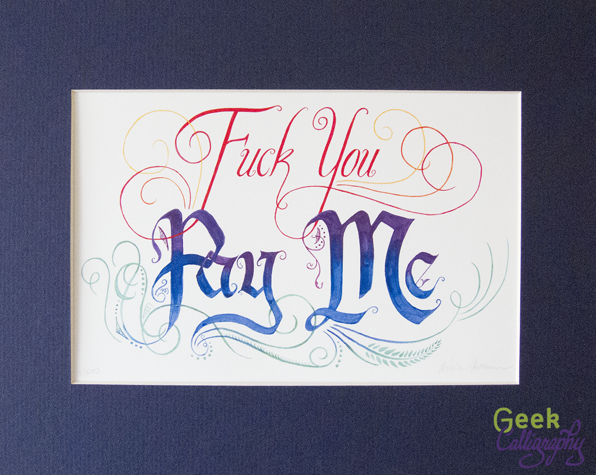
Sometimes profanity is required. When someone asks you to work "for exposure," for example. Or for "portfolio development." Or tries to haggle you down from your stated prices by trying to convince you that you're not actually that good.
Remind yourself to stand firm and insist on being paid what you are worth with this print. Beautiful letters and graceful flourishes deliver a blunt message with class.
Available in three sizes. All come with a blue mat and ship flat.
Highlighting Two Pieces of Awesome Work from Other Artists
by Ariela
Artists don't operate in a vacuum. Like any profession, we have networks and we bounce ideas off colleagues. We also create art in dialogue with our society, responding to our experiences and to what is going on in the world at large. Yes, sometimes we make things just "for the pretty," because it pleases our sense of aesthetics, but even then, our aesthetic senses are informed by our social conditioning. And the very best art is not only visually striking, it is emotionally and sometimes even morally impactful.
Here I want to raise up the work of two artists in the Jewish community who are using their art to hold Judaism to a higher standard of ethics.
First, from Jen Taylor Friedman (who is also my safrut (scribing) teacher):
The Intersectional Barbie Dream Minyan

Intersectional Barbie Dream Minyan points to the Jews who are still excluded, not intentionally but effectively, from our communities. Barbies of many different ethnicities, wearing tallit and tefillin, are having a Torah reading.
All the Barbies are wearing long denim skirts and three-quarter length sleeves. That's how I do Tefillin Barbies. They're also all wearing tallitot. One of the Barbies isn't wearing tefillin, and she's wearing a jaw-length sheitl. Perhaps she put her tefillin on before she left home, or perhaps she just doesn't do tefillin at this point in her life.
Some of the Barbies are Black, some of them are Brown. Some of them are tan, some of them are pale. Maybe some of them are Sephardic and some are Maghrebi and one is an adult convert and one was adopted and converted as a child. One of them has blue hair. One of them has red hair, and one of them has red highlights. Nobody in this minyan ever says "But where are you *really* from?" or "But surely you weren't born Jewish." Some of them are what Mattel calls "curvy." Some of them are short.
One of the Barbies has a white cane and dark glasses. You can't see her Braille siddur in the picture. She doesn't need it right now anyway because they're about to do hagbah. Another of the Barbies is sitting down because she has mobility issues and chronic pain. Another one has depression, and another one has hearing issues, but you can't tell which ones.
Two of the Barbies are married to each other. One of the Barbies is trans.
One of the Barbies couldn't afford a set of tefillin for herself, and the community helped out. Some of these Barbies didn't go to college, or were the first in their families to go to college. One of them works in construction.
All the Barbies are deeply conscious that they're all awfully young. The artist has not the skill to repaint Barbie faces to make them look older, nor to make their hair grey.
In principle, Kens are welcome in this minyan, but today they're outside fixing breakfast, which is why you can't see them.
Ten years ago, Jen made waves with the first Tefillin Barbie. For context, tefillin were historically worn by men only, barring notable exceptions. It is only within the past 50 years that women have begun wearing tefillin in any sort large numbers, and it is still rare, even in gender-egalitarian Jewish communities; putting tefillin on Barbie was quite the statement. She has gone through several different models since, including Computer Engineer Tefillin Barbie. Now that Mattel has put out Barbies with a greater range of phenotypes, Jen is once again pushing boundaries and making statements with Tefillin Barbie.
The image itself is striking, but what really makes it is the caption, which is just as much part of the piece as the photo. It combines accessibility with an explicit statement about the Jewish community and the need to live up to the ideals set forth in our own literature, from the Torah through the Codes.
Jen is also notable for being the first woman on record to have scribed an entire Torah scroll. She is always very meticulous to point out that others may have come before whose stories were not recorded thanks to the environments in which they worked. She is nearly single-handedly training an entire generation of gender-egalitarian scribes in the laws and skills of writing sacred texts, though she modestly downplays her own role in this work.
You can see more of Jen's work at HaSoferet.com.
Second, from Aaron Hodge Greenberg:
Black Lives Matter Wrapped in a Tallit

(Papercut art shows a black background with a classic white tallit with black stripes and the text BLACK LIVES MATTER on it. Below the text reads:
שכל המאבד נפש אחת מישראל. מעלה עליו הכתוב כאילו איבד עולם מלא. וכל המקיים נפש אחת מישראל מעלה עליו הכתוב כאילו קיים עולם מלא.
Translation: Anyone who destroys a life is considered to have destroyed an entire world; and anyone who saves a life has saved an entire world.)
This piece is beautiful, poignant, simple, and elegant. It's all there in black and white.
You can see more of Aaron's work at ArtistAviv.com
Lately it has been hard to talk about Black Lives Matter in a Jewish context without addressing the Movement for Black Lives statement re: the State of Israel. People are very incensed about it on all sides. I am not going to address the specifics of it here. But what I will say is that, even if the Movement for Black Lives statement makes you uncomfortable to the point that you don't want to associate with the movement, that is no reason to not to show by your actions that Black lives matter to you. As a matter of fact, I would say that it is all the more reason to do so. For example, Jen's Intersectional Barbie Dream Minyan does not use the phrase "Black lives matter," but everything about it is a statement of care about the quality of the lives of people of color (and other marginalized identities) in the Jewish community. (Note, this is not to imply any support or lack thereof on Jen's part for the Movement for Black Lives; I've never actually asked her opinion on it and have no idea what it is.)
Compared to my personal life, I don't talk all that much about social justice explicitly in my professional hat here at Geek Calligraphy. In many cases it wouldn't be appropriate, and this is a space to talk about art and geekery. But art and social justice are not entirely separate. Art is, at its best, about improving the world. Sometimes it is simply about providing something pretty that makes people happy. Sometimes it makes people uncomfortable and challenges the status quo. It is always a method of communication and always a matter of choices, conscious or unconscious. I salute Jen and Aaron for their skill as artists and their values as Jews and as human beings.
Manuscript Ketubah: The Research Behind the Design
by Ariela
I have a serious aversion to including design elements that mean nothing just to look cool. Whenever I put binary in a piece, it actually says something. I have done a custom piece with live Javascript forming the roots of a tree and two different ketubot with musical notation for the cantillation of the clients' favorite verses from the Song of Songs.
When I started working on the Mansucript ketubah art, I knew that there would be research involved. Illuminations have extensive symbolism and iconography associated with them, and I would no more pick and choose images for this design at random than I would include garbage code in a piece about programming - aside from pinching my own sensibilities, it would likely be most irritating to the target audience. Unfortunately, I don't have a lot of experience with the study of illuminated manuscripts. Sure, I look at them more frequently than the average person on the street, I'm a calligrapher. But beyond recognizing certain alphabets (what we now call "fonts") and artistic styles as being typical of certain eras and places, I don't actually know much. I certainly don't know enough about the symbolism to avoid accidentally putting something utterly inappropriate in the design. To the research-mobile!
Read MoreNew Product: Manuscript Ketubah
by Terri
Did you meet your future spouse at an event sponsored by the Society for the Creative Anachronism? Is one of you a medieval historian? Do you think having traditional Judaic iconography in your artwork is important? Then this is the ketubah for you!

Available in 4 texts.

How it Came to Be:
Ariela originally conceived this design to serve the Renfaire crowd. In our initial Google Doc (dating back to 2012), this design is listed as follows:
Book of Kells-inspired illuminated manuscript (dual-listed to fantasy)
look up really old ketubot and something properly medieval (Matthew* says “documentation”)
Once Ariela put pencil to paper for even the most preliminary sketches, she realized she needed to do some serious research. In addition, she realized that she also needed to change the time period of the art she was looking at to later than the Book of Kells. Especially because we wanted the potential audience to be as wide as possible, from any Fantasy geek couple looking for something that would be at home in $_EuropeanFantasyland all the way to historians without being an actual reproduction. After all, there is nothing for an historian quite like having a well-meaning loved one say "I got you this Olde Timey thing!" and to have it be tooth-gnashingly inaccurate.**
The all-English design and any design containing Hebrew are mirror images of one another. This is actually easy to do if you have scanned the artwork in first. We do not force Ariela to paint an entirely separate design for something like this. That would be cruel and unusual punishment.
The Manuscript Ketubah is available with personalization in our 4 standard texts for $375.
*Matthew is my husband, and many of our early ideas (SA's Oath, some of the greeting cards, some stuff you haven't seen yet) were run by him in the initial planning stages.
**For the same reason, any binary code you see on this website actually says something.
New Doodle: Michi vs. That
by Ariela
Today's doodle is once again brought to you by antics on Teh Interwebs.
Among her many hats, Michi Trota is Managing Editor at Uncanny: A Magazine of Science Fiction and Fantasy. Last Monday, Aidan Moher commented on Twitter:
Michi responded:
I found the mental image too charming to leave alone, so I quickly scribbled this:

P.S. You should definitely check out Uncanny Magazine, which is the only non-Puppy nominee for the Hugo Award category of Semiprozine in 2016. Michi is the first Filipina to be nominated for a Hugo Award. We're rooting for her and the whole Uncanny team this weekend!
A Cute Commission
by Ariela
Some commissions are easy. Some clients are wonderful to work with. Some projects are touching. And when you are very lucky, you get all three in one.
I was lucky like that recently. A fellow was referred to me who wanted to get a design done with the letter shin, his daughter's first initial. With a Hebrew name, she wouldn't be likely to find her name on commonly available novelty keychains, etc. and he wanted to get a design just for her. As someone else with a Hebrew name who could never get a novelty item off the rack, I was very taken with the project.
He suggested a few design elements he knew would appeal to her - a sun, butterflies, dinosaurs - but left the actual design entirely up to my discretion. These were the result:


He plans to print them on notebook covers and a tshirt for her. I really hope she likes them!
A Short Guide to Scribal Errors
by Ariela
The curse of engaging in a craft that many other people have done for centuries before you is that it is hard to come up with something original. But the flip side is that it's hard to screw up in a totally original way, too.
Calligraphy has been around for millennia, and basically any cock-up that can be done has been. Moreover, we have terms for them! And many of them are in Greek, because lots of them were made by monks copying bibles.
There are lots of ways to screw up writing a text. For now, I will only deal with the ones that arise from unintentional mistakes made while copying a text by looking at a reference document (called the exemplar). A different set of mistakes can be made if you are writing out a text that is being read to you, or writing from memory. I will also only deal with errors that occur in languages based on alphabets that are written horizontally; there is some overlap with syllabic or ideographic writing and vertical writing, but each does have their own pitfalls.
All examples below use the text of Frankenstein by Mary Wollstonecraft Shelley.
Haplography
This is when a scribe omits a chunk of text due to the eye skipping from one section to another. Dropping one letter by mistake is not haplography, it has to be more. There are several sub-types of haplography.
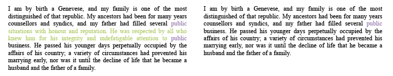
Homeo teleuton (also homeoteleuton): An eye-skip due to words or phrases having the same ending.

The word "child" is at the end of a phrase several times in this paragraph, leading to an eye jump from one instance to another. The text in purple is where the problem originates, and the text in green is omitted in the copy.
Homeo arcton (also homeoarchy): An eye skip due to words or phrases having the same beginning.

Here we have two sentences in short order that begin "There was a..." Jumping from the first to the second, we omit a bunch of text.
When the homeoarchy or homeoteleuton occurs at the beginning or end of a line, right up against the margin, it is a type of parablepsis.
Parablepsis is, according to Wiktionary, is "A circumstance in which a scribe miscopies text due to inadvertently looking to the side while copying, or accidentally skips over some of it." This is a bizarre definition, to my mind, as the punctuation seems to divide it into two completely disparate sets of errors: a) any type of error made due to looking to the side, or b) any omission of a bunch of text for any reason. I think a better definition would be "Haplography that occurs at the beginning or end of a line."
Here we have homeoteleuton that is also parablepsis: the word "public" appears at the end of two lines, and the eye skips from the first to the second.
Dittography
This is where you repeat a sequence. It can be anywhere in length from just a few letters to several lines, depending on how quickly you catch yourself.

Here we have a phrase duplicated. This sort of dittography usually indicates that the scribe's mind wandered in the middle of the line.
Dittography mostly happens when there is a repetitive element in the text, but every once in a while a scribe would just have a total brain fart and reproduce something for no apparent reason.

There's no obvious reason why the line in green was written twice.
It can also happen anywhere within a text.

This is an example of dittography within one word. "Possessed" is written correctly in the original on the left, but has an extra "ess" in the copy on the right.
Transposition
This is where you switch the order of things.
It can cover the swapping of letters in a word.

Here we have a simple letter-order swap. If you just had the copy text on the right, you would probably be able to figure it out.
It also includes the flipping of word order.

Two words are swapped around here. It makes some difference to the meaning of the text, but not a huge amount.
These are both fairly benign examples of transposition. The former is easily spotted and the latter doesn't change the text fundamentally. However, transposition can change the meaning of a text drastically if applied in the wrong place.

Changing the position of one word in this sentence changes its meaning completely.
As bad as this is, it can be much worse. English is a verbose language, and Shelley's writing style is flowery. In terse languages where word order matters (so not Esperanto, for example), moving a word around means greater disruption to the meaning imparted. In Hebrew, where words are generally shorter due to verb and noun constructs based on a three-letter root, swapping two letters can literally mean the difference between the words 'crisis' and 'meat' (שבר/בשר), 'evening' and 'hunger' (ערב/רעב), 'hate' and 'subject/thesis' (שונא/נושא). It is not always clear from context that a mistake occurred.
How to Prevent Scribal Errors
No matter how careful you are, it's almost impossible to copy out a text of great length without making any mistakes at all. In the 13 years I have been working as a professional calligrapher, I have only once written a text which my proofreader found to be completely without error. Fortunately for me, I do my calligraphy in pencil first, get it proofed, and then ink it after the corrections are made. (That's part of Terri's job.) Other scribes throughout history have not been so lucky. It is possible to fix a mistake made in ink, but the longer the mistake drags on, the harder it is. Also, errors of omission frequently don't leave enough room for fixing.
So the next time you see a tweet from us like this:
You'll know what happened.
New Product: Tech Serenity Prayer
by Ariela
On days when you need help remembering how to take a deep breath and not take a baseball bat to all the machines in sight, it helps to have this Tech Serenity Prayer at your desk.

How it Came to Be
As with almost all of my art, the inspiration for this piece came from something that happened to me. In my day job I do tech stuff for a non-profit. I describe it as "playing a programmer on TV" - I don't actually do any programming, but I am the admin of a bunch of the applications we use. Recently one crashed and burned in ways that I don't want to relive in the course of this blog post, but it was offline for an unconscionably long time. I've never heard Support use the terms "dangit" and "horrified fascination" in consumer-facing correspondence before.
Some time during this fiasco, I quipped that I needed a serenity prayer for tech problems. Then I realized that there was no reason I couldn't have one, I just needed to figure out if "a hammer" or "rm -rf/" was funnier. After a brief poll of some programmer friends, I decided to go with the latter.
In the tradition of feel-good text, I used a Copperplate hand to write it out, but I put it in white on a blue background to reference the classic Blue Screen of Death.
Prints are available in two sizes: 8"x10" for $30 and 11"x14" for $45 (matted dimensions).
What is it that I really do?
By Terri
My job title in this business is Manager, specifically Business Manager/Artist Wrangler. My personal business cards read "Knitting Instructor & Artist Wrangler*" But that's an incredibly vague term that conjures up images of Ariela in a Lasso of Truth and doesn't really describe what I do or how I learned how to do it.
I began working at The Judaica House in early 2006. Early on I was tasked with re-inventorying many of the special order items that they carry, such as personalized benchers** (yes, that's pronounced like the thing you sit on followed by the sound you use when you can't find a word), yarmulkes for imprinting and personalized ketubot from various artists (among them, Ariela's former employers). Over several years of employment, I developed relationships with some of the artists we carried and learned a whole lot about how the business works. The personalization form you fill out if you order a ketubah from us? It's a hybrid of the form I used to use at work and the one the Caspis use. My initial proofreading skills came from doing the final check on any ketubah before it went to the customer. And boy did I have to chase down a lot of rabbis. Why? Because before we would send the personalization information to any artist, that information needed to be verified by the wedding officiant.*** That led to me ranting to Ariela during May of 2009:
clearly, it must be wedding season
either that or Rabbi season, because all I seem to be doing is hunting them
Some time later, the following sketch arrived in the mail:

The giant kippah *really* makes this sketch. If you look carefully, you can see where Elmer used to be wearing a black hat.
[Image shows a pencil sketch of Elmer Fudd on the phone, wearing a kippah, holding forms. Text declares "Be vewwy vewwy QUIET. We'we hunting WABBIS...."]
So I amassed a set of incredibly specialized skills over the course of my employment (proofreading, how to get what you want from an artist without making them cranky, dogged persistence in tracking down officiants). I learned what sorts of designs appeal to the standard Jewish consumer vs. the geeky ones. And most importantly, I developed a deep and close friendship with an artist who wanted to start a calligraphy business.
I stopped working full time at The Judaica House in 2010. By then, Ariela was living in New York City and was steadily taking commissions for ketubot.**** I was her on-tap proofreader for these (I even did one over email), and we began to banter back and forth about Ariela quitting her day job. It was all pipe dreams, even in 2012 when we established that I would be the business manager. It wasn't until 2013 that I actually started doing Business Manager type things (mostly attempting to adjust unreasonable expectations from clients - something I still do).
But, you insist, none of this answers the question in the blog post title! So what is it that I do?
I proofread texts when possible (not being local to Ariela makes it trickier), answer wholesale inquiries, rein in Ariela's runaway impulses, respond to certain types of client inquiries, come up with product lines, track down phone numbers for licensing departments,***** make sure Ariela meets her deadlines, write many of our product release blog posts, serve as a sounding board, and generally act as the first line of defense for anything that keeps Ariela from being able to Do Art. I smile and nod at calligraphy details, keep our products within scope (and just slightly subversive), act as a font of completely useless knowledge, track down frames at thrift stores, make sure Ariela doesn't take on too much, tweet and share things on Facebook that are relevant to the business, and write long rants on our blog when fandom needs a good swift kick in the pants. Since that doesn't fit on a business card, you get Artist Wrangler instead.
*Unfortunately they went to print before I could get "professional killjoy" added to them
**Small prayerbooks or laminated cards containing the Grace After Meals and other assorted pre and post meal prayers for the Sabbath and Holidays.
***We ask for your officiant's contact information for this very reason (also, if we have any questions we can avoid asking you them during what is a busy and stressful time for you).
****Our friends did persist in getting married.
*****It's amazing how much easier it is to contact the people in charge of Star Wars licenses now that Disney owns Lucasfilm.