by Ariela
I get a lot of questions from people who are interested in learning calligraphy. They cover a range of topics, but a lot of them concern materials. So today, I am going to talk about pens.
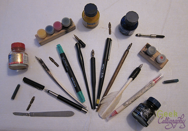
That's a lot of pens.
Like many things, there's no one right pen for all things. You need to use the correct tool for the job, and sometimes it comes down to a matter of personal preference.
I am going to go through the biggest categories of calligraphy pens and talk a little bit about what projects they are great for and what my favorite brands are.
Felt Tip Calligraphy Markers
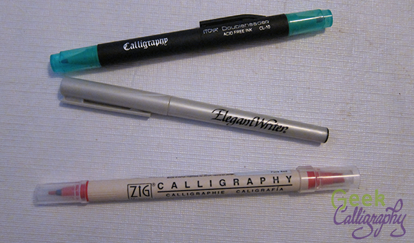
A very small sample of the number of felt tip calligraphy markers out there
What they are good for:
Felt tips are great for beginners who are just starting out. They don't require any sort of learning curve for care and feeding of the pen, the inkflow, etc., which frees the user up to concentrate on learning pen angles and strokes.
As markers, they require no maintenance beyond remembering to cap them when you're done. They come in a rainbow of colors and you can buy them in any art store and many office supply stores as well.
They are also nice for casual projects and for taking along when you need to go somewhere, as they are the least likely to leak.
What they're not good for:
Felt tips are not great at creating thin lines. For projects that require hair-thin lines, felt-tips are not your friend. They are also not good at subtle changes in pen angle and pressure. The line quality and ink density are also not great. Work you do with them may be prone to fading.
Ariela's Favorite Brands:
Zig makes a nice variety of colors and they have double-tipped markers, which I like very much for the two-in-one. But they are pricier than a lot of the other brands.
Cartridge/Fountain Pens

Several uncapped fountain pens with cartridges and a bottle of ink.
What they are good for:
A good fountain pen with good ink will give you the most consistent ink flow of any tool available.
Cartridge pens provide better line quality than felt tips, with good thick and thin. They also travel pretty well.
The roundhand nibs of cartridge pens tend to be fairly rigid. This may be a feature or a bug depending on your preference.
If you need to write a whole lot with the same nib width, and you will use the pen regularly, a cartridge pen is probably the best tool for the job.
What they are not good for:
These are not pens to buy on a budget. Note my first sentence about "good" pens with "good" ink; that means pricey. Cheap pens and ink may give you okay results, but they may also be made of fail. Buying ink in cartridges is an even more expensive proposition than in bottles, and refillable cartridges are not everyone's cup of tea, though I rather enjoy the process.
Good fountain pens also need to be bought from a specialty store. You cannot walk into Michaels or your local craft store and buy one. Chances are that you will find Sheaffer's and Manuscript, and believe me, they are made of DO NOT WANT.
Cartridge pens need to be cleaned regularly. If you use your pens at least every other day, you can get away with only cleaning them every couple of cartridge changes/refills, but if you only use it occasionally you should clean it after every use. Cleaning them can be pain in the tush. Leave them uncleaned for long enough, and you will probably need to replace the whole pen as many companies don't sell replacement parts individually anymore (though you can always check Ebay!).
As mentioned above, the roundhand nibs on calligraphy pens with cartridges tend to be pretty rigid. If you like a flexible pen or need to get variations based on pen pressure, this is the wrong tool for the job.
For my money, I hate grinding the nibs on cartridge pens, but your mileage may vary.
I find that the variety of nib widths offered by cartridge pens is much narrower than for dip pen nibs.
If you want to use lots and lots of colors, then you need to have lots and lots of pens, or be prepared to wait a long time between switches as you clean and dry your pen.
Ariela's Favorite Brands:
I am a loyal devotee of Rotring Art Pens, though they have been cutting down their calligraphy line of late. 0.6 nibs are no longer to be had for love nor money, and 0.9s are only available on Ebay once in a blue moon. I like Rotring because they give good inkflow for a fairly inexpensive pen (by fountain pen standards), and they disassemble completely, which makes cleaning them - and especially drying out the parts afterward - much easier than the ones that don't break down so fully.
Unfortunately, my next favorite brand, Osmiroid, is no longer in production, though there are plenty of them floating around eBay. It's a workhorse brand with good value for your money. In the debit column, their nib and feed don't separate from the grip, which makes them harder to clean. However, the barrels of Osmiroid pens are shorter than the Rotring pens, which means they feel better in my hand.
Dip Pens
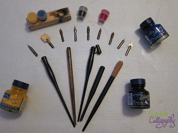
Just a few of the options available for dip pen nibs, pen bodies, and ink.
What they are good for:
If you want a variety of options, dip pens are the go-to. You can get nibs in so many sizes and shapes you may experience decision paralysis. Want roundhand nibs? Spoon nibs? Poster nibs? Copperplate nibs? Left-hand nibs? We have all those and more in a variety of sizes and flexibility.
Dip nibs are the most responsive to subtle changes in pressure and angle, and they have the widest thick and thin range. Some are more responsive than others and you can get a nib that is as responsive to pressure as you personally like.
Many, but not all, nibs are interchangeable, so you can also customize your pen experience a lot. You can pair any number of nibs with any number of pen bodies, and you can even alter an existing pen body or commission a new one if you really want something super special.
While the volume of nibs to buy can add up to a significant price tag, each nib is pretty cheap and there are very affordable pen bodies, making dip pens a very affordable option.
Ink is available in a rainbow of colors, which you can switch between easily with just a wipe of a cloth.
The pens need to be cleaned after each use, by which I mean dunked in water or a pen cleaner and then wiped off thoroughly. Don't put your nibs away wet. That's all.
What they're not good for:
There's a steep learning curve for dip pens. You don't suddenly switch from felt tips and ballpoints/biros to a dip pen without a serious adjustment period. In my opinion this is a skill well worth the time and effort, but beginners, you have been warned what you are getting yourselves into.
Ink can be blobby and distribute unevenly between a freshly dipped pen and one that needs to be dipped again. This gets easier and less apparent the more experienced the user, but it will never be quite as regular as a good cartridge pen.
If you have to write a large amount in a short amount of time, the time spent turning to dip the pen in the ink is wasted motion. If you are in a hurry, this is probably not the best pen for the job.
Ariela's Favorite Brands:
For broad nibs, I adore Mitchell roundhand nibs. But I am in the "bendier is better" camp. For those who like an inflexible nib, I hear that Brause is the go-to. Some of them also have built-in reservoirs, if that's your jam (it is most definitely not mine). If you are new to calligraphy, you may need to try both to figure out what you like.
I am brand agnostic when it comes to spoon nibs, G nibs, and EFs. I have some Hunts and some Speedballs that I quite like, but I have been itching to try out Leonardt brand as well as some of Brause's bendier nibs like the Blue Pumpkin.
Quills

Ariela's quills and equipment.
What they are good for:
Even moreso than metal nibs, quills are flexible, customizeable, and responsive to subtle shifts in pen angle and pressure. When used skillfully, a quill will yield a line quality like nothing else. Since each quill is cut and re-cut multiple times, you get to cut it in just the way you like, with the angles that you like, and the ink channels the way you like them.
If you are looking to do historically accurate reproduction or reenactment, quills are very probably what you will need (unless you are looking to mimic a time and place where reed pens were de rigeur).
What they aren't good for (aka, all the reasons we no longer use quills much):
Quills wear out quickly. If you are writing a lot, you may need to re-sharpen your quill multiple times daily. They can be touchy about humidity levels, causing the tines to split annoyingly along the ink channel in dry temps.
Cutting quills is a whole separate skill set from writing with them, but unless you are part of a large operation where you have a dedicated quill cutter, you really cannot write with quills without learning to cut your own, which is also time-consuming and frustrating. Hint: if you had been part of one of those large operations, you would never have been allowed to progress to writing without first learning the grunt work of cutting quills.
As mentioned above, quills are very responsive instruments. This means that if you don't have a lot of experience and fine motor control, they can respond in ways you wish they wouldn't.
Quills can be annoyingly narrow to grip. It is simply not comfortable to firmly grasp something that small for a long period of time. After trying out several different fixes, I solved this issue by making grips out of Sugru, but goodness only knows what the scribes of yore did.
Ariela's Favorite "Brands:"
So far I have only worked with turkey feathers, but I hear goose feathers are better for tiny work, so I should get some of those for my mezuzah work (letters on mezuzot are teeny!).
Reed Pens
I don't actually use them at all, so I don't have any recommendations here.
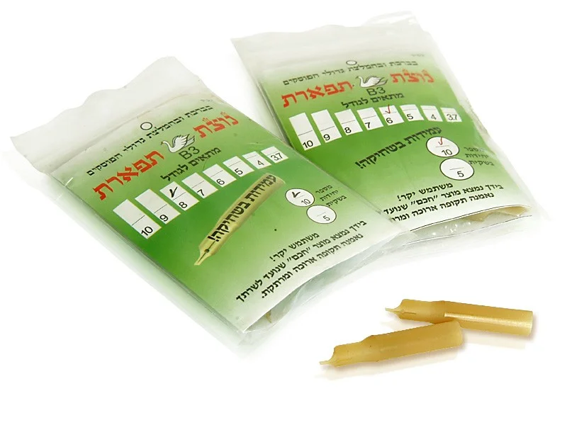
Image from MerkazHasofrim.com
Plastic Nibs
What they are good for:
Yes, they are a thing that exists.
I have never heard of these being used by anyone except Torah scribes. It makes sense: they want something they don't have to shape themselves, but can't use metal because, aside from Kabbalistic squeamishness about using metal other than gold in the production of a Torah, safrut ink literally eats through metal nibs.
What they aren't good for:
I haven't actually ever tried one of them, but I cannot imagine that they are better than metal nibs for anything (except not being eaten by safrut ink).
Where To Buy Good Pens
If you want to buy pens in person, Dick Blick/Utrecht actually stocks a decent selection of nibs in-store. They also sometimes have Rotrings, so definitely check them out.
If you have a local stationers, they may have good pens, or they may not. The older the store, the more likely they still stock good pens. Call or go in and look, but be prepared to come away empty-handed.
If you are shopping online, I cannot recommend John Neal Booksellers enough. If you are ready to take the plunge into buying parchment for something other than Jewish holy texts (which have a bunch of extra requirements), try Pergamena.
A Note on Inks
Ink behaves differently at different temperatures and humidities. It is also a matter of preference. I have a strong liking for Winsor & Newton brand ink, but I know other calligraphers who swear by Higgins, which I cannot abide. You may need to buy a bunch and try them out. And the ink you like best in the summer may not be the one you like in the winter.
A Note on Papers
A lot of your writing experience is determined by the paper on which you are writing. Even a great pen will not make writing on crummy paper much better. If you aren't having any luck with any pens, it might be time to try a different paper.
When not writing on parchment (real parchment, the kind made from animal skins, not the paper that gets called parchment by art stores), I like writing on Bristol, which is fairly inexpensive and doesn't bleed much.
Any Other Questions?
You can always ask me on Facebook or Twitter. As long as I have time, I am happy to chat about the tools of the trade.