by Ariela
This is the second in a series of three blog posts on the making of the Penric's Demon Illuminated First Page art print. Read the first part here.
While I have done plenty of text and illumination work before, this was my first time trying to for the style of a page from a medieval codex. When creating ketubot and other similar commissions, I tend to paint the images first and then calligraph the text in the space I left for it. But for this project I decided to follow the order of operations used to make medieval manuscripts: text first, then images.
Of course, unlike medieval copyists and illustrators, I got to work in pencil on a first draft before moving to create the final piece. (Paper culture is kind of awesome. So is the ability to proofread before you work in ink.)
While the two manuscripts I used as my models featured 40 and 36 lines per column respectively, I was making this as a display piece, not an actual book page, so I decided on just 25 lines per column, or five times five, for a nice, theologically significant number in the 5GU.
The next question was which alphabet to write in? As mentioned in the previous post, I decided on a Blackletter hand to capitalize on the association with Olde Stuff, but there are lots of different alphabets within that family. Unfortunately, the very feature that made Blackletter such a desirable hand for medieval scribes - its compact consistency - made it difficult for me to use here. The consistency means that it is very hard to fudge around if you need to stretch or contract letter width or spacing to equalize lines with different numbers of characters. I quickly settled on a Fraktur variant because it was looser than most of the other versions and would be more forgiving if I had to stretch it a bit to justify the text.
Speaking of justifying the text, that wasn't always nearly so much of a thing as it is now. Unsurprisingly, when you write everything out by hand, in ink, no draft, it's hard. Neither of my two primary inspiration documents use it, though BL Royal MS 20 D I at least made an effort.

Histoire ancienne jusqu'à César, c. 1325-1350 CE
BL Royal MS 20 D i fol 2r
The lines are at least similar widths.
So what did a medieval copyist do when they started a word and realized too late that it wouldn't all fit on the line? They moved to the next line. Some just finished on the next line, paying no attention to the line break in the middle of the word. Some would start the word again from the beginning on the next line (this was the most common practice in Hebrew manuscripts).
In the opposite case, where a copyist realized ahead of time that a word wouldn't fit on the line, sometimes they filled the extra space in with designs. Sometimes they just left the whitespace alone.
Unfortunately, letting the lines vary widely in width, continuing words from line to line, or re-starting words on the next line are none of them arrangements that will really fly in a world that has become accustomed to the magic of computer-based text layout. Despite the comparative flexibility of Fraktur, it doesn't stretch enough to allow for perfect justification. Neither of my primary inspiration manuscripts filled in dead space with squiggles. I decided that, if I could fit three letters of a word on the first line, I would use a hyphen and break the word, as I could expect modern audiences to at least recognize and understand that convention.

Early stage draft of "Penric's Demon" Illuminated First Page, photographed in terrible light on a cell phone.
While laying out the text, I realized that my initial plan of illustrating the bottom of the page with an image of Penric kneeling by the stricken Ruchia would not work. The text on this page doesn't get that far, and while illustrations don't always correspond exactly to the text of the page, that was just a bit too far removed to work conceptually. So I changed the plan and decided to portray Penric following Gans as they ride out from Jurald Court to Pen's betrothal ceremony.
Thus followed much research into horses in medieval manuscripts. Oh, the horses.

Apocalypse glosée, c. 1240-1250 CE, BnF Français 403 fol. 8v

MS Ludwig XII fol. 47v
I know that horse breeds common to Europe at this time had more arched necks than the horses I am accustomed to now, but looking at those pictures made me want to scream at the riders to ease up on their reigns.
Others, though, just made me want to scream.

Sigenot, c. 1470 CE, Cod. Pal. germ. 67 fol. 15r

Lutrell Psalter, c. 1325-1340 CE, BL Add MS 42130, fol. 163r

L'estoire del Saint Graal, c. 1316 CE, BL Add 10292 fol. 213r
I finally chose these two as my main models for Penric and Gans' horses, though I dialed back the decorations on the tack, as Jurald is an impoverished lordly house. I also did a bit of smoothing of the silhouettes to make them prettier to the modern eye.

Apocalypse, c. 1260 CE, BL Add MS 35166 fol. 8r

Codex Manesse 73 r Zurich, c 1300-1340 CE
I modeled Gans after the rider in the first picture, removing the scales to allow his hand to gesture back towards Pen to tell him to "pick up the pace." Penric was more difficult. He's supposed to be wearing a suit with matching jacket and trousers, but none of the manuscripts I was already looking at depicted anyone in a doublet. The ones I did eventually find were much later, which wasn't a problem with historical accuracy, which is a meaningless concept for a fictional world, but the style clashed with my primary models and consistency does matter in worldbuilding. In the end I just kind of winged it.
With Penric and Gans departing toward Pen's betrothal (or so they think), they needed somewhere from whence to depart. Jurald Court is wooden structure, rather modest compared to Castle Martenden. "Large, sprawling, fortified farmhouse" it might be, but in visual shorthand, that meant that I needed to make it rather simple. Unfortunately for me, my reference manuscripts weren't big into simple structures in their illustrations.

Royal MS 20 D I fol. 6r

Royal MS 20 D I fol. 35r

Royal MS 20 D I fol. 16v

Royal MS 20 D I fol. 22r
Eventually I found a picture of an old, simple tower in a wall and used it as a vague inspiration. I also elected not to use the blues and purples in my reference manuscript, assuming it would become a "Tiffany Problem." ("Tiffany Problem" is a term coined by Jo Walton, referring to the tension between perception of history and historical record. Tiffany was a woman's name in medieval times, a variant of Theophania, but if you name a character in a medieval setting Tiffany people will say it's unrealistic.)
Here are two process pictures of the draft version, which was done on drawing paper with a 2B pencil.

Photo of the mostly complete draft.

Finished draft.
Once the major pieces were all in place on the draft and worked out to a reasonable degree, it was time to move on to the final piece.

Penciling in the text first.

Full pencil in place.

Starting to ink the text.
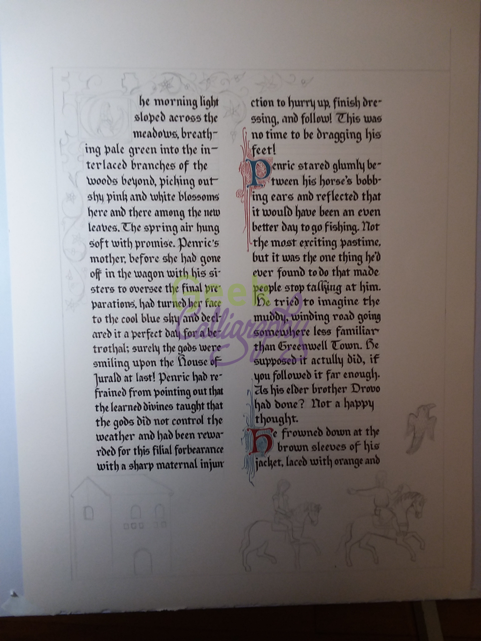
Embellishing the initial letters of the paragraph breaks.
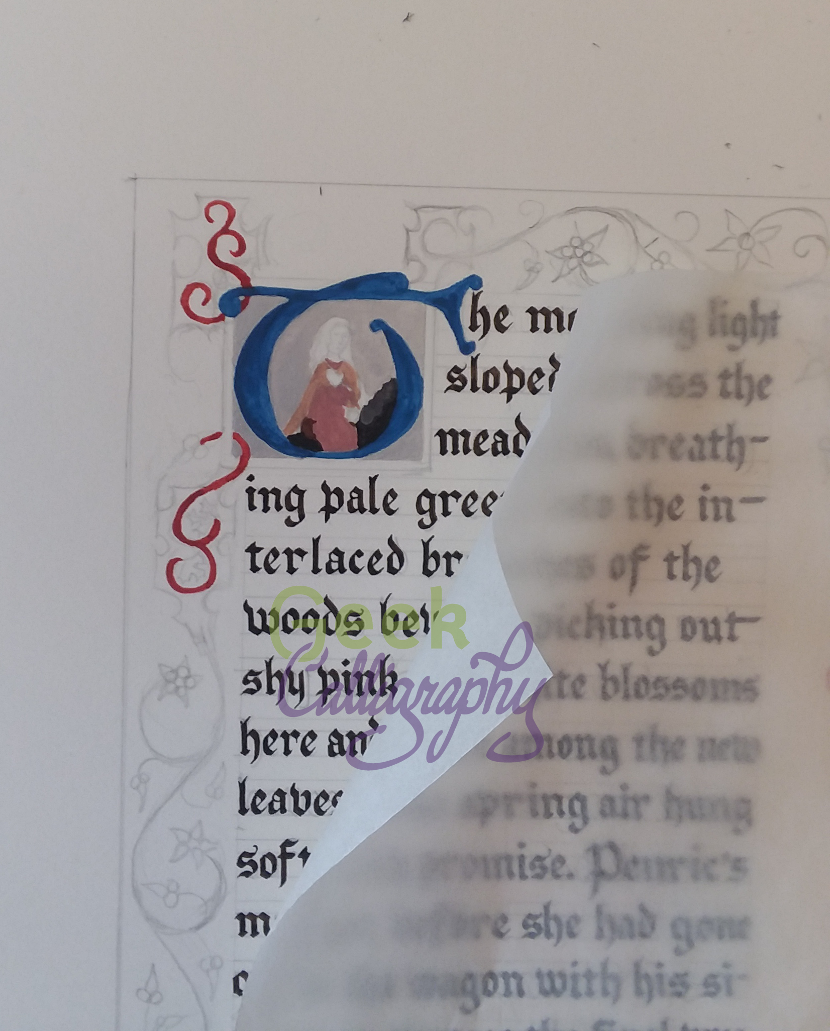
Underlayers of the historiated initial. I covered the rest of the paper with waxed paper to protect it.

Painting in the vines.
And then it was done!
We're off next week for Shavuot and then Terri and I are off to WisCon, so in two weeks I will explain some of the symbolism behind my artistic choices.
Go back: Part 1: The Artistic Framework
Go forward: Part 3: Symbolism