My Garden, Let Me Show You It

by Terri

A collage of washcloths, tawashi,* and a bath mat in progress

A collage of washcloths, tawashi,* and a bath mat in progress

The tail end of winter in Boston can drive me a little nuts. The weather gets warm, then cold, then it dumps a whack of snow on you in mid-March. I cope with this in one of two ways. Either I start a bunch of knitting projects, or I start some seeds. This year, I went on a washcloth knitting binge AND started 5 small trays of seeds.

I'm an incredibly amateur gardener. I pretty much choose seeds based on "will the resultant plant produce edible food" and "will that food look pretty.**" Hence my ordering of purple basil seeds, choggia beets, three different colors of cherry tomato, and multiple colors of pod beans & snow peas. My garden is run on the principles of watering when I remember to and fertilizing sometimes. I'm usually really good about starting seeds and shepherding them to seedling stage, then getting them into pots. Typically, small animals will get the seedlings, then I go to a nursery and buy bigger ones. Eventually, the plants will produce very small amounts of fruit or vegetables, which we will eat as they are picked. 

I'm trying a little something different this year. I'm being helped by the prolonged cold snap, as I can't actually plant out any of the seedlings that are trucking along on my office window. I'm trying to leave the seedlings indoors as long as possible, to ensure that robust plants are what go outside. Also, it's nice to have some green in the office.

So here's my garden. I'm hoping to enjoy it more in the coming months:

Incredibly shaky panoramic image of all the seedlings on the windowsill. There are cucumber, squash, pea, tomato, shallot, carrot, scallion, beet, various herb and flower seedlings poking up their heads.

Incredibly shaky panoramic image of all the seedlings on the windowsill. There are cucumber, squash, pea, tomato, shallot, carrot, scallion, beet, various herb and flower seedlings poking up their heads.

Close up on the pea seedlings. I have a feeling that these will do just fine, and that they'll be accompanied by some wonderful friends. There's also a cucumber seedling.

Close up on the pea seedlings. I have a feeling that these will do just fine, and that they'll be accompanied by some wonderful friends. There's also a cucumber seedling.


*Tawashi is the Japanese word for small cotton cloths used for face cream and makeup remover. I'm trying to knit my own and thus not need to go through throwaway cotton pads.

**Seed catalogs are my nemesis. 

Visitor Friendliness and Hostility: On Airports and Disneyland

by Ariela

My geekery takes a lot of forms. I like things that are considered culturally geeky: comics, SFF, etc. I also have a day job in tech. But today I want to geek out about something I haven't spoken about much on this blog: usability.

In between aspiring to be a professional artist when I was a child and then circling back around to actually become one as an adult (with an ongoing dog-leg into non-profit technology), I spent my high school and college years wanting to go into exhibit design for history museums. This meant that I spent some time learning about visitor flow in physical spaces as well as in websites.* Since I spent a week in London recently, I thought a lot about usability in the real world, between doing touristy stuff at historic sites and museums and flying in and out.

Heathrow security prep station. This photo is from futuretravelexperience.com. I did not get my own as I didn't want to hold up a line by taking photos.

Heathrow security prep station. This photo is from futuretravelexperience.com. I did not get my own as I didn't want to hold up a line by taking photos.

Let me say, for all the terrible things that people say about Heathrow, I found it quite visitor-friendly. Before going through security, they have preparation stations set up. They're little counters where you can sort your stuff out. They not only have trash cans, they also have designated receptacles where you can dump liquids out of your bottles, and they have plastic bag dispensers for your small liquids. At security itself, the bins are bigger than in American airports. Not only that, but instead of having carts of them at the head of the line, the empties are returned to the start point by gravity rollers underneath the conveyor belt that brings the full ones through the screener. They had security personnel at each conveyor belt assisting you. Oh, and you get to keep your shoes on. It not only made the onerous process of going through security rather less terrible, it also made it faster, so there wasn't much of a wait.

This image of dense crowds at an airport is from TravelAndLeisure.com. Sure looks leisurely to us. Oh wait, no it doesn't.

This image of dense crowds at an airport is from TravelAndLeisure.com. Sure looks leisurely to us. Oh wait, no it doesn't.

Contrast this to an American airport. There's nowhere convenient to prepare to go through security. There's nowhere nearby to dump liquids, which means that the person who inevitably forgot to empty their water bottle has to run back to find someplace, holding up the line. They certainly don't provide plastic bags for small liquids either. No one assists you as you prepare your stuff to go through the screener - the security personnel near that side of the conveyor belt tend to walk around shouting reminders to put your laptop in a bin by itself, etc. There's no automatic return of bins, so that can be another holdup. It's not actually designed for maximum inefficiency and misery during the process, but it seems to come close. Nobody likes being in an American airport, and security is everyone's least favorite part.

Water fountains for people of all heights in California Adventure.

Water fountains for people of all heights in California Adventure.

If I had to name the opposite of an American airport, I would choose Disneyland. I went to Disneyland for the first time in September 2016, and I was blown away by the user-friendliness of the place. A lot of this was just because it was actually designed with the idea that people who aren't adults have a right to be accommodated. There were changing stations in all the bathrooms, usually multiples. Water fountains came in several different heights. As an adult who needs shoes to see 5' tall, believe me, there's a difference in the comfort of seats designed for multiple heights and ones designed for the average adult. But a lot of it has nothing to do with children.

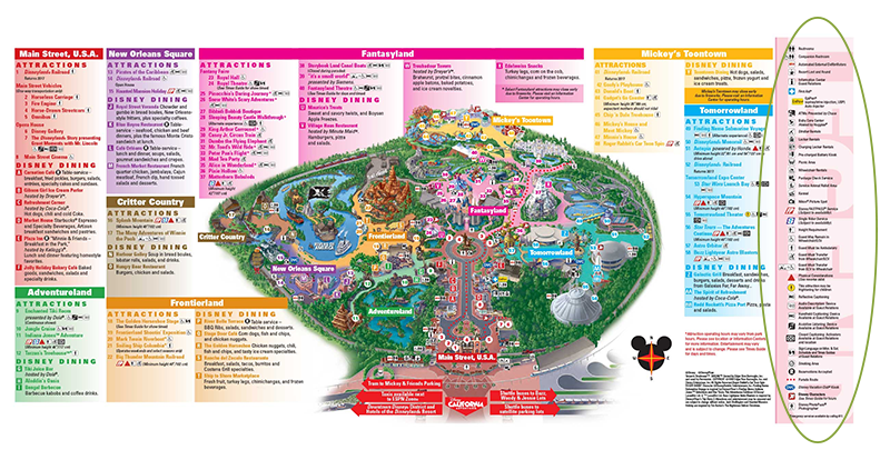
I can't speak to the actual accessibility of Disney for people who are vision, auditory, or mobility impaired, but I sure noticed all the notations on the map about accessibility, pictured below. The fact that it was there up front, as opposed to having to go looking for it to learn about it, impressed me quite a bit.

Map of Disneyland with a legend on the right highlighting ALL THE SERVICES. Click to embiggen.

Map of Disneyland with a legend on the right highlighting ALL THE SERVICES. Click to embiggen.

This is a text payphone! How cool is that? So necessary for anyone hearing impaired who doesn't have access to a cell for whatever reason!

This is a text payphone! How cool is that? So necessary for anyone hearing impaired who doesn't have access to a cell for whatever reason!

Disposal cans at Main St. USA

Disposal cans at Main St. USA

The trash cans are a thing of Disney lore. Websites give conflicting stats, usually citing either 20 or 30 steps maximum between trash cans. I didn't stop to count it out - my poor spouse had to wait for me to take pictures of them, I suspect neither he nor the other visitors would have appreciated me stopping to measure out paces between each of them - but they appear at much shorter intervals than I have ever seen trash cans anywhere else. The same websites cite Walt himself as instituting the policy of so many trash cans as part of lowering the bar to guests throwing out their rubbish properly. I suspect that we don't see this outside of Disney not because institutions are not interested in lowering the bar to using trash cans but because of how many staff hours it would take to empty that many cans. Space might also be a consideration, too, as who wants to give that much footprint to trash cans?

One type of space that the trash cans at Disney don't take up so much is visual space. They are incorporated into the decor of the attraction, so they don't stick out as utilitarian, they're part of the experience and novelty. The other place Disney does this really well is in the waiting areas to get into rides. Like airports, Disney hosts people who inevitably spend a large amount of time waiting in lines. However, unlike airports, Disney tries to make this wait time as pleasant as possible, and they dress the waiting area in decor matching that of the ride, essentially trying to make the wait itself part of the ride, too.

Of course, airports can't make your wait more entertaining by making the waiting resemble being on an airplane because the vast majority of fliers are far more interested in their destination than the ride. But there are definitely things they could do to make the wait, and the ride less miserable. Unfortunately, there's no incentive to do so. People don't pay to use airports, they pay the airlines, and no airline is going to spearhead improvements in the general airport when they won't inspire anyone to fly with them more often. In fact, there's incentive not to improve, as that "calculated misery cost" is what causes people to pay for things like TSA PreCheck and visitor lounges. Ditto coach vs. First Class on the planes themselves.

There isn't really a point to all this rambling, except to say that user-friendliness has a lot of aspects and that they can make a huge difference to our experiences, even for something as simple as waiting in a line. Necessary but unpleasant experiences can be mitigated by user-friendliness, while good experiences can be enhanced; conversely good experiences can be soured by user-hostile environments and bad ones are transformed from annoying to miserable. This is true on the web as well as in the real world, but I rarely see people comparing the two outside of niche interest sites.

So next time you have a really unpleasant experience somewhere, ask yourself if there's something that could be done to make it more pleasant. If possible, give feedback on it; few places are as user-hostile as airports, and many want to make themselves more welcoming.

*If you ever see me in a museum exhibit, you may find me staring at the ceiling to check out their lighting configuration, or critiquing the layout of object labels.

New Product: All Others Must Bring Data

by Terri

Have you been feeling frustrated by people who think that the plural of anecdote is data? For that matter, do people that can't correctly conjugate the plurals around the word data make you cranky? Then you're probably the target audience for this print.

In God We Trust All Others Must Bring Data - Art Print from Geek Calligraphy

How It Came To Be:

Both Ariela and I are quite concerned about how established scientific fact is currently being maimed and mangled to fit current political needs. That's not what data are for. A friend suggested we might do a print based around a quote attributed to Galileo, but it seemed too obscure to convey what we were feeling. Instead, Ariela picked a pointed quote attributed to W. E. Deming.

The graphs and spreadsheets in the background are all from Kaggle, a crowdsourcing platform for data-mining and analytics. As such, Kaggle is an enormous library of publicly available datasets, covering everything from Aviation Accident Synopses  to Dogs of Zurich to the Anime Recommendations Database, and many that are much weirder or more depressing. Also an enormous amount of data about Pokémon.

Which dataset is featured here? Why, the metadata on Kaggle usage! It's data about data, for a lovely, self-referential, navel-gazing loop. How are we presenting it? Honestly, our presentation here is nonsense, with graphs made out of data that show no particular results and spreadsheets juxtaposed just for the heck of it. This probably seems like an odd decision to make here of all places, particularly from an artist who makes much hay about the fact that she doesn't put nonsense text, binary, or even musical notation into her work.  It is there as a commentary on Deming's quote, to act as a caveat. The artful rearrangement of the data into pretty but meaningless patterns reminds us that data is only useful if we know how to analyze it well. If we don't, at best it is noise, and at worst it can lead us to conclude that ice cream causes drowning.* The Deming quote is pithy, but the truth is always more complicated.

This print is relevant for many situations, whether encouraging good decision-making at work or screaming at politicians and talking heads on the news. It is available in two sizes, 8" x 10" and 11" x 14" (matted dimensions) for $35 and $45 respectively.


*This is a famous example of "correlation does not imply causation." As ice cream sales increase, so do drowning deaths. Turns out both are just more common the hotter it gets. 

Be Back on Wednesday...

by Terri

Image shows 5 Mardis Gras** masks over many strings of beads.

Image shows 5 Mardis Gras** masks over many strings of beads.

Ariela is making her way back from London and I have just thrown my very first Purim seudah.* Thus, a short blog post accompanied by festive graphics and a slightly hung over Artist Wrangler. We will be back on Wednesday for March's Product Release!

Somebody get me two aka-seltzer and an economy size bottle of Advil....


*The festive meal that we are commanded to have on the holiday of Purim. Traditionally one invites friends to partake in copious amounts of food and alcohol. There were certainly both in abundance at my table.

**While Purim isn't precisely analogous to Mardis Gras, the mask is a recognizable symbol of the holiday, and Mardis Gras has a similar amount of festivity.

Fun with Quill Grips Part III

by Ariela

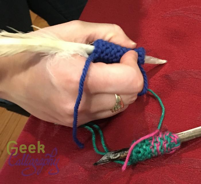
Quill grips knitted by Terri

Quill grips knitted by Terri

Back in May I wrote about the discomfort I was experiencing as I started to write with a quill due to the shaft being narrower than was comfortable for me to grip. Terri knitted two quill grips for me to use, proving that she is a wonderful manager and best friend and sometimes just as inclined as I am to do weird stuff just because the idea is there.

Alas, I discovered I have a tendency to get ink on them. And when you get ink on yarn you are gripping firmly, it comes back out. Sometimes I just got it on my fingers, sometimes it dripped, and sometimes it gooshed out in truly unfortunate ways. No photographic evidence of this part exists, because whenever it happened I was occupied with grabbing for blotting rags rather than reaching for a camera. I refuse to attempt to recreate it for the interwebs - I have some dignity to maintain.

So I turned back to the Rainbow Loom grip that I made. It is significantly less comfy than Terri's knitted ones, but rubber bands have zero absorbance, so I just wiped it off whenever I got ink on it. It did not get quite as sweaty as I had feared it would, but the knobbiness got to be a problem if I wrote for more than an hour.

Around the same time that I was inspired to upgrade my nib organization, I was similarly inspired to look into solving the persistent irritant of my quill grip. I knew that what I really wanted was molding rubber, but that I also didn't want to deal with making a mold. Fortunately for me, other people have also had a similar desire, and some time spent googling around introduced me to Sugru.

I ordered some Sugru and after a number of delays I finally got it. Based on all the images and gifs I have seen of people putting it on wires and showing how bendy it is I assumed it would have a decent amount of squish to it after it cured. Between the formulation of that sentence and the photos of people using it to hang pots on the wall, you have probably guessed that this did not turn out to be the case. Yet somehow I failed to reason that out. So I wrapped the entire packet around it in an effort to increase the girth of the quill as much as possible to counteract the assumed squish. Turns out, Sugru is only bendy when small amounts are wrapped around other things that are bendy. When you wrap a chunk around something that doesn't have a heck of a lot of give to it, it's pretty solid.

The new quill grip made out of black Sugru. I chose black so that it won't show any staining from the ink.

The new quill grip made out of black Sugru. I chose black so that it won't show any staining from the ink.

I've been busy with other projects since I did this, so I haven't had a chance to test out the new grip for an extended period, which is always the proving ground. I may trim it down, or I may use another packet to make a narrower grip, perhaps with a bit more contouring, though I have never been a fan of those super-contoured pencil grips they make. But I think that Sugru is probably the solution I have been looking for.

Upgrading Nib Organization

by Ariela

When I feel like I cannot control what is going on in my life, one of my coping mechanisms is to clean and organize. Clutter makes me tense, and it acts as a good proxy for things I cannot actually control. Last year, during a particularly bad couple of weeks at work, I labeled every ten-inch span of the shelves in my pantry.

A few weeks ago, inspired by I am not sure what, I decided that I needed to upgrade my nib organization system. I mean, I know why I needed to improve the situation, I'm just not sure what prompted me to decide that now was the time that it needed to be fixed.

 This was my old organization system:

One box with slots, seven little envelopes, three little plastic bags, and one box labeled "random nibs" with utter chaos inside.

One box with slots, seven little envelopes, three little plastic bags, and one box labeled "random nibs" with utter chaos inside.

The plastic case with the different slots for 10 nibs, a piece of magnet, and reservoirs, was originally a set of Manuscript nibs that I bought years ago in a state of naivete. (I have since learned that I hate Manuscript everything, from their nibs to their cartridge pens.) I moved the Manuscript nibs somewhere else and put my primary set of nibs, right-handed Mitchell Roundhand nibs from John Neal Booksellers, in there. It's not space efficient, but it meant that I could find the correct size nib easily.

Not so for the rest of my nibs. My left-hand Mitchell nib set, used for certain Hebrew hands that require a different pen angle, I continued to keep in the little envelope John Neal sent it in. Every time I wanted a nib, I had to dump out the entire set and sort through them to find the right size. Ditto my backup sets of nibs for both right and left Mitchell nibs. All my other nibs were jumbled together in a small box held closed with a rubber band.

I thought about trying to get more cases like the one my Manuscript nibs came in, but it's not particularly space efficient.

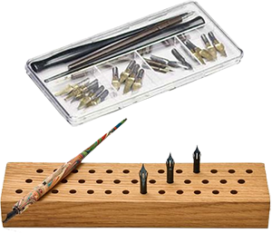
The two nib organizers that don't meet my needs.

The two nib organizers that don't meet my needs.

So I googled for "pen nib organizer." I came up with surprisingly little. Artbin has a container similar to the Manuscript one, but it has several compartments in which to put multiple nibs, which would still require a bunch of sifting through a bunch of nibs to find the right one. There was also an Etsy listing for a block of wood that would store the nibs pointing upright, perfect for stabbing yourself when trying to get the next nib over. But the second image result led me to this blog post from Studio Chavelli.

So over the following weekend, I made my own. I continue to be terrible about taking process photos, but here is my finished Nib Organizer Wallet:

Head-on view of the new nib organizer wallet, with my hand

Head-on view of the new nib organizer wallet, with my hand

Side view of the open nib organizer wallet

Side view of the open nib organizer wallet

The first two rows or "pages" of nibs are both Mitchell Roundhands, righty nibs in front with the yellow paper, lefty second with the purple paper. The two remaining rows behind are both covered in white paper and contain my Brause poster nibs, a selection of Hunts, aka Speedball, and two random singletons with space for more at the back. Each is labeled, but the color and order tells me at a glance what is where.

The inside of the organizer is all corrugated cardboard, but I wanted the outside to be more durable. I used a different kind of cardboard that is much denser but also thinner and taped both a front and a back on just like extra pages. I added two additional pieces to create a top flap that lapped the front over. I covered it with some tan pleather I had lying around, gluing it in place with PVA glue. Then I cut a small notch in the front of the outside cover so that I could settle the socket half of a large snap in place. I then sewed the snap down with doubled button thread. I used a piece of durable blue fabric leftover from a bookbinding project to cover the inside of the front cover; cut it to size, pinked the edges, and then glued it into place with PVA. The blue cloth covered up the edges of the pleather and the ugly side of the stitches on the snap socket.

I cut a piece of the same blue cloth to cover the inside of the back cover next. I sewed the stud half of the snap to that fabric before pinking the edges and gluing it into place to keep from having to sew through the cardboard and leave the stitches showing on the other side of the pleather. I glued the pinked fabric with the snap sewn in to the inside of the back cover with PVA. And that was it.

I brought the new nib wallet with me to Capricon where I was doing some art demos. I could tell when a fellow dip-pen user walked by because they would stop and goggle at the open nib wallet next to me. I got nearly as many exclamations over the nib wallet as I did over the calligraphy in process. Clearly I am not the only one who has felt the absence of such an item in their life.

All Art Is Political

by Terri

"At this point, assume all art is political unless proven otherwise" ~ me

Image is text that reads "Assume all art is political until proven otherwise. Then question that proof."

Image is text that reads "Assume all art is political until proven otherwise. Then question that proof."

I'm angry a lot these days. I'm angry at the government, I'm angry at everyone who doesn't understand just how dire the situation is. But a special sort of anger is reserved for people who are angry at artists for daring to be "political."

You know those people. The ones who can't stand Meryl Streep's acceptance speech at this year's Golden Globe awards.* The folks who think "Born In the USA" and "This Land is Your Land" are patriotic anthems, rather than the protest songs that they are. Your uncle who watches Fox News and thinks that Beyonce's costuming choices for her Super Bowl Halftime performance last year were anti-police and beyond the pale.

The underlying message that those people are trying to convey is this: "you are a robot. You many speak the words that we place in your mouth and no more. You may sing the songs that we like and no more. You may paint pretty pictures that we like and no more. How dare you express opinions that I** disagree with." 

I'm sure that some people think that our art is "too political." Neither Ariela nor I keep quiet about how we feel about institutional racism, systemic misogyny, antisemitism, ableism, or any other form of bias that keeps people from achieving their all. We have greeting cards and art prints that refuse to place boundaries on love.*** Our ketubot all have an option to come with a text that places no limits on the gender of the people getting married.

We will not be your performing monkeys. We are humans, as are movie stars, famous musicians, performance artists and anyone who is on stage and entertaining you. We are entitled to our opinions and we are entitled to broadcast them in any way we choose.

You've been warned. My patience is up.


*There were problematic elements to that speech to be sure. But they were the inherent ableism, rather than the political message.

**Notice how the people complaining about "political art" are usually on the right. Your average liberal might boycott or protest movie stars, musicians, etc that they don't agree with,**** but they don't tell them that they shouldn't speak their views.

***Granted, they depict zombies in them. But hey, we refuse to have exclusively heteronormative zombies on greeting cards.

****There is an underlying assumption working here that "political" means "thing I don't agree with." I honestly don't have the time and energy to unpack that in this post. Maybe next time.

New Product - "Take Care of Yourself"

By Terri

The news is horrible. We're all in danger of succumbing to outrage fatigue. Hang this on your wall to remind yourself to take the steps necessary to stay sane and keep fighting.

How It Came To Be:

This is not actually the print we had originally planned for February,* but Ariela made this because it was something she needed to hear herself, plus she was somewhat creatively burnt out. Thus creating this print was also an act of self-care.

The print is riotously colorful, because it needs to be happy to remind others to be happy. All of the activities listed require relatively little money, because Ariela wanted them to be widely accessible. Yes, we're aware that if you are poor enough, they're not all accessible. We're also aware that making a high-end art print that is aware of this limitation is somewhat ironic, but artists need to eat. We should not be cutting our own bottom line out from under ourselves to further our commitment to social justice.**

Self-care is not selfish. You are precious. And you cannot take care of others or fight for what you believe well if you are run-down and burnt out. This is a long haul kinda thing and burning up in a blaze of self-sacrifice at the beginning isn't the way to go.

The print is available in two sizes: 8" x 10" and 11" x 14" (matted dimensions) for $30 and $45 respectively. $5 from the sale of each print will be donated to the Hebrew Immigrant Aid Society (HIAS), who are currently doing some amazing work supporting refugees trying to come to this country.

*To be honest, it's not even the second print scheduled for this month. We've both been overwhelmed and burnt out since the election. Overwhelmed and burnt out artists and their wranglers edit their production calendars like sensible people.

**In addition, when you cut the bottom out of your own bottom line, you also cut the bottom out from other artists, too. So making a charitable print and taking a loss on it might cause people to buy your thing rather than someone else's who cannot actually afford to take a loss. Which is why it is good artist practice to encourage others to price themselves properly, even when starting out.


Con Schedule: Capricon with Bonus Boskone

by Ariela

Image shows the Capricon 37 flyerTagline: And the Children Shall LeadAuthor Guest of Honor Beth Revis, Artist Guest of Honor Nilah Magruder, Fan Guest of Honor Meg Frank, Musical Guest Tim Griffin

Image shows the Capricon 37 flyer
Tagline: And the Children Shall Lead
Author Guest of Honor Beth Revis, Artist Guest of Honor Nilah Magruder, Fan Guest of Honor Meg Frank, Musical Guest Tim Griffin

I am off to Capricon this week!

Capricon 37
February 16-19
Westin Chicago North Shore
Wheeling, IL

In addition to hanging art in the show, I will be sitting on a number of panels.

Friday, 1:00 PM:  Theology in SF
Room: Botanic Garden Ballroom A
Panel # 96
How are real world and fictional religions portrayed in SFF? What authors get it right, and how does it go wrong?
Note that this panel will definitely cover Fantasy as well as Science Fiction regardless of the panel name. How do I know? I'm the moderator, that's how. Mwahahaha.

Saturday, 1:00 PM: BFFs in SFF
Room: Botanic Garden Ballroom B
Panel # 100
Our panelists explore the power of female friendship in fiction, media, and gaming.

Saturday, 5:30 PM: Art in the BEFORE TIMES.....
Room: Birch A
Panel # 10
A look at the way art was produced before digital tools were readily available.

Sunday, 10:00 AM: Getting Started in Costuming and Cosplay
Room: Birch A
Panel # 110
Is there a better way to show your love of a character than to cosplay as them? We don't think so. Creating original costumes is an amazing way to express your creativity. Panelists and audience exchange costume creation tips.

Sunday, 12:00 PM: Diversity Programming
Room: Birch A
Panel # 26
What does diversity programming mean? How do we move from being purposefully diverse to organically diverse?

I will also be doing art demos at the art show at X times. Come stop by!

Bonus art show: Boskone!

In addition, we are sending art to the Boskone 54 Art Show, February 17-19 at the Westin Boston Waterfront in Boston, MA. Terri might stop by on Sunday, but no guarantees. If you were not able to snag a piece of art you wanted at the Arisia show, stop by Boskone, it might be there!

More Advice for Artists: On Contracts

Including Sample contracts for Ketubot and Teaching Workshops

by Ariela

In addition to the "Judaism's Influence on SFF" panel, I also sat on a panel on "Consulting & Contracting: How To Make (For) Money." We covered a lot of practical advice, ranging from answering specific questions from the audience to general advice (Find a nice person to do your taxes for you, they are worth every penny!).

This is what a sample of the first page of Ariela's boilerplate contract looks like.

This is what a sample of the first page of Ariela's boilerplate contract looks like.

One of the "brass tacks" sections that I insisted we cover was the basic parts of a contract. For me, they are:

  • Deliverables - make sure everyone understands what is being promised and what is not within the scope of the project.
  • Timeline, Breakdown, and Deadlines - make sure everyone knows what has to happen first and that deadlines work both ways; you cannot deliver the product on time if you don't get the necessary answers and pieces on time.
  • Copyrights, etc. - lay out who holds the rights to what once the project is done.
  • Payment - set the payment schedule and the projected cost, with a caveat that changes to the scope of the project along the way will change the price, probably increasing; include late fees if possible.
  • Provision for changes - lay out the process by which a party can request changes to the deliverables or contract, plus cost renegotiation.
  • Escape Clause - how can the contract be canceled?

We also talked about finding contract templates online. There are lots of them available. The Graphic Artists' Guild has some good examples. However, I mentioned that since my commission work - ketubot (Jewish marriage documents) - is so niche, none of the samples I found really covered the particulars I needed. At which point the other panelists turned to me and asked "Have you put a sample online for other artists?" And I went, "Oh, yeah, that would be a good thing to do."

So here: Sample Contract for Ketubah Art and Calligraphy

Please feel free to download it and alter it to suit your needs. It is not watermarked and does not have the Geek Calligraphy logo on it, and you should feel free to remove the attribution at the end when you adapt it for yourself. I want this to be as widely available as possible.

You may notice that it is long. Many sample art contracts are just one page. This one covers a lot of specifics to the ketubah trade, and there are many fiddly details to be worked out when the contract is to produce another contract.

While I am at it, I also want to make available my other mainstay contract, the one for teaching engagements. I mostly teach in my safrut (Jewish ritual scribing) hat, but I am available for teaching regular Hebrew or English calligraphy as well. And I won't teach without a contract.

Sample Contract for Teaching Engagement

This one is a lot more generic, and there are plenty of other sample contracts for teaching isolated gigs out there. Find one that covers your particulars.

Some Words of Warning

Now remember kids! Don't ever work without a contract unless you are willing to be stiffed completely for the project.

Unfortunately, even having a contract is not a guarantee of getting paid. Sometimes just getting a lawyer to write a threatening letter on official stationery is enough to inspire a client to pay. But then there are times you have to make a decision about whether it is worth contacting a collections agency or taking the client to small claims court to get paid or just needing to eat the loss. But if you don't have a contract, the chances of not getting paid are much, much higher. I know this from experience. And if anyone balks at signing a contract run away fast.

This goes just as much for work you do for friends and family as it does for work you do for strangers. Many friends are lovely and respectful about it, but others turn out to be nightmare clients. Spend some time on Clients from Hell and you will see complaints about people whom you thought were close to you expecting hours of free labor by dint of relationship. Your work is valuable and people do not have a right to impose on you just because they are friends or family.

While we're talking about the worth of your work, a topic on which I have expressed strong feelings in the past, let's talk for a moment about pricing. I won't go into specifics because I can't even begin to create a price chart for my own work, nevermind for someone else's, given the number of potential variables. But don't think that just because you are new to professional art-ing that you shouldn't get paid. Particularly please do not think that you are doing other, more experienced artists a disservice by charging. When you charge too little, you a) set up expectation that your prices will be too low in the future, and b) you cut the market out from underneath everyone. So for the love of whatever higher power you embrace, please charge what your time is worth and get a contract signed.